> ## Documentation Index
> Fetch the complete documentation index at: https://docs.quickblox.com/llms.txt
> Use this file to discover all available pages before exploring further.
# Customization
> The QuickBlox UIKit for Android allows you to create your own unique view of the UIKit.
## Themes
### Default themes
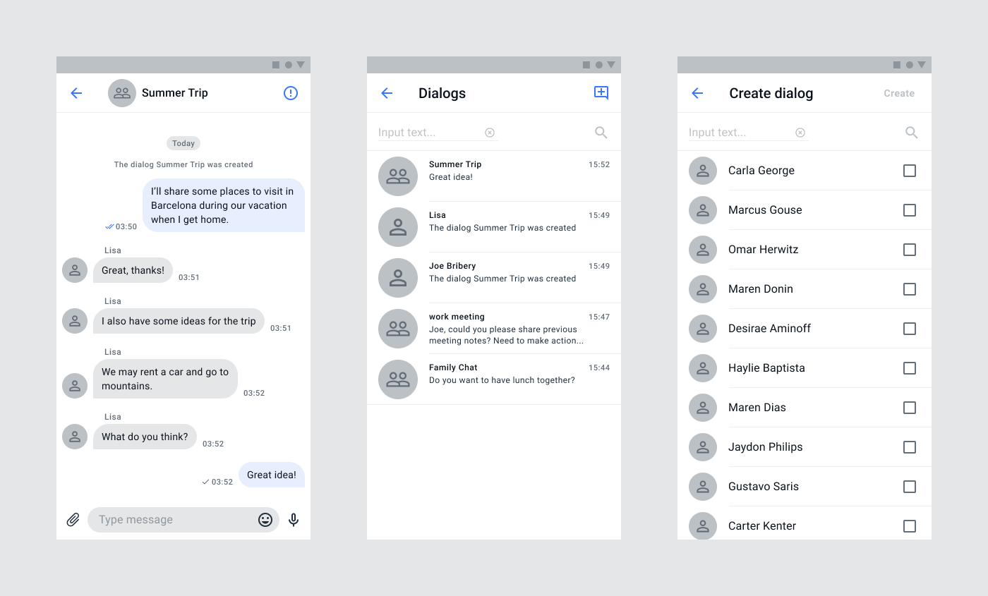
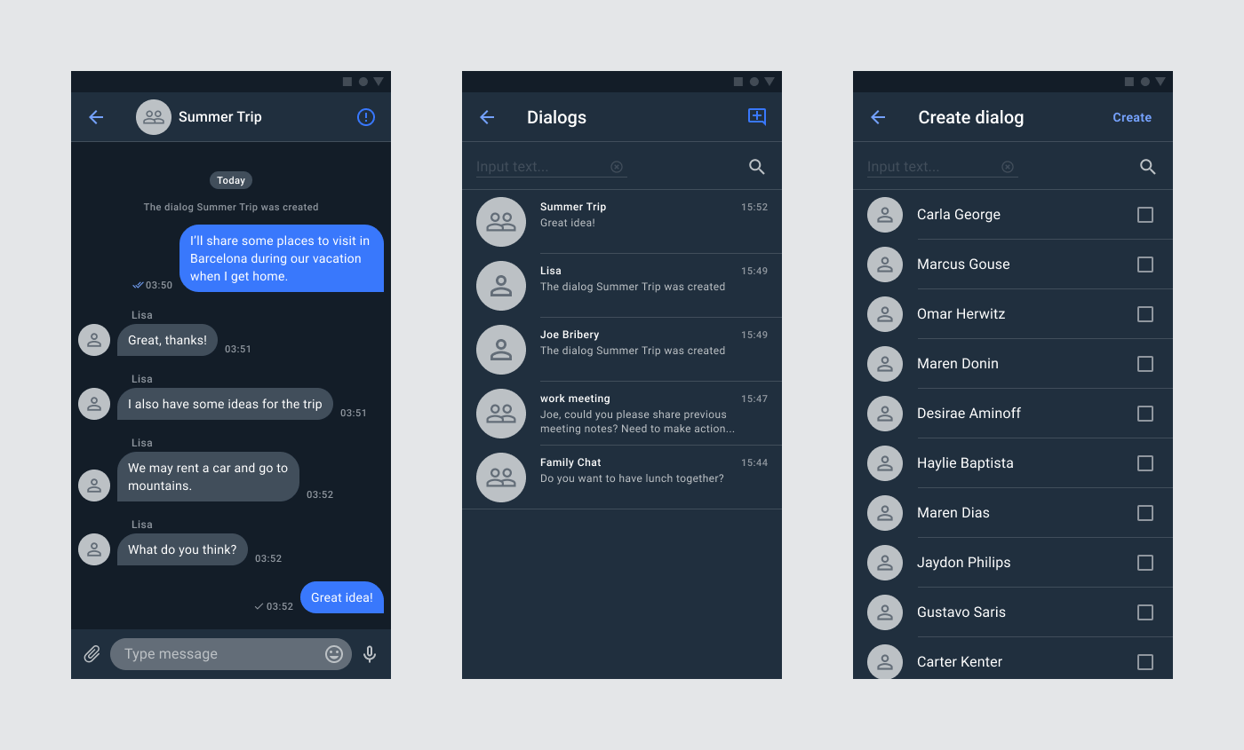
**QuickBlox Android UIKit** comes with two preset themes: **light (LightUIKitTheme)** and **dark (DarkUIKitTheme)**. Both themes implement the **UIKitTheme** interface, which allows you to use them to customize the appearance of interface elements.
#### Light Theme
 #### Dark Theme
 ### Theme colors
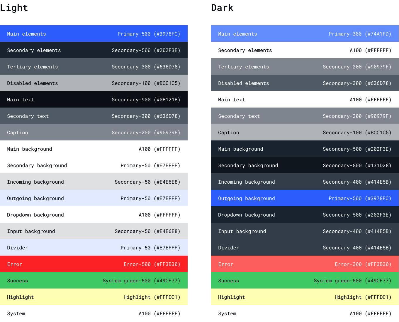 The default themes in **QuickBlox Android UIKit** already define primary colors corresponding to light and dark themes. However, you can also change the specific colors in the preset themes to tailor them to your needs.
```Kotlin Kotlin theme={null}
val darkUiKitTheme: UiKitTheme = DarkUiKitTheme()
val whiteColor = "#FFFFFF"
darkUiKitTheme.setMainTextColor(whiteColor)
QuickBloxUiKit.setTheme(darkUiKitTheme)
```
In the example, we set the white color for the main text in the **DarkUIKitTheme** and set this theme to **UIKit**. You can use the default pre-installed themes in **QuickBlox Android UIKit** and change only the colors you need by overriding the appropriate attributes.
Important
Modified themes need to be set before launching UIKit screens and components.
### Custom theme
If you want to create a completely custom theme, it must also implement the **UIKitTheme** interface. You will be able to define and customize all colors and attributes to suit your needs.
```Kotlin Kotlin theme={null}
class CustomUIKitTheme : UiKitTheme {
private var mainBackgroundColor: String = "#FFFFFF"
private var statusBarColor: String = "#E4E6E8"
private var mainElementsColor: String = "#3978FC"
private var secondaryBackgroundColor: String = "#E7EFFF"
private var mainTextColor: String = "#0B121B"
private var disabledElementsColor: String = "#BCC1C5"
private var secondaryTextColor: String = "#636D78"
private var secondaryElementsColor: String = "#202F3E"
private var dividerColor: String = "#E7EFFF"
private var incomingMessageColor: String = "#E4E6E8"
private var outgoingMessageColor: String = "#E7EFFF"
private var inputBackgroundColor: String = "#E4E6E8"
private var tertiaryElementsColor: String = "#636D78"
private var errorColor: String = "#FF766E"
override fun getMainBackgroundColor(): Int {
return parseColorToIntFrom(mainBackgroundColor)
}
override fun setMainBackgroundColor(colorString: String) {
mainBackgroundColor = colorString
}
override fun getStatusBarColor(): Int {
return parseColorToIntFrom(statusBarColor)
}
override fun setStatusBarColor(colorString: String) {
statusBarColor = colorString
}
override fun getMainElementsColor(): Int {
return parseColorToIntFrom(mainElementsColor)
}
override fun setMainElementsColor(colorString: String) {
mainElementsColor = colorString
}
override fun getSecondaryBackgroundColor(): Int {
return parseColorToIntFrom(secondaryBackgroundColor)
}
override fun setSecondaryBackgroundColor(colorString: String) {
secondaryBackgroundColor = colorString
}
override fun setDisabledElementsColor(colorString: String) {
disabledElementsColor = colorString
}
override fun getDisabledElementsColor(): Int {
return parseColorToIntFrom(disabledElementsColor)
}
override fun getMainTextColor(): Int {
return parseColorToIntFrom(mainTextColor)
}
override fun setMainTextColor(colorString: String) {
mainTextColor = colorString
}
override fun setSecondaryTextColor(colorString: String) {
secondaryTextColor = colorString
}
override fun getSecondaryTextColor(): Int {
return parseColorToIntFrom(secondaryTextColor)
}
override fun setSecondaryElementsColor(colorString: String) {
secondaryElementsColor = colorString
}
override fun getIncomingMessageColor(): Int {
return parseColorToIntFrom(incomingMessageColor)
}
override fun setIncomingMessageColor(colorString: String) {
incomingMessageColor = colorString
}
override fun getOutgoingMessageColor(): Int {
return parseColorToIntFrom(outgoingMessageColor)
}
override fun setOutgoingMessageColor(colorString: String) {
outgoingMessageColor = colorString
}
override fun getDividerColor(): Int {
return parseColorToIntFrom(dividerColor)
}
override fun setDividerColor(colorString: String) {
dividerColor = colorString
}
override fun getInputBackgroundColor(): Int {
return parseColorToIntFrom(inputBackgroundColor)
}
override fun setInputBackgroundColor(colorString: String) {
inputBackgroundColor = colorString
}
override fun getTertiaryElementsColor(): Int {
return parseColorToIntFrom(tertiaryElementsColor)
}
override fun setTertiaryElementsColor(colorString: String) {
tertiaryElementsColor = colorString
}
override fun getSecondaryElementsColor(): Int {
return parseColorToIntFrom(secondaryElementsColor)
}
override fun getErrorColor(): Int {
return parseColorToIntFrom(errorColor)
}
override fun setErrorColor(colorString: String) {
errorColor = colorString
}
override fun parseColorToIntFrom(colorString: String): Int {
try {
return Color.parseColor(colorString)
} catch (exception: IllegalArgumentException) {
throw ParseColorException(exception.message.toString())
} catch (exception: NumberFormatException) {
throw ParseColorException(exception.message.toString())
}
}
}
```
After which you need to add your custom theme to UIKit:
```Kotlin Kotlin theme={null}
val customTheme: UiKitTheme = CustomUIKitTheme()
QuickBloxUiKit.setTheme(customTheme)
```
Important
Modified themes need to be set before launching UIKit screens and components.
## Screens
### Creating a custom screen factory
The **QuickBlox Android UIKit** provides an interface called **ScreenFactory**, which allows you to customize the creation of screens in your Android application. The default implementation of this interface is **DefaultScreenFactory()**, which creates screens using Fragments. However, if you need to replace a specific screen with your screen, you can create your own implementation of the **ScreenFactory** interface. This custom implementation will be responsible for creating the desired screens according to your requirements. This allows you to tailor the screen creation process to suit your application's specific needs.
```Kotlin Kotlin theme={null}
open class CustomScreenFactory : ScreenFactory {
override fun createDialogs(screenSettings: DialogsScreenSettings?): Fragment {
return DialogsFragment.newInstance(screenSettings)
}
override fun createDialogName(dialogEntity: DialogEntity?, screenSettings: DialogNameScreenSettings?): Fragment {
return DialogNameFragment.newInstance(dialogEntity, screenSettings)
}
override fun createUsers(dialogEntity: DialogEntity?, screenSettings: UsersScreenSettings?): Fragment {
return UsersFragment.newInstance(dialogEntity, screenSettings)
}
override fun createPrivateChat(dialogId: String?, screenSettings: PrivateChatScreenSettings?): Fragment {
return PrivateChatFragment.newInstance(dialogId, screenSettings)
}
override fun createGroupChat(dialogId: String?, screenSettings: GroupChatScreenSettings?): Fragment {
return GroupChatFragment.newInstance(dialogId, screenSettings)
}
override fun createGroupChatInfo(dialogId: String?, screenSettings: GroupChatInfoScreenSettings?): Fragment {
return GroupChatInfoFragment.newInstance(dialogId, screenSettings)
}
override fun createPrivateChatInfo(dialogId: String?, screenSettings: PrivateChatInfoScreenSettings?): Fragment {
return PrivateChatInfoFragment.newInstance(dialogId, screenSettings)
}
override fun createMembers(dialogId: String?, screenSettings: MembersScreenSettings?): Fragment {
return MembersFragment.newInstance(dialogId, screenSettings)
}
override fun createAddMembers(dialogId: String?, screenSettings: AddMembersScreenSettings?): Fragment {
return AddMembersFragment.newInstance(dialogId, screenSettings)
}
}
```
After which you need to set a custom factory in UIKit:
```Kotlin Kotlin theme={null}
val customScreenFactory: ScreenFactory = CustomScreenFactory()
QuickBloxUiKit.setScreenFactory(customScreenFactory)
```
Important
Modified ScreenFactory need to be set before launching UIKit screens and components.
### Customizing screens
In **QuickBlox Android UIKit**, each screen accepts an instance of a specific implementation of the **ScreenSettings** interface as a constructor parameter. This ScreenSettings object is responsible for configuring the components and settings of the screen. It's important to note that the **ScreenSettings** parameter is optional, and if not provided, the default implementation will be used.
The ScreenSettings interface allows you to define the properties and behavior of the screen components. It provides methods to show or hide specific components and allows you to set custom components for a particular screen. This gives you the flexibility to customize the appearance and functionality of each screen according to your specific requirements.
To create a **ScreenSettings** object, **QuickBlox Android UIKit** utilizes the Builder pattern. This pattern allows you to conveniently set the desired properties and configurations for the screen. You can chain multiple methods calls to set various settings, such as showing or hiding specific components, setting custom components, or modifying any other relevant screen attributes.
By using the Builder pattern, you can create a **ScreenSettings** object with the desired configurations before passing it to the screen's constructor. This approach simplifies the process of customizing and fine-tuning the screen's appearance and behavior.
```Kotlin Kotlin theme={null}
val darkUiKitTheme: UiKitTheme = DarkUiKitTheme()
val dialogsScreenSettings = DialogsScreenSettings.Builder(context)
.showDialogs(true)
.showHeader(true)
.showSearch(false)
.setTheme(darkUiKitTheme)
.setDialogsComponent(DialogsComponentImpl(context))
.setHeaderComponent(HeaderWithIconComponentImpl(context))
.setSearchComponent(SearchComponentImpl(context))
.build()
DialogsActivity.show(this, dialogsScreenSettings)
```
In this example, we showed how to add **ScreenSettings** with your own setting to the dialogs screen.
Of course, we don’t need to invoke all methods like in the code snippet above. We can invoke only the exact methods that we need. For example, if we need just to hide the search component the code will be like the snippet below:
```Kotlin Kotlin theme={null}
val dialogsScreenSettings = DialogsScreenSettings.Builder(context)
.showSearch(false)
.build()
DialogsActivity.show(this, dialogsScreenSettings)
```
Quick start using our [Android UIKit sample](https://github.com/QuickBlox/quickblox-android-sdk/tree/master/android-ui-kit-sample)
This sample implements authorization functionality and provides an example of color theme customization. Sample code available by this [link](https://github.com/QuickBlox/quickblox-android-sdk/tree/master/android-ui-kit-sample). How to set up and run a sample, see the article in out blog [Getting Started with the QuickBlox Android UIKit](https://quickblox.com/blog/getting-started-with-quickblox-android-ui-kit/).
The default themes in **QuickBlox Android UIKit** already define primary colors corresponding to light and dark themes. However, you can also change the specific colors in the preset themes to tailor them to your needs.
```Kotlin Kotlin theme={null}
val darkUiKitTheme: UiKitTheme = DarkUiKitTheme()
val whiteColor = "#FFFFFF"
darkUiKitTheme.setMainTextColor(whiteColor)
QuickBloxUiKit.setTheme(darkUiKitTheme)
```
In the example, we set the white color for the main text in the **DarkUIKitTheme** and set this theme to **UIKit**. You can use the default pre-installed themes in **QuickBlox Android UIKit** and change only the colors you need by overriding the appropriate attributes.
Important
Modified themes need to be set before launching UIKit screens and components.
### Custom theme
If you want to create a completely custom theme, it must also implement the **UIKitTheme** interface. You will be able to define and customize all colors and attributes to suit your needs.
```Kotlin Kotlin theme={null}
class CustomUIKitTheme : UiKitTheme {
private var mainBackgroundColor: String = "#FFFFFF"
private var statusBarColor: String = "#E4E6E8"
private var mainElementsColor: String = "#3978FC"
private var secondaryBackgroundColor: String = "#E7EFFF"
private var mainTextColor: String = "#0B121B"
private var disabledElementsColor: String = "#BCC1C5"
private var secondaryTextColor: String = "#636D78"
private var secondaryElementsColor: String = "#202F3E"
private var dividerColor: String = "#E7EFFF"
private var incomingMessageColor: String = "#E4E6E8"
private var outgoingMessageColor: String = "#E7EFFF"
private var inputBackgroundColor: String = "#E4E6E8"
private var tertiaryElementsColor: String = "#636D78"
private var errorColor: String = "#FF766E"
override fun getMainBackgroundColor(): Int {
return parseColorToIntFrom(mainBackgroundColor)
}
override fun setMainBackgroundColor(colorString: String) {
mainBackgroundColor = colorString
}
override fun getStatusBarColor(): Int {
return parseColorToIntFrom(statusBarColor)
}
override fun setStatusBarColor(colorString: String) {
statusBarColor = colorString
}
override fun getMainElementsColor(): Int {
return parseColorToIntFrom(mainElementsColor)
}
override fun setMainElementsColor(colorString: String) {
mainElementsColor = colorString
}
override fun getSecondaryBackgroundColor(): Int {
return parseColorToIntFrom(secondaryBackgroundColor)
}
override fun setSecondaryBackgroundColor(colorString: String) {
secondaryBackgroundColor = colorString
}
override fun setDisabledElementsColor(colorString: String) {
disabledElementsColor = colorString
}
override fun getDisabledElementsColor(): Int {
return parseColorToIntFrom(disabledElementsColor)
}
override fun getMainTextColor(): Int {
return parseColorToIntFrom(mainTextColor)
}
override fun setMainTextColor(colorString: String) {
mainTextColor = colorString
}
override fun setSecondaryTextColor(colorString: String) {
secondaryTextColor = colorString
}
override fun getSecondaryTextColor(): Int {
return parseColorToIntFrom(secondaryTextColor)
}
override fun setSecondaryElementsColor(colorString: String) {
secondaryElementsColor = colorString
}
override fun getIncomingMessageColor(): Int {
return parseColorToIntFrom(incomingMessageColor)
}
override fun setIncomingMessageColor(colorString: String) {
incomingMessageColor = colorString
}
override fun getOutgoingMessageColor(): Int {
return parseColorToIntFrom(outgoingMessageColor)
}
override fun setOutgoingMessageColor(colorString: String) {
outgoingMessageColor = colorString
}
override fun getDividerColor(): Int {
return parseColorToIntFrom(dividerColor)
}
override fun setDividerColor(colorString: String) {
dividerColor = colorString
}
override fun getInputBackgroundColor(): Int {
return parseColorToIntFrom(inputBackgroundColor)
}
override fun setInputBackgroundColor(colorString: String) {
inputBackgroundColor = colorString
}
override fun getTertiaryElementsColor(): Int {
return parseColorToIntFrom(tertiaryElementsColor)
}
override fun setTertiaryElementsColor(colorString: String) {
tertiaryElementsColor = colorString
}
override fun getSecondaryElementsColor(): Int {
return parseColorToIntFrom(secondaryElementsColor)
}
override fun getErrorColor(): Int {
return parseColorToIntFrom(errorColor)
}
override fun setErrorColor(colorString: String) {
errorColor = colorString
}
override fun parseColorToIntFrom(colorString: String): Int {
try {
return Color.parseColor(colorString)
} catch (exception: IllegalArgumentException) {
throw ParseColorException(exception.message.toString())
} catch (exception: NumberFormatException) {
throw ParseColorException(exception.message.toString())
}
}
}
```
After which you need to add your custom theme to UIKit:
```Kotlin Kotlin theme={null}
val customTheme: UiKitTheme = CustomUIKitTheme()
QuickBloxUiKit.setTheme(customTheme)
```
Important
Modified themes need to be set before launching UIKit screens and components.
## Screens
### Creating a custom screen factory
The **QuickBlox Android UIKit** provides an interface called **ScreenFactory**, which allows you to customize the creation of screens in your Android application. The default implementation of this interface is **DefaultScreenFactory()**, which creates screens using Fragments. However, if you need to replace a specific screen with your screen, you can create your own implementation of the **ScreenFactory** interface. This custom implementation will be responsible for creating the desired screens according to your requirements. This allows you to tailor the screen creation process to suit your application's specific needs.
```Kotlin Kotlin theme={null}
open class CustomScreenFactory : ScreenFactory {
override fun createDialogs(screenSettings: DialogsScreenSettings?): Fragment {
return DialogsFragment.newInstance(screenSettings)
}
override fun createDialogName(dialogEntity: DialogEntity?, screenSettings: DialogNameScreenSettings?): Fragment {
return DialogNameFragment.newInstance(dialogEntity, screenSettings)
}
override fun createUsers(dialogEntity: DialogEntity?, screenSettings: UsersScreenSettings?): Fragment {
return UsersFragment.newInstance(dialogEntity, screenSettings)
}
override fun createPrivateChat(dialogId: String?, screenSettings: PrivateChatScreenSettings?): Fragment {
return PrivateChatFragment.newInstance(dialogId, screenSettings)
}
override fun createGroupChat(dialogId: String?, screenSettings: GroupChatScreenSettings?): Fragment {
return GroupChatFragment.newInstance(dialogId, screenSettings)
}
override fun createGroupChatInfo(dialogId: String?, screenSettings: GroupChatInfoScreenSettings?): Fragment {
return GroupChatInfoFragment.newInstance(dialogId, screenSettings)
}
override fun createPrivateChatInfo(dialogId: String?, screenSettings: PrivateChatInfoScreenSettings?): Fragment {
return PrivateChatInfoFragment.newInstance(dialogId, screenSettings)
}
override fun createMembers(dialogId: String?, screenSettings: MembersScreenSettings?): Fragment {
return MembersFragment.newInstance(dialogId, screenSettings)
}
override fun createAddMembers(dialogId: String?, screenSettings: AddMembersScreenSettings?): Fragment {
return AddMembersFragment.newInstance(dialogId, screenSettings)
}
}
```
After which you need to set a custom factory in UIKit:
```Kotlin Kotlin theme={null}
val customScreenFactory: ScreenFactory = CustomScreenFactory()
QuickBloxUiKit.setScreenFactory(customScreenFactory)
```
Important
Modified ScreenFactory need to be set before launching UIKit screens and components.
### Customizing screens
In **QuickBlox Android UIKit**, each screen accepts an instance of a specific implementation of the **ScreenSettings** interface as a constructor parameter. This ScreenSettings object is responsible for configuring the components and settings of the screen. It's important to note that the **ScreenSettings** parameter is optional, and if not provided, the default implementation will be used.
The ScreenSettings interface allows you to define the properties and behavior of the screen components. It provides methods to show or hide specific components and allows you to set custom components for a particular screen. This gives you the flexibility to customize the appearance and functionality of each screen according to your specific requirements.
To create a **ScreenSettings** object, **QuickBlox Android UIKit** utilizes the Builder pattern. This pattern allows you to conveniently set the desired properties and configurations for the screen. You can chain multiple methods calls to set various settings, such as showing or hiding specific components, setting custom components, or modifying any other relevant screen attributes.
By using the Builder pattern, you can create a **ScreenSettings** object with the desired configurations before passing it to the screen's constructor. This approach simplifies the process of customizing and fine-tuning the screen's appearance and behavior.
```Kotlin Kotlin theme={null}
val darkUiKitTheme: UiKitTheme = DarkUiKitTheme()
val dialogsScreenSettings = DialogsScreenSettings.Builder(context)
.showDialogs(true)
.showHeader(true)
.showSearch(false)
.setTheme(darkUiKitTheme)
.setDialogsComponent(DialogsComponentImpl(context))
.setHeaderComponent(HeaderWithIconComponentImpl(context))
.setSearchComponent(SearchComponentImpl(context))
.build()
DialogsActivity.show(this, dialogsScreenSettings)
```
In this example, we showed how to add **ScreenSettings** with your own setting to the dialogs screen.
Of course, we don’t need to invoke all methods like in the code snippet above. We can invoke only the exact methods that we need. For example, if we need just to hide the search component the code will be like the snippet below:
```Kotlin Kotlin theme={null}
val dialogsScreenSettings = DialogsScreenSettings.Builder(context)
.showSearch(false)
.build()
DialogsActivity.show(this, dialogsScreenSettings)
```
Quick start using our [Android UIKit sample](https://github.com/QuickBlox/quickblox-android-sdk/tree/master/android-ui-kit-sample)
This sample implements authorization functionality and provides an example of color theme customization. Sample code available by this [link](https://github.com/QuickBlox/quickblox-android-sdk/tree/master/android-ui-kit-sample). How to set up and run a sample, see the article in out blog [Getting Started with the QuickBlox Android UIKit](https://quickblox.com/blog/getting-started-with-quickblox-android-ui-kit/).