> ## Documentation Index
> Fetch the complete documentation index at: https://docs.quickblox.com/llms.txt
> Use this file to discover all available pages before exploring further.
# Screens
> QuickBlox Android UIKit allows you to create customizable screens and execute main chat functions such as list dialogs, create dialogs, and chat in dialogs.
## Overview
Screens are made up of three main parts: `Fragment`, `ScreenSettings`, and `ViewModel`. Each fragment has a specific `ScreenSettings` that creates the view and each `ScreenSettings` contains customizable UI components. A fragment also has a corresponding `ViewModel` that provides the necessary data from **QuickBlox Android SDK**.
Refer to the table below to see which screens we provide and the components that make up each screen.
| Screen | Fragment | ScreenSettings | ViewModel | Components |
| ---------------------------------------------------------------------------- | ----------------------- | ----------------------------- | ------------------------ | ------------------------------------------ |
| [Dialog list](/ui-kits/android-uikit-screens#dialog-list-screen) | DialogsFragment | DialogsScreenSettings | DialogsViewModel | HeaderWithIconComponentDialogsComponent |
| [Dialog name](/ui-kits/android-uikit-screens#dialog-name-screen) | DialogNameFragment | DialogNameScreenSettings | DialogNameViewModel | HeaderWithTextComponentDialogNameComponent |
| [User list](/ui-kits/android-uikit-screens#user-list-screen) | UsersFragment | UsersScreenSettings | UsersViewModel | HeaderWithTextComponentUsersComponent |
| [Group сhat](/ui-kits/android-uikit-screens#group-chat-screen) | GroupChatFragment | GroupChatScreenSettings | GroupChatViewModel | HeaderWithAvatarComponentMessagesComponent |
| [Private chat](/ui-kits/android-uikit-screens#private-chat-screen) | PrivateChatFragment | PrivateChatScreenSettings | PrivateChatViewModel | HeaderWithAvatarComponentMessagesComponent |
| [Group chat info](/ui-kits/android-uikit-screens#group-chat-info-screen) | GroupChatInfoFragment | GroupChatInfoScreenSettings | GroupChatInfoViewModel | HeaderWithTextComponentDialogInfoComponent |
| [Private chat info](/ui-kits/android-uikit-screens#private-chat-info-screen) | PrivateChatInfoFragment | PrivateChatInfoScreenSettings | PrivateChatInfoViewModel | HeaderWithTextComponentDialogInfoComponent |
| [Members](/ui-kits/android-uikit-screens#members-screen) | MembersFragment | MembersScreenSettings | MembersViewModel | HeaderWithIconComponentUsersComponent |
| [Add members](/ui-kits/android-uikit-screens#add-members-screen) | AddMembersFragment | AddMembersScreenSettings | AddMembersViewModel | HeaderWithIconComponentUsersComponent |
## Dialog list screen
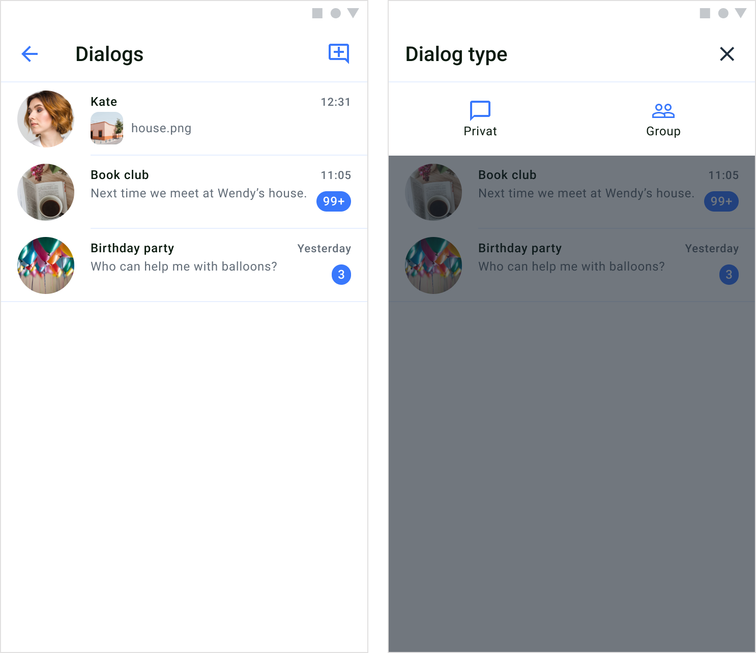
The dialog list screen shows a complete list of group and private dialogs of which the current user is a member.
After following the steps described in the [Get started](/ui-kits/android-uikit-send-your-first-message#get-started) section, you can display and manage the list of dialogs.
 ### Screen structure
The dialogs list screen consists of two components: header and dialogs.
**Header**
The header component contains a screen title and a default button in the upper right corner that allows you to select the type of dialog you want to create.
The view of the header component is created and configured in the `DialogsScreenSettings`.
**Dialogs**
The dialogs component shows a list of all private and group dialogs that the current user is part of. To create a view for each dialog list item, you need to use the`DialogsAdapter` and bind dialog data to the view. When the current user taps on one of the dialogs in the list, they will be able to enter a [private](/ui-kits/android-uikit-screens#private-chat-screen) or [group](/ui-kits/android-uikit-screens#group-chat-screen) chat screen depending on the dialog type.
### Usage
**QuickBlox UIKit for Android** provides both an **activity** and a **fragment** to create a dialog list screen. You can choose which one to build your app with, and you can solely use an **activity** or a **fragment** if you like. You can create a dialogs screen with a `DialogsActivity` which uses a `ScreenFactory` to create views.
**Start an activity**
You can start a dialogs activity by using the method `show()` of `DialogsActivity` as shown below:
```Kotlin Kotlin theme={null}
DialogsActivity.show(context)
```
**Create a fragment**
To create a `DialogsFragment` use the `ScreenFactory`, how to create a `DialogsFragment` is shown in the example below:
```Kotlin Kotlin theme={null}
val fragment: Fragment = QuickBloxUiKit.getScreenFactory().createDialogs()
```
### Customization
In `DialogsScreenSettings` you can customize the `DialogsFragment` to change various aspects of the screen. The `DialogsScreenSettings` class allows you to configure `DialogsFragment` components. If you want to customize the fragment beyond using the APIs provided in the `DialogsScreenSettings`, you need to inherit the `DialogsScreenSettings` and extend the functionality.
The following table shows the main classes used in the `DialogsFragment` to display and customize the dialogs screen.
| Fragment | ScreenSettings | Components | Theme | RecyclerView |
| --------------- | --------------------- | --------------------------------------- | ---------- | -------------- |
| DialogsFragment | DialogsScreenSettings | HeaderWithIconComponentDialogsComponent | UiKitTheme | DialogsAdapter |
## Dialog name screen
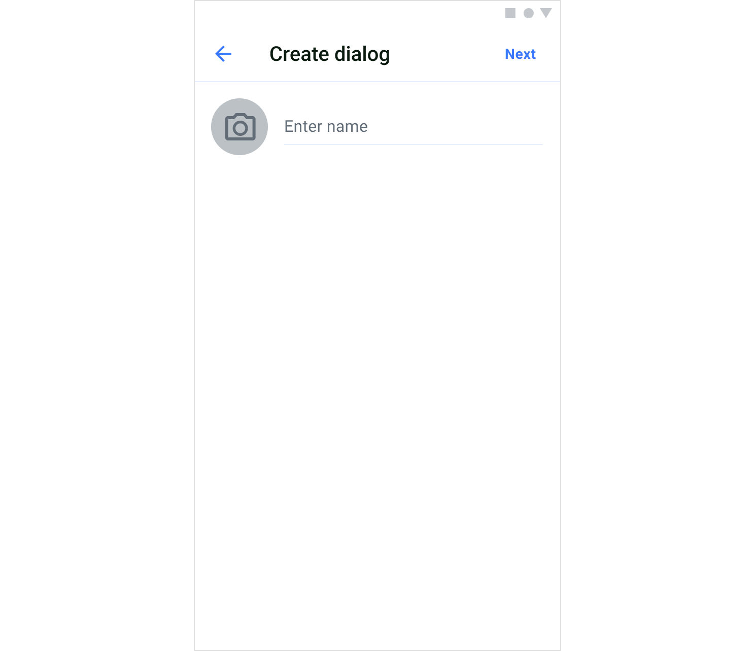
The dialog name screen is used in the group dialog creation flow. And allows you to set a name and photo for a group dialog.
### Screen structure
The dialogs list screen consists of two components: header and dialogs.
**Header**
The header component contains a screen title and a default button in the upper right corner that allows you to select the type of dialog you want to create.
The view of the header component is created and configured in the `DialogsScreenSettings`.
**Dialogs**
The dialogs component shows a list of all private and group dialogs that the current user is part of. To create a view for each dialog list item, you need to use the`DialogsAdapter` and bind dialog data to the view. When the current user taps on one of the dialogs in the list, they will be able to enter a [private](/ui-kits/android-uikit-screens#private-chat-screen) or [group](/ui-kits/android-uikit-screens#group-chat-screen) chat screen depending on the dialog type.
### Usage
**QuickBlox UIKit for Android** provides both an **activity** and a **fragment** to create a dialog list screen. You can choose which one to build your app with, and you can solely use an **activity** or a **fragment** if you like. You can create a dialogs screen with a `DialogsActivity` which uses a `ScreenFactory` to create views.
**Start an activity**
You can start a dialogs activity by using the method `show()` of `DialogsActivity` as shown below:
```Kotlin Kotlin theme={null}
DialogsActivity.show(context)
```
**Create a fragment**
To create a `DialogsFragment` use the `ScreenFactory`, how to create a `DialogsFragment` is shown in the example below:
```Kotlin Kotlin theme={null}
val fragment: Fragment = QuickBloxUiKit.getScreenFactory().createDialogs()
```
### Customization
In `DialogsScreenSettings` you can customize the `DialogsFragment` to change various aspects of the screen. The `DialogsScreenSettings` class allows you to configure `DialogsFragment` components. If you want to customize the fragment beyond using the APIs provided in the `DialogsScreenSettings`, you need to inherit the `DialogsScreenSettings` and extend the functionality.
The following table shows the main classes used in the `DialogsFragment` to display and customize the dialogs screen.
| Fragment | ScreenSettings | Components | Theme | RecyclerView |
| --------------- | --------------------- | --------------------------------------- | ---------- | -------------- |
| DialogsFragment | DialogsScreenSettings | HeaderWithIconComponentDialogsComponent | UiKitTheme | DialogsAdapter |
## Dialog name screen
The dialog name screen is used in the group dialog creation flow. And allows you to set a name and photo for a group dialog.
 ### Screen structure
The dialog name screen consists of two components: header and dialog name.
**Header**
The header component contains a screen title. Also, the header includes a default button "Next" in the upper right corner that allows you to open the user list screen
The view of the header component is created and configured in the `DialogNameScreenSettings`.
**Dialog name**
The dialog name component allows you to set a name and photo for a group dialog.
### Usage
**QuickBlox UIKit for Android** provides both an **activity** and a **fragment** to create a dialog name screen. You can choose which one to build your app with, and you can solely use an **activity** or a **fragment** if you like. You can create a dialog name screen with a `DialogNameActivity` which uses a `ScreenFactory` to create views.
**Start an activity**
You can start a dialog name activity by using the method `show()` of `DialogNameActivity` as shown below:
```Kotlin Kotlin theme={null}
DialogNameActivity.show(context, dialogEntity)
```
**Create a fragment**
To create a `DialogNameFragment` use the `ScreenFactory`, how to create a `DialogNameFragment` is shown in the example below:
```Kotlin Kotlin theme={null}
val fragment: Fragment = QuickBloxUiKit.getScreenFactory().createDialogName(dialogEntity)
```
### Customization
In `DialogNameScreenSettings` you can customize the `DialogNameFragment` to change various aspects of the screen. The `DialogNameScreenSettings` class allows you to configure `DialogNameFragment` components. If you want to customize the fragment beyond using the APIs provided in the `DialogNameScreenSettings`, you need to inherit the `DialogNameScreenSettings` and extend the functionality.
The following table shows the main classes used in the `DialogNameFragment` to display and customize the dialog name screen.
| Fragment | ScreenSettings | Components | Theme |
| ------------------ | ------------------------ | ------------------------------------------ | ---------- |
| DialogNameFragment | DialogNameScreenSettings | HeaderWithTextComponentDialogNameComponent | UiKitTheme |
## User list screen
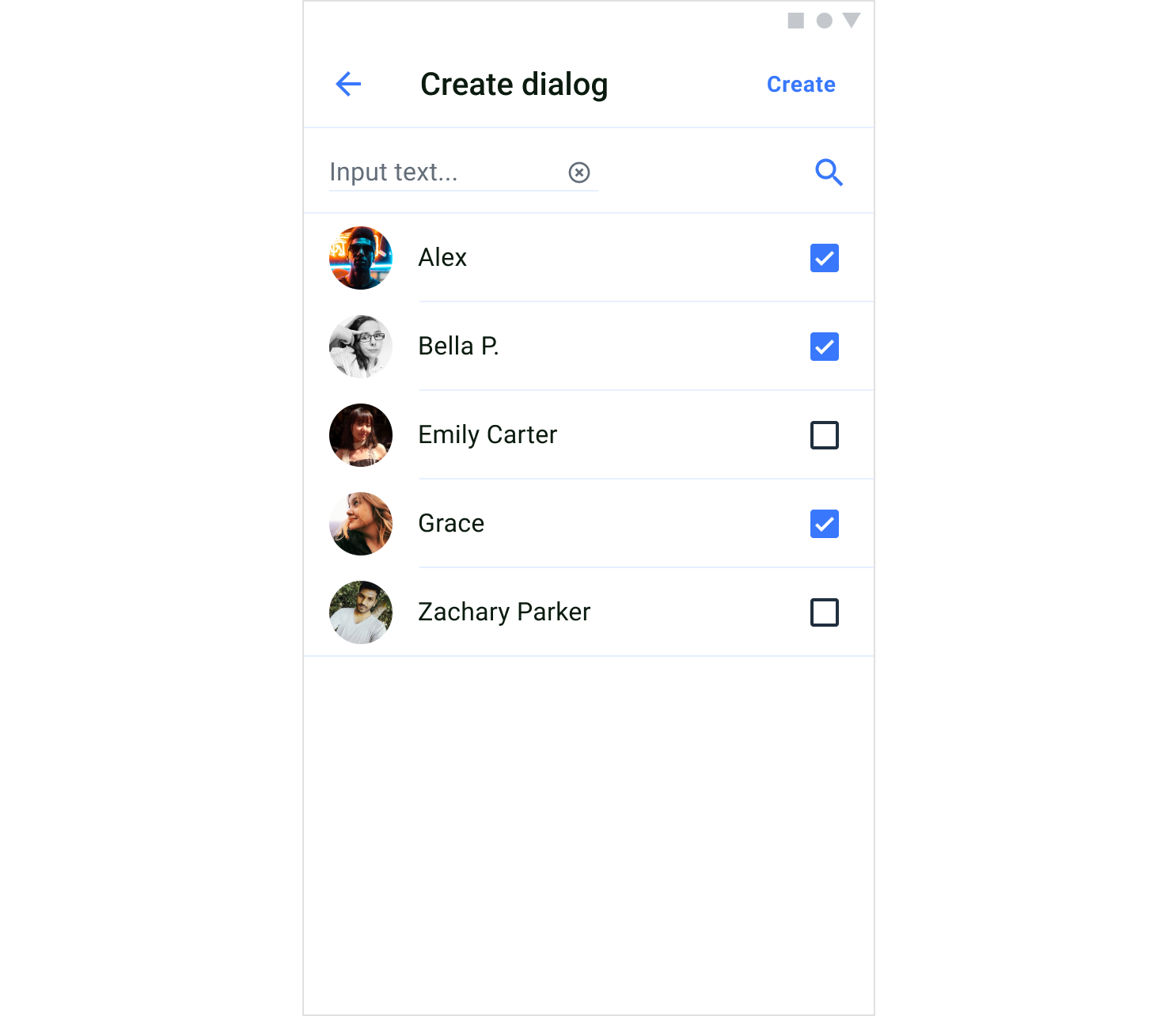
The user list screen displays available users that can be selected to create a group or private dialog.
### Screen structure
The dialog name screen consists of two components: header and dialog name.
**Header**
The header component contains a screen title. Also, the header includes a default button "Next" in the upper right corner that allows you to open the user list screen
The view of the header component is created and configured in the `DialogNameScreenSettings`.
**Dialog name**
The dialog name component allows you to set a name and photo for a group dialog.
### Usage
**QuickBlox UIKit for Android** provides both an **activity** and a **fragment** to create a dialog name screen. You can choose which one to build your app with, and you can solely use an **activity** or a **fragment** if you like. You can create a dialog name screen with a `DialogNameActivity` which uses a `ScreenFactory` to create views.
**Start an activity**
You can start a dialog name activity by using the method `show()` of `DialogNameActivity` as shown below:
```Kotlin Kotlin theme={null}
DialogNameActivity.show(context, dialogEntity)
```
**Create a fragment**
To create a `DialogNameFragment` use the `ScreenFactory`, how to create a `DialogNameFragment` is shown in the example below:
```Kotlin Kotlin theme={null}
val fragment: Fragment = QuickBloxUiKit.getScreenFactory().createDialogName(dialogEntity)
```
### Customization
In `DialogNameScreenSettings` you can customize the `DialogNameFragment` to change various aspects of the screen. The `DialogNameScreenSettings` class allows you to configure `DialogNameFragment` components. If you want to customize the fragment beyond using the APIs provided in the `DialogNameScreenSettings`, you need to inherit the `DialogNameScreenSettings` and extend the functionality.
The following table shows the main classes used in the `DialogNameFragment` to display and customize the dialog name screen.
| Fragment | ScreenSettings | Components | Theme |
| ------------------ | ------------------------ | ------------------------------------------ | ---------- |
| DialogNameFragment | DialogNameScreenSettings | HeaderWithTextComponentDialogNameComponent | UiKitTheme |
## User list screen
The user list screen displays available users that can be selected to create a group or private dialog.
 ### Screen structure
The user list screen consists of two components: header and users.
**Header**
The header component contains a screen title. Also, the header includes a default button "Create" in the upper right corner that allows you to create a dialog and open the chat screen.
The view of the header component is created and configured in the `UsersScreenSettings`.
**Users**
The users component shows a list of available users that can be selected to create a group or private dialog. To create the view for each user list item, you need to use the `SelectionUsersAdapter` and bind user data to the view.
### Usage
**QuickBlox UIKit for Android** provides both an **activity** and a **fragment** to create a user list screen. You can choose which one to build your app with, and you can solely use an **activity** or a **fragment** if you like. You can create a users screen with a `UsersActivity` which uses a `ScreenFactory` to create views.
**Start an activity**
You can start a users activity by using the method `show()` of `UsersActivity` as shown below:
```Kotlin Kotlin theme={null}
UsersActivity.show(context, dialogEntity)
```
**Create a fragment**
To create a `UsersFragment` use the `ScreenFactory`, how to create a `UsersFragment` is shown in the example below:
```Kotlin Kotlin theme={null}
val fragment: Fragment = QuickBloxUiKit.getScreenFactory().createUsers(dialogEntity)
```
### Customization
In `UsersScreenSettings` you can customize the `UsersFragment` to change various aspects of the screen. The `UsersScreenSettings` class allows you to configure `UsersFragment` components. If you want to customize the fragment beyond using the APIs provided in the `UsersScreenSettings`, you need to inherit the `UsersScreenSettings` and extend the functionality.
The following table shows the main classes used in the `UsersFragment` to display and customize the user list screen.
| Fragment | ScreenSettings | Components | Theme | RecyclerView |
| ------------- | ------------------- | ------------------------------------- | ---------- | --------------------- |
| UsersFragment | UsersScreenSettings | HeaderWithTextComponentUsersComponent | UiKitTheme | SelectionUsersAdapter |
## Group chat screen
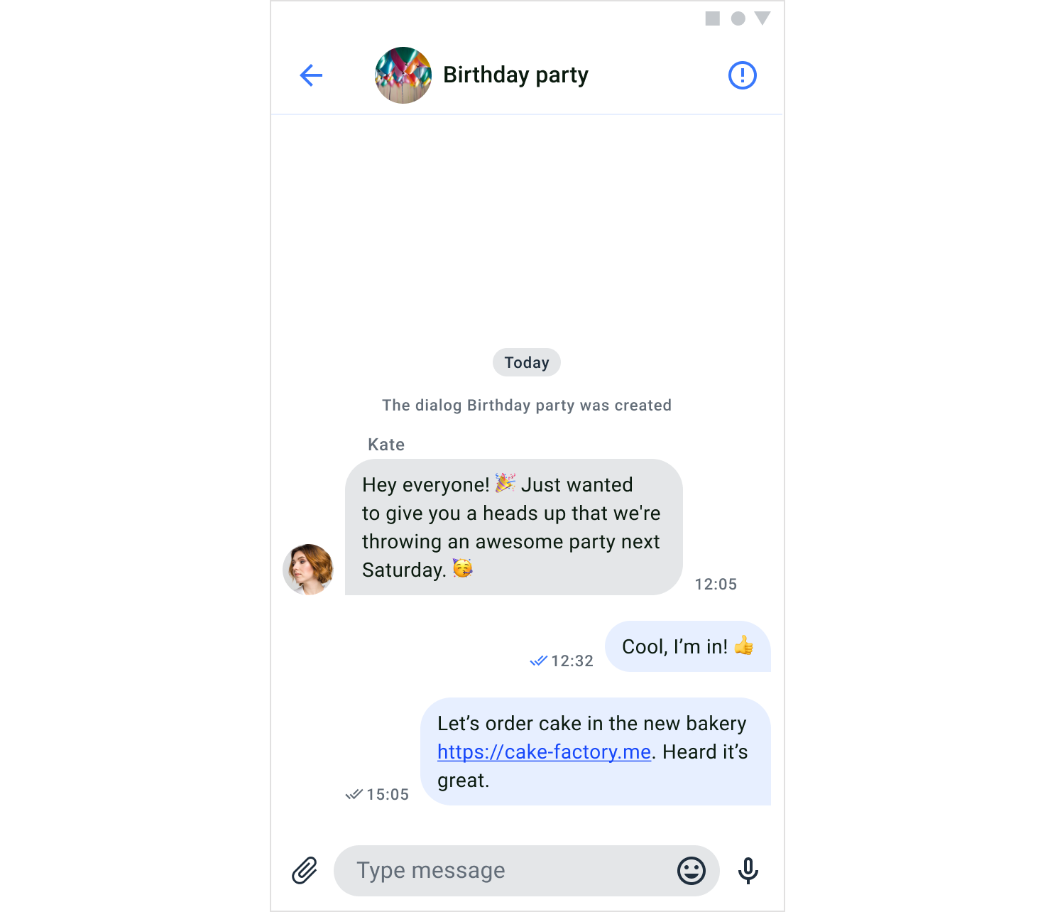
A group chat screen allows close interactions between a limited number of users. To join the dialog, one of the members needs to add you to the dialog.
### Screen structure
The user list screen consists of two components: header and users.
**Header**
The header component contains a screen title. Also, the header includes a default button "Create" in the upper right corner that allows you to create a dialog and open the chat screen.
The view of the header component is created and configured in the `UsersScreenSettings`.
**Users**
The users component shows a list of available users that can be selected to create a group or private dialog. To create the view for each user list item, you need to use the `SelectionUsersAdapter` and bind user data to the view.
### Usage
**QuickBlox UIKit for Android** provides both an **activity** and a **fragment** to create a user list screen. You can choose which one to build your app with, and you can solely use an **activity** or a **fragment** if you like. You can create a users screen with a `UsersActivity` which uses a `ScreenFactory` to create views.
**Start an activity**
You can start a users activity by using the method `show()` of `UsersActivity` as shown below:
```Kotlin Kotlin theme={null}
UsersActivity.show(context, dialogEntity)
```
**Create a fragment**
To create a `UsersFragment` use the `ScreenFactory`, how to create a `UsersFragment` is shown in the example below:
```Kotlin Kotlin theme={null}
val fragment: Fragment = QuickBloxUiKit.getScreenFactory().createUsers(dialogEntity)
```
### Customization
In `UsersScreenSettings` you can customize the `UsersFragment` to change various aspects of the screen. The `UsersScreenSettings` class allows you to configure `UsersFragment` components. If you want to customize the fragment beyond using the APIs provided in the `UsersScreenSettings`, you need to inherit the `UsersScreenSettings` and extend the functionality.
The following table shows the main classes used in the `UsersFragment` to display and customize the user list screen.
| Fragment | ScreenSettings | Components | Theme | RecyclerView |
| ------------- | ------------------- | ------------------------------------- | ---------- | --------------------- |
| UsersFragment | UsersScreenSettings | HeaderWithTextComponentUsersComponent | UiKitTheme | SelectionUsersAdapter |
## Group chat screen
A group chat screen allows close interactions between a limited number of users. To join the dialog, one of the members needs to add you to the dialog.
 ### Screen structure
The group chat screen consists of two components: header and messages.
**Header**
The header component contains the name and the photo of the dialog. Also, the header contains a default button in the upper right corner that allows you to open the group chat info screen.
The view of the header component is created and configured in the `GroupChatScreenSettings`.
**Messages**
The message component shows a list of all messages exchanged in the chat, in chronological order. The list displays messages sent by the current user and the other members of the dialog. The view of `MessagesComponent` is created and configured in the `GroupChatScreenSettings`. To create a view for each message list item, you need to use a `MessageAdapter`.
**Send message**
The send message component is where the user can either enter a text message or send the message with an attachment like file, image, or video.
### Usage
**QuickBlox UIKit for Android** provides both an **activity** and a **fragment** to create a group chat screen. You can choose which one to build your app with, and you can solely use an **activity** or a **fragment** if you like. You can create a group chat screen with a `GroupChatActivity` which uses a `ScreenFactory` to create views.
**Start an activity**
You can start a group chat activity by using the method `show()` of `GroupChatActivity` as shown below:
```Kotlin Kotlin theme={null}
GroupChatActivity.show(context, dialogId)
```
**Create a fragment**
To create a `GroupChatFragment` use the `ScreenFactory`, how to create a `GroupChatFragment` is shown in the example below:
```Kotlin Kotlin theme={null}
val fragment: Fragment = QuickBloxUiKit.getScreenFactory().createGroupChat(dialogId)
```
### Customization
In `GroupChatScreenSettings` you can customize the `GroupChatFragment` to change various aspects of the screen. The `GroupChatScreenSettings` class allows you to configure `GroupChatFragment` components. If you want to customize the fragment beyond using the APIs provided in the `GroupChatScreenSettings`, you need to inherit the `GroupChatScreenSettings` and extend the functionality.
The following table shows the main classes used in the `PrivateChatFragment` to display and customize the group chat screen.
| Fragment | ScreenSettings | Components | Theme | RecyclerView |
| ----------------- | ----------------------- | ------------------------------------------ | ---------- | -------------- |
| GroupChatFragment | GroupChatScreenSettings | HeaderWithAvatarComponentMessagesComponent | UiKitTheme | MessageAdapter |
## Private chat screen
A private chat screen allows close interaction between two users. To participate in this type of dialog, you can create a dialog with your opponent or your opponent can create a dialog with you.
### Screen structure
The group chat screen consists of two components: header and messages.
**Header**
The header component contains the name and the photo of the dialog. Also, the header contains a default button in the upper right corner that allows you to open the group chat info screen.
The view of the header component is created and configured in the `GroupChatScreenSettings`.
**Messages**
The message component shows a list of all messages exchanged in the chat, in chronological order. The list displays messages sent by the current user and the other members of the dialog. The view of `MessagesComponent` is created and configured in the `GroupChatScreenSettings`. To create a view for each message list item, you need to use a `MessageAdapter`.
**Send message**
The send message component is where the user can either enter a text message or send the message with an attachment like file, image, or video.
### Usage
**QuickBlox UIKit for Android** provides both an **activity** and a **fragment** to create a group chat screen. You can choose which one to build your app with, and you can solely use an **activity** or a **fragment** if you like. You can create a group chat screen with a `GroupChatActivity` which uses a `ScreenFactory` to create views.
**Start an activity**
You can start a group chat activity by using the method `show()` of `GroupChatActivity` as shown below:
```Kotlin Kotlin theme={null}
GroupChatActivity.show(context, dialogId)
```
**Create a fragment**
To create a `GroupChatFragment` use the `ScreenFactory`, how to create a `GroupChatFragment` is shown in the example below:
```Kotlin Kotlin theme={null}
val fragment: Fragment = QuickBloxUiKit.getScreenFactory().createGroupChat(dialogId)
```
### Customization
In `GroupChatScreenSettings` you can customize the `GroupChatFragment` to change various aspects of the screen. The `GroupChatScreenSettings` class allows you to configure `GroupChatFragment` components. If you want to customize the fragment beyond using the APIs provided in the `GroupChatScreenSettings`, you need to inherit the `GroupChatScreenSettings` and extend the functionality.
The following table shows the main classes used in the `PrivateChatFragment` to display and customize the group chat screen.
| Fragment | ScreenSettings | Components | Theme | RecyclerView |
| ----------------- | ----------------------- | ------------------------------------------ | ---------- | -------------- |
| GroupChatFragment | GroupChatScreenSettings | HeaderWithAvatarComponentMessagesComponent | UiKitTheme | MessageAdapter |
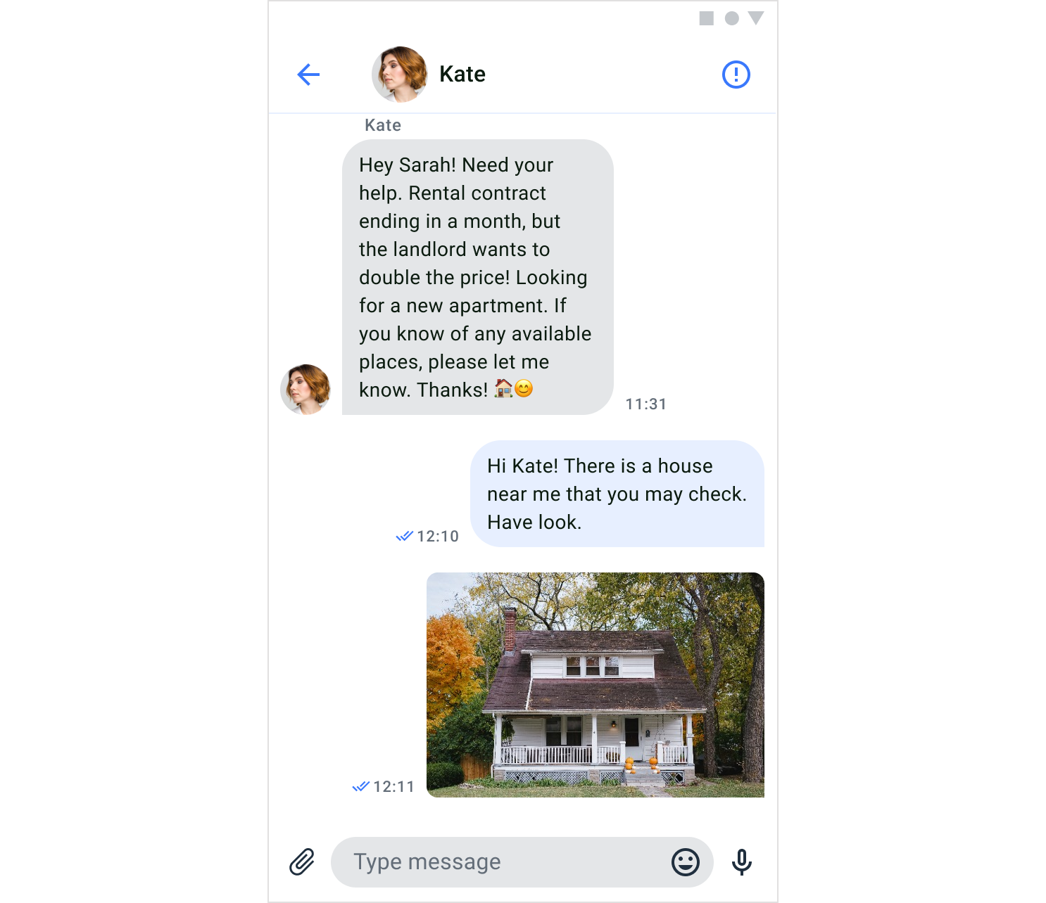
## Private chat screen
A private chat screen allows close interaction between two users. To participate in this type of dialog, you can create a dialog with your opponent or your opponent can create a dialog with you.
 ### Screen structure
The private chat screen consists of two components: header and messages.
**Header**
The header component contains the name and the photo of the opponent. Also, the header includes a default button in the upper right corner that allows you to open the info chat screen
The view of the header component is created and configured in the `PrivateChatScreenSettings`.
**Messages**
The message component shows a list of all messages exchanged in the chat, in chronological order. The list displays messages sent by the current user and the other member of the dialog. The view of `MessagesComponent` is created and configured in the `PrivateChatScreenSettings`. To create a view for each message list item, you need to use a `MessageAdapter`.
### Send message
The send message component is where the user can enter a text message or send the message with an attachment like file, image, or video.
### Usage
**QuickBlox UIKit for Android** provides both an **activity** and a **fragment** to create a private chat screen. You can choose which one to build your app with, and you can solely use an **activity** or a **fragment** if you like. You can create a private chat screen with a `PrivateChatActivity` which uses a `ScreenFactory` to create views.
**Start an activity**
You can start a private chat activity by using the method `show()` of `PrivateChatActivity` as shown below:
```Kotlin Kotlin theme={null}
PrivateChatActivity.show(context, dialogId)
```
**Create a fragment**
To create a `PrivateChatFragment` use the `ScreenFactory`, how to create a `PrivateChatFragment` is shown in the example below:
```Kotlin Kotlin theme={null}
val fragment: Fragment = QuickBloxUiKit.getScreenFactory().createPrivateChat(dialogId)
```
### Customization
In `PrivateChatScreenSettings` you can customize the `PrivateChatFragment` to change various aspects of the screen. The `PrivateChatScreenSettings` class allows you to configure `PrivateChatFragment` components. If you want to customize the fragment beyond using the APIs provided in the `PrivateChatScreenSettings`, you need to inherit the `PrivateChatScreenSettings` and extend the functionality.
The following table shows the main classes used in the `PrivateChatFragment` to display and customize the private chat screen.
| Fragment | ScreenSettings | Components | Theme | RecyclerView |
| ------------------- | ------------------------- | ------------------------------------------ | ---------- | -------------- |
| PrivateChatFragment | PrivateChatScreenSettings | HeaderWithAvatarComponentMessagesComponent | UiKitTheme | MessageAdapter |
## Group chat info screen
The group chat info screen allows configuring the group dialog. If you are an owner you can customize the dialog name and dialog image, you can also leave the dialog.
### Screen structure
The private chat screen consists of two components: header and messages.
**Header**
The header component contains the name and the photo of the opponent. Also, the header includes a default button in the upper right corner that allows you to open the info chat screen
The view of the header component is created and configured in the `PrivateChatScreenSettings`.
**Messages**
The message component shows a list of all messages exchanged in the chat, in chronological order. The list displays messages sent by the current user and the other member of the dialog. The view of `MessagesComponent` is created and configured in the `PrivateChatScreenSettings`. To create a view for each message list item, you need to use a `MessageAdapter`.
### Send message
The send message component is where the user can enter a text message or send the message with an attachment like file, image, or video.
### Usage
**QuickBlox UIKit for Android** provides both an **activity** and a **fragment** to create a private chat screen. You can choose which one to build your app with, and you can solely use an **activity** or a **fragment** if you like. You can create a private chat screen with a `PrivateChatActivity` which uses a `ScreenFactory` to create views.
**Start an activity**
You can start a private chat activity by using the method `show()` of `PrivateChatActivity` as shown below:
```Kotlin Kotlin theme={null}
PrivateChatActivity.show(context, dialogId)
```
**Create a fragment**
To create a `PrivateChatFragment` use the `ScreenFactory`, how to create a `PrivateChatFragment` is shown in the example below:
```Kotlin Kotlin theme={null}
val fragment: Fragment = QuickBloxUiKit.getScreenFactory().createPrivateChat(dialogId)
```
### Customization
In `PrivateChatScreenSettings` you can customize the `PrivateChatFragment` to change various aspects of the screen. The `PrivateChatScreenSettings` class allows you to configure `PrivateChatFragment` components. If you want to customize the fragment beyond using the APIs provided in the `PrivateChatScreenSettings`, you need to inherit the `PrivateChatScreenSettings` and extend the functionality.
The following table shows the main classes used in the `PrivateChatFragment` to display and customize the private chat screen.
| Fragment | ScreenSettings | Components | Theme | RecyclerView |
| ------------------- | ------------------------- | ------------------------------------------ | ---------- | -------------- |
| PrivateChatFragment | PrivateChatScreenSettings | HeaderWithAvatarComponentMessagesComponent | UiKitTheme | MessageAdapter |
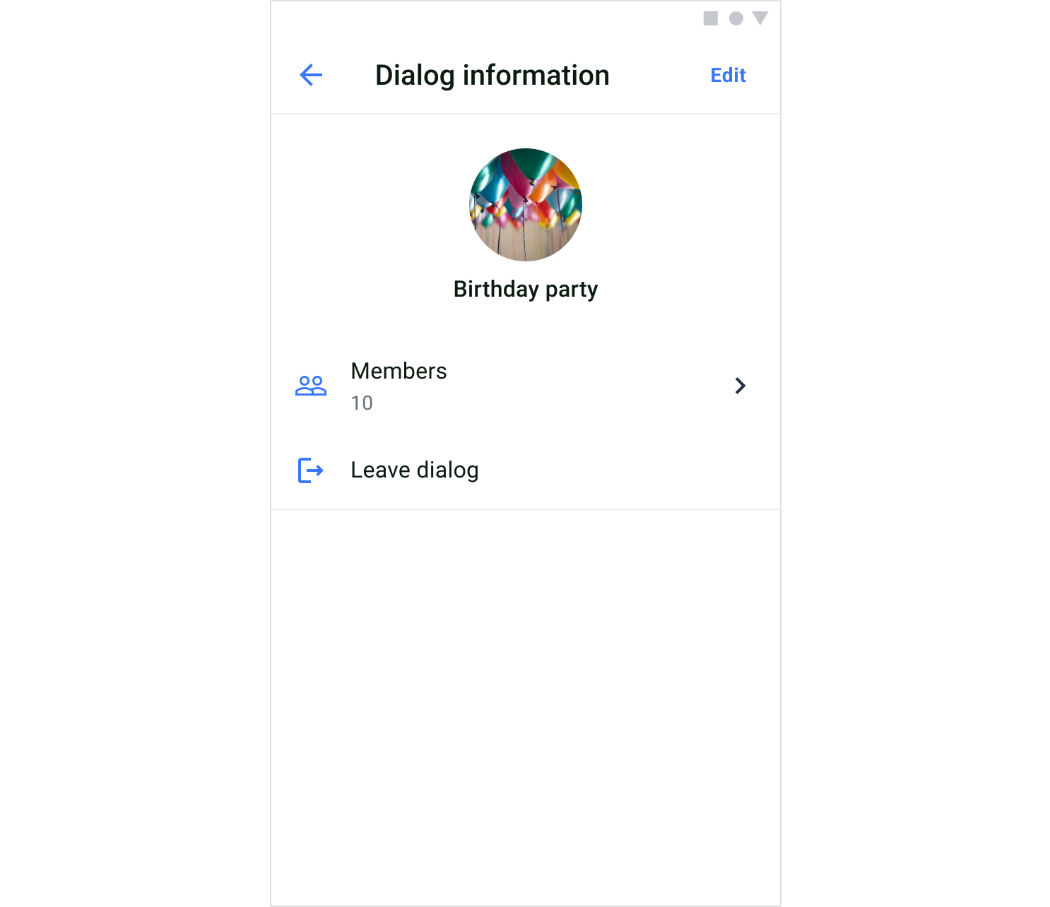
## Group chat info screen
The group chat info screen allows configuring the group dialog. If you are an owner you can customize the dialog name and dialog image, you can also leave the dialog.
 ### Screen structure
The group chat info screen consists of two components: header and dialog info.
**Header**
The header component contains a screen title. If you are a dialog owner, the header includes a default button "Edit" in the upper right corner that allows you to open the flow for updating the name and image of the dialog.
The view of the header component is created and configured in the `GroupChatInfoScreenSettings`.
**Dialog info**
The dialog info component shows the dialog image and name by default. The view of the dialog information is created and customized in the `DialogInfoComponent` of the `GroupChatInfoScreenSettings`.
### Usage
**QuickBlox UIKit for Android** provides both an **activity** and a **fragment** to create a group chat info screen. You can choose which one to build your app with, and you can solely use an **activity** or a **fragment** if you like. You can create a group chat info screen with a `GroupChatInfoActivity` which uses a `ScreenFactory` to create views.
**Start an activity**
You can start a group chat info activity by using the method `show()` of `GroupChatInfoActivity` as shown below:
```Kotlin Kotlin theme={null}
GroupChatInfoActivity.show(context, dialogId)
```
**Create a fragment**
To create a `GroupChatInfoFragment` use the `ScreenFactory`, how to create a `GroupChatInfoFragment` is shown in the example below:
```Kotlin Kotlin theme={null}
val fragment: Fragment = QuickBloxUiKit.getScreenFactory().createGroupChatInfo(dialogId)
```
### Customization
In `GroupChatInfoScreenSettings` you can customize the `GroupChatInfoFragment` to change various aspects of the screen. The `GroupChatInfoScreenSettings` class allows you to configure `GroupChatInfoFragment` components. If you want to customize the fragment beyond using the APIs provided in the `GroupChatInfoScreenSettings`, you need to inherit the `GroupChatInfoScreenSettings` and extend the functionality.
The following table shows the main classes used in the `GroupChatInfoFragment` to display and customize the group chat info screen.
| Fragment | ScreenSettings | Components | Theme |
| --------------------- | --------------------------- | ------------------------------------------ | ---------- |
| GroupChatInfoFragment | GroupChatInfoScreenSettings | HeaderWithTextComponentDialogInfoComponent | UiKitTheme |
## Private chat info screen
The private chat info screen allows configuring settings of the private dialog. You can also leave the dialog.
### Screen structure
The group chat info screen consists of two components: header and dialog info.
**Header**
The header component contains a screen title. If you are a dialog owner, the header includes a default button "Edit" in the upper right corner that allows you to open the flow for updating the name and image of the dialog.
The view of the header component is created and configured in the `GroupChatInfoScreenSettings`.
**Dialog info**
The dialog info component shows the dialog image and name by default. The view of the dialog information is created and customized in the `DialogInfoComponent` of the `GroupChatInfoScreenSettings`.
### Usage
**QuickBlox UIKit for Android** provides both an **activity** and a **fragment** to create a group chat info screen. You can choose which one to build your app with, and you can solely use an **activity** or a **fragment** if you like. You can create a group chat info screen with a `GroupChatInfoActivity` which uses a `ScreenFactory` to create views.
**Start an activity**
You can start a group chat info activity by using the method `show()` of `GroupChatInfoActivity` as shown below:
```Kotlin Kotlin theme={null}
GroupChatInfoActivity.show(context, dialogId)
```
**Create a fragment**
To create a `GroupChatInfoFragment` use the `ScreenFactory`, how to create a `GroupChatInfoFragment` is shown in the example below:
```Kotlin Kotlin theme={null}
val fragment: Fragment = QuickBloxUiKit.getScreenFactory().createGroupChatInfo(dialogId)
```
### Customization
In `GroupChatInfoScreenSettings` you can customize the `GroupChatInfoFragment` to change various aspects of the screen. The `GroupChatInfoScreenSettings` class allows you to configure `GroupChatInfoFragment` components. If you want to customize the fragment beyond using the APIs provided in the `GroupChatInfoScreenSettings`, you need to inherit the `GroupChatInfoScreenSettings` and extend the functionality.
The following table shows the main classes used in the `GroupChatInfoFragment` to display and customize the group chat info screen.
| Fragment | ScreenSettings | Components | Theme |
| --------------------- | --------------------------- | ------------------------------------------ | ---------- |
| GroupChatInfoFragment | GroupChatInfoScreenSettings | HeaderWithTextComponentDialogInfoComponent | UiKitTheme |
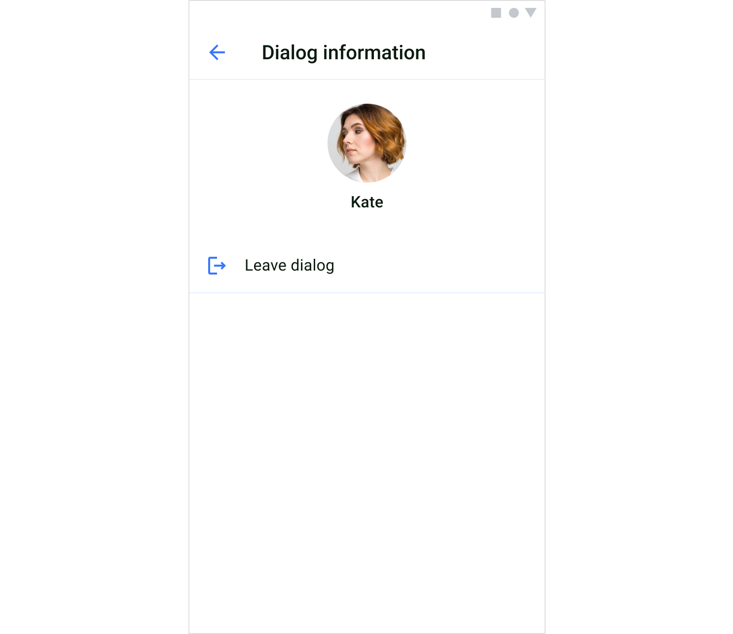
## Private chat info screen
The private chat info screen allows configuring settings of the private dialog. You can also leave the dialog.
 ### Screen structure
The private chat info screen consists of two components: header and dialog info.
**Header**
The header component contains a screen title.
The view of the header component is created and configured in the `PrivateChatInfoScreenSettings`.
**Dialog info**
The dialog info component shows the dialog image and name by default. The view of the dialog information is created and customized in the `DialogInfoComponent` of the `PrivateChatInfoScreenSettings`.
### Usage
**QuickBlox UIKit for Android** provides both an **activity** and a **fragment** to create a private chat info screen. You can choose which one to build your app with, and you can solely use an **activity** or a **fragment** if you like. You can create a private chat info screen with a `PrivateChatInfoActivity` which uses a `ScreenFactory` to create views.
**Start an activity**
You can start a private chat info activity by using the method `show()` of `PrivateChatInfoActivity` as shown below:
```Kotlin Kotlin theme={null}
PrivateChatInfoActivity.show(context, dialogId)
```
**Create a fragment**
To create a `PrivateChatInfoFragment` use the `ScreenFactory`, how to create a `PrivateChatInfoFragment` is shown in the example below:
```Kotlin Kotlin theme={null}
val fragment: Fragment = QuickBloxUiKit.getScreenFactory().createPrivateChatInfo(dialogId)
```
### Customization
In `PrivateChatInfoScreenSettings` you can customize the `PrivateChatInfoFragment` to change various aspects of the screen. The `PrivateChatInfoScreenSettings` class allows you to configure `PrivateChatInfoFragment` components. If you want to customize the fragment beyond using the APIs provided in the `PrivateChatInfoScreenSettings`, you need to inherit the `PrivateChatInfoScreenSettings` and extend the functionality.
The following table shows the main classes used in the `PrivateChatInfoFragment` to display and customize the private chat info screen.
| Fragment | ScreenSettings | Components | Theme |
| ----------------------- | ----------------------------- | ------------------------------------------ | ---------- |
| PrivateChatInfoFragment | PrivateChatInfoScreenSettings | HeaderWithTextComponentDialogInfoComponent | UiKitTheme |
## Members screen
A members screen is a complete list of users that are members of a group dialog. The dialog member list is created through the`MembersActivity` or `MembersFragment`.
### Screen structure
The private chat info screen consists of two components: header and dialog info.
**Header**
The header component contains a screen title.
The view of the header component is created and configured in the `PrivateChatInfoScreenSettings`.
**Dialog info**
The dialog info component shows the dialog image and name by default. The view of the dialog information is created and customized in the `DialogInfoComponent` of the `PrivateChatInfoScreenSettings`.
### Usage
**QuickBlox UIKit for Android** provides both an **activity** and a **fragment** to create a private chat info screen. You can choose which one to build your app with, and you can solely use an **activity** or a **fragment** if you like. You can create a private chat info screen with a `PrivateChatInfoActivity` which uses a `ScreenFactory` to create views.
**Start an activity**
You can start a private chat info activity by using the method `show()` of `PrivateChatInfoActivity` as shown below:
```Kotlin Kotlin theme={null}
PrivateChatInfoActivity.show(context, dialogId)
```
**Create a fragment**
To create a `PrivateChatInfoFragment` use the `ScreenFactory`, how to create a `PrivateChatInfoFragment` is shown in the example below:
```Kotlin Kotlin theme={null}
val fragment: Fragment = QuickBloxUiKit.getScreenFactory().createPrivateChatInfo(dialogId)
```
### Customization
In `PrivateChatInfoScreenSettings` you can customize the `PrivateChatInfoFragment` to change various aspects of the screen. The `PrivateChatInfoScreenSettings` class allows you to configure `PrivateChatInfoFragment` components. If you want to customize the fragment beyond using the APIs provided in the `PrivateChatInfoScreenSettings`, you need to inherit the `PrivateChatInfoScreenSettings` and extend the functionality.
The following table shows the main classes used in the `PrivateChatInfoFragment` to display and customize the private chat info screen.
| Fragment | ScreenSettings | Components | Theme |
| ----------------------- | ----------------------------- | ------------------------------------------ | ---------- |
| PrivateChatInfoFragment | PrivateChatInfoScreenSettings | HeaderWithTextComponentDialogInfoComponent | UiKitTheme |
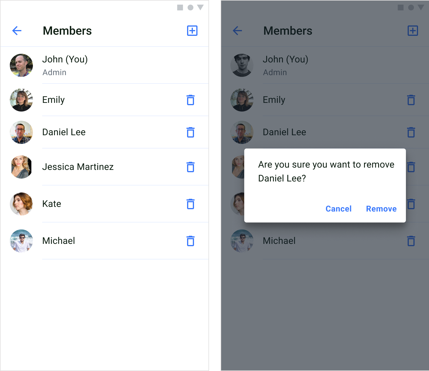
## Members screen
A members screen is a complete list of users that are members of a group dialog. The dialog member list is created through the`MembersActivity` or `MembersFragment`.
 ### Screen structure
The members screen consists of two components: header and users.
**Header**
The header component contains a screen title and a default button in the upper right corner that allows you to open add members screen.
The view of the header component is created and configured in the `MembersScreenSettings`.
**Users**
The users component shows a list of members of a group dialog. To create the view for each user list item, you need to use the`MembersAdapter` and bind user data to the view.
### Usage
**QuickBlox UIKit for Android** provides both an **activity** and a **fragment** to create a members screen. You can choose which one to build your app with, and you can solely use an **activity** or a **fragment** if you like. You can create a members screen with a `MembersActivity` which uses a `ScreenFactory` to create views.
**Start an activity**
You can start a members activity by using the method `show()` of `MembersActivity` as shown below:
```Kotlin Kotlin theme={null}
MembersActivity.show(context, dialogId)
```
**Create a fragment**
To create a `MembersFragment` use the `ScreenFactory`, how to create a `MembersFragment` is shown in the example below:
```Kotlin Kotlin theme={null}
val fragment: Fragment = QuickBloxUiKit.getScreenFactory().createMembers(dialogId)
```
### Customization
In `MembersScreenSettings` you can customize the `MembersFragment` to change various aspects of the screen. The `MembersScreenSettings` class allows you to configure `MembersFragment` components. If you want to customize the fragment beyond using the APIs provided in the `MembersScreenSettings`, you need to inherit the `MembersScreenSettings` and extend the functionality.
The following table shows the main classes used in the `MembersFragment` to display and customize the members screen.
| Fragment | ScreenSettings | Components | Theme | RecyclerView |
| --------------- | --------------------- | ------------------------------------- | ---------- | -------------- |
| MembersFragment | MembersScreenSettings | HeaderWithIconComponentUsersComponent | UiKitTheme | MembersAdapter |
## Add members screen
The add members screen allows adding new members to a group dialog via the `AddMembersActivity` or `AddMembersFragment`. All users are listed through the pagination, and members who already belong to the dialog are not shown.
### Screen structure
The members screen consists of two components: header and users.
**Header**
The header component contains a screen title and a default button in the upper right corner that allows you to open add members screen.
The view of the header component is created and configured in the `MembersScreenSettings`.
**Users**
The users component shows a list of members of a group dialog. To create the view for each user list item, you need to use the`MembersAdapter` and bind user data to the view.
### Usage
**QuickBlox UIKit for Android** provides both an **activity** and a **fragment** to create a members screen. You can choose which one to build your app with, and you can solely use an **activity** or a **fragment** if you like. You can create a members screen with a `MembersActivity` which uses a `ScreenFactory` to create views.
**Start an activity**
You can start a members activity by using the method `show()` of `MembersActivity` as shown below:
```Kotlin Kotlin theme={null}
MembersActivity.show(context, dialogId)
```
**Create a fragment**
To create a `MembersFragment` use the `ScreenFactory`, how to create a `MembersFragment` is shown in the example below:
```Kotlin Kotlin theme={null}
val fragment: Fragment = QuickBloxUiKit.getScreenFactory().createMembers(dialogId)
```
### Customization
In `MembersScreenSettings` you can customize the `MembersFragment` to change various aspects of the screen. The `MembersScreenSettings` class allows you to configure `MembersFragment` components. If you want to customize the fragment beyond using the APIs provided in the `MembersScreenSettings`, you need to inherit the `MembersScreenSettings` and extend the functionality.
The following table shows the main classes used in the `MembersFragment` to display and customize the members screen.
| Fragment | ScreenSettings | Components | Theme | RecyclerView |
| --------------- | --------------------- | ------------------------------------- | ---------- | -------------- |
| MembersFragment | MembersScreenSettings | HeaderWithIconComponentUsersComponent | UiKitTheme | MembersAdapter |
## Add members screen
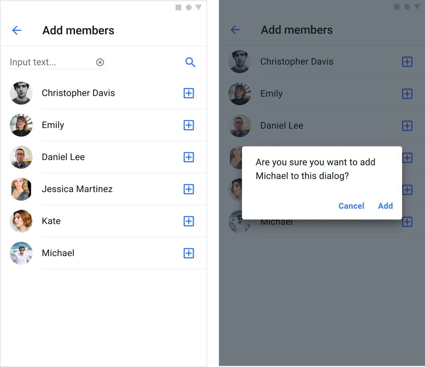
The add members screen allows adding new members to a group dialog via the `AddMembersActivity` or `AddMembersFragment`. All users are listed through the pagination, and members who already belong to the dialog are not shown.
 ### Screen structure
The add members screen consists of two components: header and users
**Header**
The header component contains a screen title.
The view of the header component is created and configured in the `AddMembersScreenSettings`.
**Users**
The users component shows a list of users that can be added to a group dialog. To create the view for each user list item, you need to use the`AddMembersAdapter` and bind user data to the view.
### Usage
**QuickBlox UIKit for Android** provides both an **activity** and a **fragment** to create a add members screen. You can choose which one to build your app with, and you can solely use an **activity** or a **fragment** if you like. You can create a add members screen with a `AddMembersActivity` which uses a `ScreenFactory` to create views.
**Start an activity**
You can start a add members activity by using the method `show()` of `AddMembersActivity` as shown below:
```Kotlin Kotlin theme={null}
AddMembersActivity.show(context, dialogId)
```
**Create a fragment**
To create a `AddMembersFragment` use the `ScreenFactory`, how to create a `AddMembersFragment` is shown in the example below:
```Kotlin Kotlin theme={null}
val fragment: Fragment = QuickBloxUiKit.getScreenFactory().createAddMembers(dialogId)
```
### Customization
In `AddMembersScreenSettings` you can customize the `AddMembersFragment` to change various aspects of the screen. The `AddMembersScreenSettings` class allows you to configure `AddMembersFragment` components. If you want to customize the fragment beyond using the APIs provided in the `AddMembersScreenSettings`, you need to inherit the `AddMembersScreenSettings` and extend the functionality.
The following table shows the main classes used in the `AddMembersFragment` to display and customize the add members screen.
| Fragment | ScreenSettings | Components | Theme | RecyclerView |
| ------------------ | ------------------------ | ------------------------------------- | ---------- | ----------------- |
| AddMembersFragment | AddMembersScreenSettings | HeaderWithIconComponentUsersComponent | UiKitTheme | AddMembersAdapter |
### Screen structure
The add members screen consists of two components: header and users
**Header**
The header component contains a screen title.
The view of the header component is created and configured in the `AddMembersScreenSettings`.
**Users**
The users component shows a list of users that can be added to a group dialog. To create the view for each user list item, you need to use the`AddMembersAdapter` and bind user data to the view.
### Usage
**QuickBlox UIKit for Android** provides both an **activity** and a **fragment** to create a add members screen. You can choose which one to build your app with, and you can solely use an **activity** or a **fragment** if you like. You can create a add members screen with a `AddMembersActivity` which uses a `ScreenFactory` to create views.
**Start an activity**
You can start a add members activity by using the method `show()` of `AddMembersActivity` as shown below:
```Kotlin Kotlin theme={null}
AddMembersActivity.show(context, dialogId)
```
**Create a fragment**
To create a `AddMembersFragment` use the `ScreenFactory`, how to create a `AddMembersFragment` is shown in the example below:
```Kotlin Kotlin theme={null}
val fragment: Fragment = QuickBloxUiKit.getScreenFactory().createAddMembers(dialogId)
```
### Customization
In `AddMembersScreenSettings` you can customize the `AddMembersFragment` to change various aspects of the screen. The `AddMembersScreenSettings` class allows you to configure `AddMembersFragment` components. If you want to customize the fragment beyond using the APIs provided in the `AddMembersScreenSettings`, you need to inherit the `AddMembersScreenSettings` and extend the functionality.
The following table shows the main classes used in the `AddMembersFragment` to display and customize the add members screen.
| Fragment | ScreenSettings | Components | Theme | RecyclerView |
| ------------------ | ------------------------ | ------------------------------------- | ---------- | ----------------- |
| AddMembersFragment | AddMembersScreenSettings | HeaderWithIconComponentUsersComponent | UiKitTheme | AddMembersAdapter |