> ## Documentation Index
> Fetch the complete documentation index at: https://docs.quickblox.com/llms.txt
> Use this file to discover all available pages before exploring further.
# Customization
The QuickBlox UIKit for React allows you to create your own unique view of the UIKit.
## Default themes
The QuickBlox UIKit for React has 2 built in themes: Dark and Light.
## Color Theme
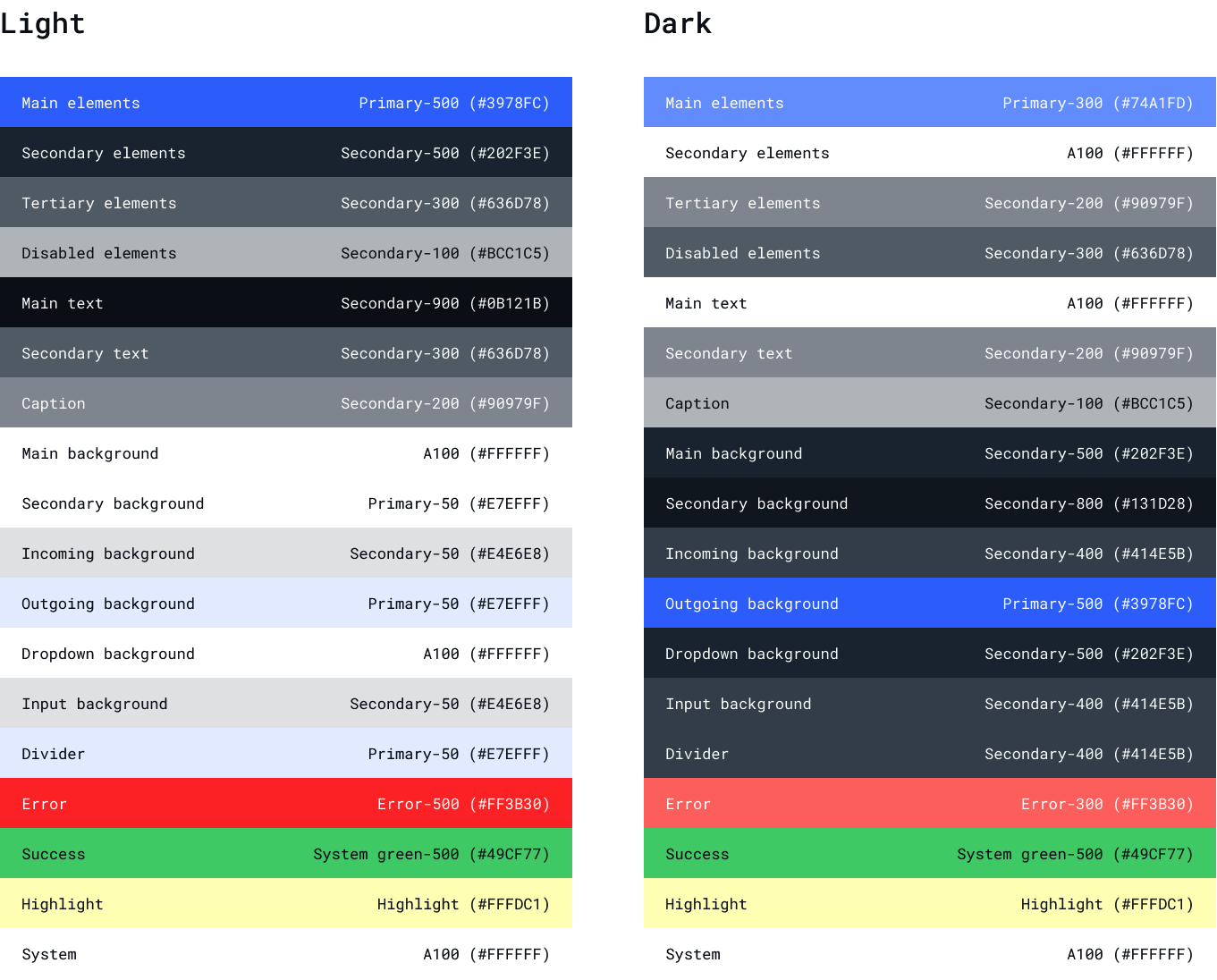 Default theme for UIKit is Light.
To set theme you need to set value 'dark' to key data-theme in global styles (html\[data-theme="dark”]).
For example, you can use pure JavaScript:
```JavaScript JavaScript theme={null}
document.documentElement.setAttribute('data-theme', 'dark');
```
## Use your own theme
There are two options how you can create your own theme:
* Customize current theme using css
* Create your own theme to customize selected components
To customize the current theme you just need to set the new colors in css variables.
Or you can create your own theme. To do this you need to create a new class that implements the UiKitTheme interface.
To use your own theme using css you need to create \_theme\_colors\_scheme.scss and set colors
```SCSS SCSS theme={null}
$background-overlay-light: rgba(19, 29, 40, .80);
$background-overlay-dark: rgba(144, 151, 159, .80);
$primary-50: #E7EFFF;
$primary-100: #C4D7FE;
$primary-200: #9CBCFE;
$primary-300: #74A1FD;
$primary-400: #578CFC;
$primary-500: #3978FC;
$primary-600: #3370FC;
$primary-700: #2C65FB;
$primary-800: #245BFB;
$primary-900: #1748FA;
$primary-a-100: #FFFFFF;
$primary-a-200: #F7F9FF;
$primary-a-400: #C4CFFF;
$primary-a-700: #ABBAFF;
$secondary-50: #E4E6E8;
$secondary-100: #BCC1C5;
$secondary-200: #90979F;
$secondary-300: #636D78;
$secondary-400: #414E5B;
$secondary-500: #202F3E;
$secondary-600: #1C2A38;
$secondary-700: #182330;
$secondary-800: #131D28;
$secondary-900: #0B121B;
$secondary-a-100: #74A1FD;
$secondary-a-200: #3978FC;
$secondary-a-400: #245BFB;
$secondary-a-700: #0050DC;
$system-green-100: #C8F1D6;
$system-green-200: #A4E7BB;
$system-green-300: #80DDA0;
$system-green-400: #64D68B;
$system-green-500: #49CF77;
$error-100: #FFC4C1;
$error-200: #FF9D98;
$error-300: #FF766E;
$error-400: #FF584F;
$error-500: #FF3B30;
$information: #FDB0FF;
$highlight: #FFFDC1;
```
To use your own new theme colors create \_theme\_dark.scss and \_theme\_light.scss files and set color variable.
```SCSS SCSS theme={null}
// _theme_dark.scss:
html[data-theme="dark"]{
--color-background-info: #{$primary-500};
--tertiary-elements: #{$background-overlay-dark};
--main-elements: #{$primary-300};
--secondary-elements: #{$primary-a-100};
--input-elements: #{$secondary-200};
--disabled-elements: #{$secondary-300};
--field-border: #{$secondary-200};
--main-text: #{$primary-a-100};
--secondary-text: #{$secondary-200};
--caption: #{$secondary-100};
--main-background: #{$secondary-500};
--secondary-background: #{$secondary-800};
--incoming-background: #{$secondary-400};
--outgoing-background: #{$primary-500};
--dropdown-background: #{$secondary-400};
--chat-input: #{$secondary-800};
--divider: #{$secondary-400};
--error: #{$error-300};
--hightlight: #{$highlight};
}
// _theme_light.scss:
:root{
--color-background-info:#{$primary-100};
--tertiary-elements: #{$secondary-300};
--main-elements: #{$primary-500};
--secondary-elements: #{$secondary-500};
--input-elements: #{$secondary-500};
--disabled-elements: #{$secondary-100};
--field-border: #{$secondary-200};
--main-text: #{$secondary-900};
--secondary-text: #{$secondary-300};
--caption: #{$secondary-200};
--main-background: #{$primary-a-100};
--secondary-background: #{$primary-a-100};
--secondary-background-modal: #{$background-overlay-light};
--incoming-background: #{$secondary-50};
--outgoing-background: #{$primary-50};
--dropdown-background: #{$primary-a-100};
--chat-input: #{$primary-a-200};
--divider: #{$primary-50};
--error: #{$error-500};
--hightlight: #{$highlight};
}
```
To create your own theme to customize selected components you need to create a new class that implements the UiKitTheme interface.
```TypeScript TypeScript theme={null}
//DefaultTheme implements UiKitTheme
export default class CustomTheme extends DefaultTheme {
divider = (): string => 'var(--divider)';
mainText = (): string => '#FFFFFF';
fontFamily = (): string => 'Roboto';
/*
The DefaultTheme contains other theme methods :
caption = (): string => 'var(--caption)';
chatInput = (): string => 'var(--chat-input)';
disabledElements = (): string => 'var(--disabled-elements)';
dropdownBackground = (): string => 'var(--dropdown-background)';
error = (): string => 'var(--error)';
fieldBorder = (): string => 'var(--field-border)';
hightlight = (): string => 'var(--hightlight)';
incomingBackground = (): string => 'var(--incoming-background)';
inputElements = (): string => 'var(--input-elements)';
mainBackground = (): string => 'var(--main-background)';
mainElements = (): string => 'var(--main-elements)';
outgoingBackground = (): string => 'var(--outgoing-background)';
secondaryBackground = (): string => 'var(--secondary-background)';
secondaryElements = (): string => 'var(--secondary-elements)';
secondaryText = (): string => 'var(--secondary-text)';
*/
}
```
and specify selected components:
* desktop layout container
```TypeScript TypeScript theme={null}
```
* header of dialogs
```TypeScript TypeScript theme={null}
```
* item of dialogs
```TypeScript TypeScript theme={null}
```
More information about how to implement your own theme you can find in our samples.
Quick start using our React UIKit look [React UIKit Sample](https://github.com/QuickBlox/quickblox-javascript-sdk/tree/gh-pages/samples/react-chat).
This sample implements authorization functionality and provides an example of color theme customization. The sample code is available by this [link](https://github.com/QuickBlox/quickblox-javascript-sdk/tree/gh-pages/samples/react-chat). How to set up and run a sample, See blog [How to create a React Chat Application in just a Few Steps](https://quickblox.com/blog/how-to-create-a-react-chat-application-with-quickblox-uikit/).
Default theme for UIKit is Light.
To set theme you need to set value 'dark' to key data-theme in global styles (html\[data-theme="dark”]).
For example, you can use pure JavaScript:
```JavaScript JavaScript theme={null}
document.documentElement.setAttribute('data-theme', 'dark');
```
## Use your own theme
There are two options how you can create your own theme:
* Customize current theme using css
* Create your own theme to customize selected components
To customize the current theme you just need to set the new colors in css variables.
Or you can create your own theme. To do this you need to create a new class that implements the UiKitTheme interface.
To use your own theme using css you need to create \_theme\_colors\_scheme.scss and set colors
```SCSS SCSS theme={null}
$background-overlay-light: rgba(19, 29, 40, .80);
$background-overlay-dark: rgba(144, 151, 159, .80);
$primary-50: #E7EFFF;
$primary-100: #C4D7FE;
$primary-200: #9CBCFE;
$primary-300: #74A1FD;
$primary-400: #578CFC;
$primary-500: #3978FC;
$primary-600: #3370FC;
$primary-700: #2C65FB;
$primary-800: #245BFB;
$primary-900: #1748FA;
$primary-a-100: #FFFFFF;
$primary-a-200: #F7F9FF;
$primary-a-400: #C4CFFF;
$primary-a-700: #ABBAFF;
$secondary-50: #E4E6E8;
$secondary-100: #BCC1C5;
$secondary-200: #90979F;
$secondary-300: #636D78;
$secondary-400: #414E5B;
$secondary-500: #202F3E;
$secondary-600: #1C2A38;
$secondary-700: #182330;
$secondary-800: #131D28;
$secondary-900: #0B121B;
$secondary-a-100: #74A1FD;
$secondary-a-200: #3978FC;
$secondary-a-400: #245BFB;
$secondary-a-700: #0050DC;
$system-green-100: #C8F1D6;
$system-green-200: #A4E7BB;
$system-green-300: #80DDA0;
$system-green-400: #64D68B;
$system-green-500: #49CF77;
$error-100: #FFC4C1;
$error-200: #FF9D98;
$error-300: #FF766E;
$error-400: #FF584F;
$error-500: #FF3B30;
$information: #FDB0FF;
$highlight: #FFFDC1;
```
To use your own new theme colors create \_theme\_dark.scss and \_theme\_light.scss files and set color variable.
```SCSS SCSS theme={null}
// _theme_dark.scss:
html[data-theme="dark"]{
--color-background-info: #{$primary-500};
--tertiary-elements: #{$background-overlay-dark};
--main-elements: #{$primary-300};
--secondary-elements: #{$primary-a-100};
--input-elements: #{$secondary-200};
--disabled-elements: #{$secondary-300};
--field-border: #{$secondary-200};
--main-text: #{$primary-a-100};
--secondary-text: #{$secondary-200};
--caption: #{$secondary-100};
--main-background: #{$secondary-500};
--secondary-background: #{$secondary-800};
--incoming-background: #{$secondary-400};
--outgoing-background: #{$primary-500};
--dropdown-background: #{$secondary-400};
--chat-input: #{$secondary-800};
--divider: #{$secondary-400};
--error: #{$error-300};
--hightlight: #{$highlight};
}
// _theme_light.scss:
:root{
--color-background-info:#{$primary-100};
--tertiary-elements: #{$secondary-300};
--main-elements: #{$primary-500};
--secondary-elements: #{$secondary-500};
--input-elements: #{$secondary-500};
--disabled-elements: #{$secondary-100};
--field-border: #{$secondary-200};
--main-text: #{$secondary-900};
--secondary-text: #{$secondary-300};
--caption: #{$secondary-200};
--main-background: #{$primary-a-100};
--secondary-background: #{$primary-a-100};
--secondary-background-modal: #{$background-overlay-light};
--incoming-background: #{$secondary-50};
--outgoing-background: #{$primary-50};
--dropdown-background: #{$primary-a-100};
--chat-input: #{$primary-a-200};
--divider: #{$primary-50};
--error: #{$error-500};
--hightlight: #{$highlight};
}
```
To create your own theme to customize selected components you need to create a new class that implements the UiKitTheme interface.
```TypeScript TypeScript theme={null}
//DefaultTheme implements UiKitTheme
export default class CustomTheme extends DefaultTheme {
divider = (): string => 'var(--divider)';
mainText = (): string => '#FFFFFF';
fontFamily = (): string => 'Roboto';
/*
The DefaultTheme contains other theme methods :
caption = (): string => 'var(--caption)';
chatInput = (): string => 'var(--chat-input)';
disabledElements = (): string => 'var(--disabled-elements)';
dropdownBackground = (): string => 'var(--dropdown-background)';
error = (): string => 'var(--error)';
fieldBorder = (): string => 'var(--field-border)';
hightlight = (): string => 'var(--hightlight)';
incomingBackground = (): string => 'var(--incoming-background)';
inputElements = (): string => 'var(--input-elements)';
mainBackground = (): string => 'var(--main-background)';
mainElements = (): string => 'var(--main-elements)';
outgoingBackground = (): string => 'var(--outgoing-background)';
secondaryBackground = (): string => 'var(--secondary-background)';
secondaryElements = (): string => 'var(--secondary-elements)';
secondaryText = (): string => 'var(--secondary-text)';
*/
}
```
and specify selected components:
* desktop layout container
```TypeScript TypeScript theme={null}
```
* header of dialogs
```TypeScript TypeScript theme={null}
```
* item of dialogs
```TypeScript TypeScript theme={null}
```
More information about how to implement your own theme you can find in our samples.
Quick start using our React UIKit look [React UIKit Sample](https://github.com/QuickBlox/quickblox-javascript-sdk/tree/gh-pages/samples/react-chat).
This sample implements authorization functionality and provides an example of color theme customization. The sample code is available by this [link](https://github.com/QuickBlox/quickblox-javascript-sdk/tree/gh-pages/samples/react-chat). How to set up and run a sample, See blog [How to create a React Chat Application in just a Few Steps](https://quickblox.com/blog/how-to-create-a-react-chat-application-with-quickblox-uikit/).