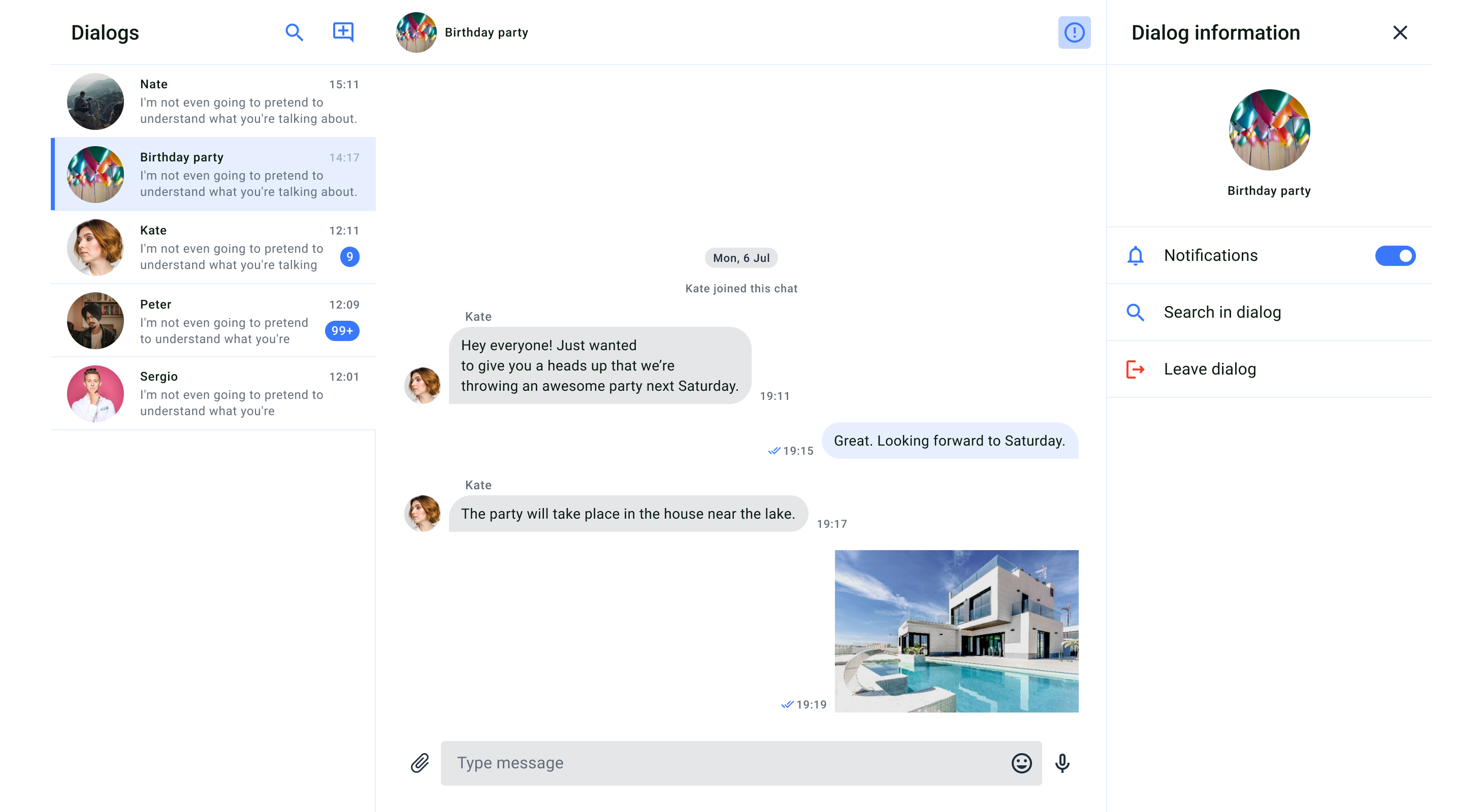
 The QuickBlox React Chat UIKit screen is divided into three main screen modules:
* Dialogs List
* Message History for each dialog
* Dialog Information
Refer to the table below to see the screen modules we provide and the components that each screen module consists of.
The QuickBlox React Chat UIKit screen is divided into three main screen modules:
* Dialogs List
* Message History for each dialog
* Dialog Information
Refer to the table below to see the screen modules we provide and the components that each screen module consists of.
 ### Screen structure
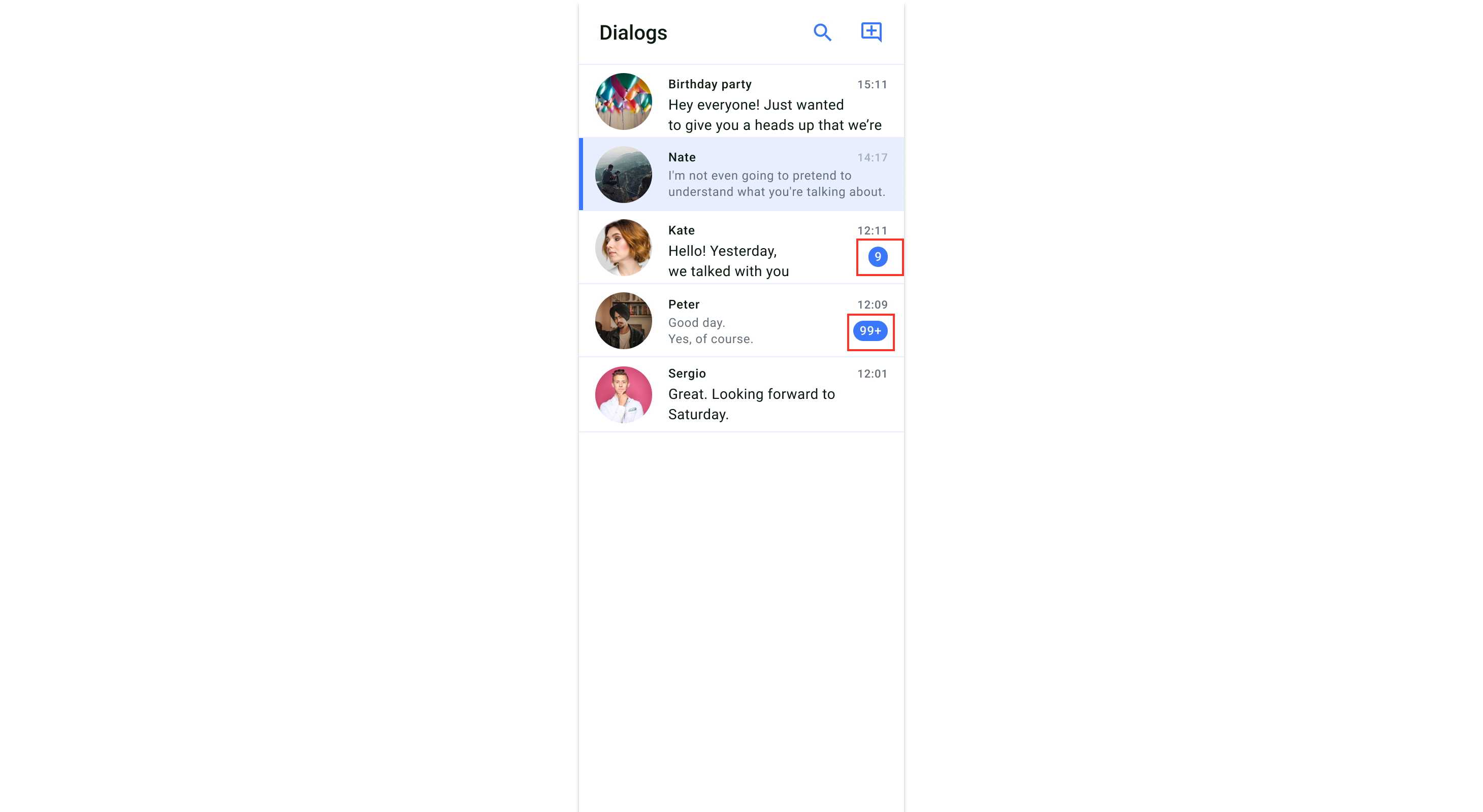
The screen with the list of dialogs is made up of two components: the header and the dialogs section.
**Header**
### Screen structure
The screen with the list of dialogs is made up of two components: the header and the dialogs section.
**Header**
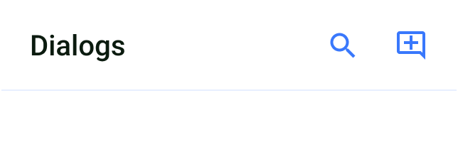 The header component includes the title for the dialog list and default buttons in the top right corner, which allow you to create dialogs and filter them. The view of the header component is created and configured in the `HeaderDialogsProps`.
**Dialog list**
The header component includes the title for the dialog list and default buttons in the top right corner, which allow you to create dialogs and filter them. The view of the header component is created and configured in the `HeaderDialogsProps`.
**Dialog list**
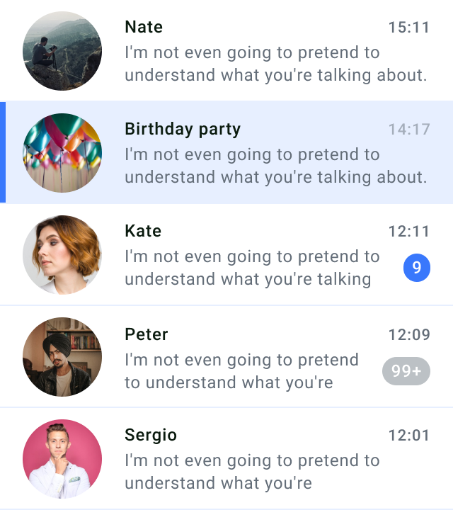 The dialogs component displays a list of all private and group dialogs that the current user is part of. The list of dialogs is generated in the **Dialogs** component based on data from the **ViewModel**. To create the view for each dialog list item, you need to use `PreviewDialog`. When the current user clicks on one of the dialog windows in the list, they will be able to enter the chat screen.
### Features
* Display a list of dialogs: The Dialog List component presents a visually appealing list of dialogs in the application.
The dialogs component displays a list of all private and group dialogs that the current user is part of. The list of dialogs is generated in the **Dialogs** component based on data from the **ViewModel**. To create the view for each dialog list item, you need to use `PreviewDialog`. When the current user clicks on one of the dialog windows in the list, they will be able to enter the chat screen.
### Features
* Display a list of dialogs: The Dialog List component presents a visually appealing list of dialogs in the application.
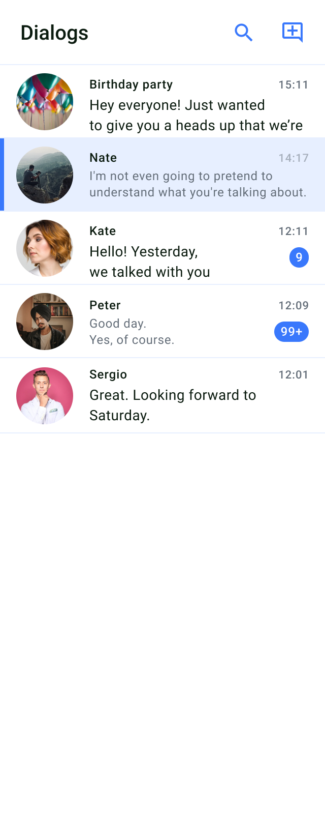 * Select and view dialog details: Users can select a dialog from the list to view more details about the selected dialog.
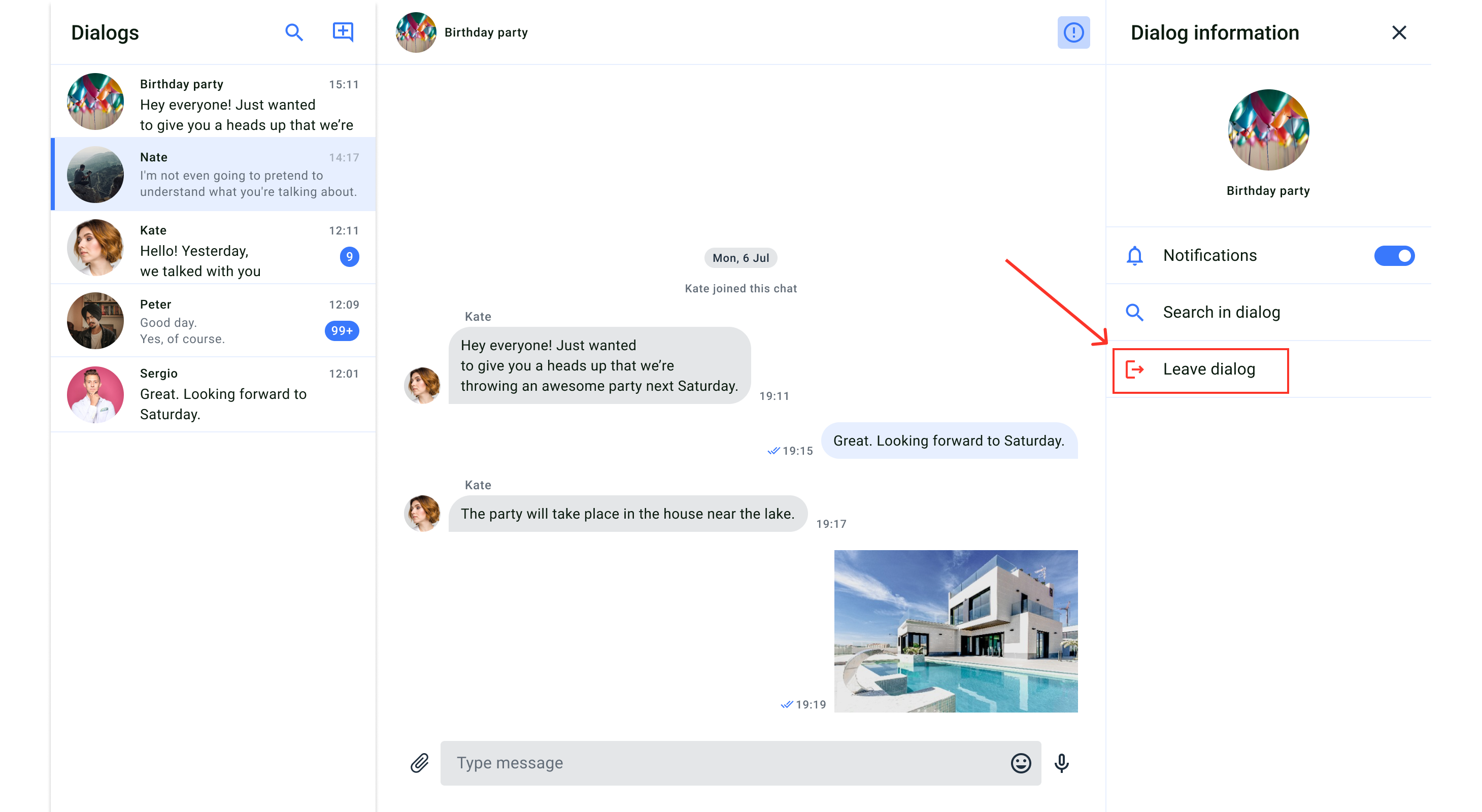
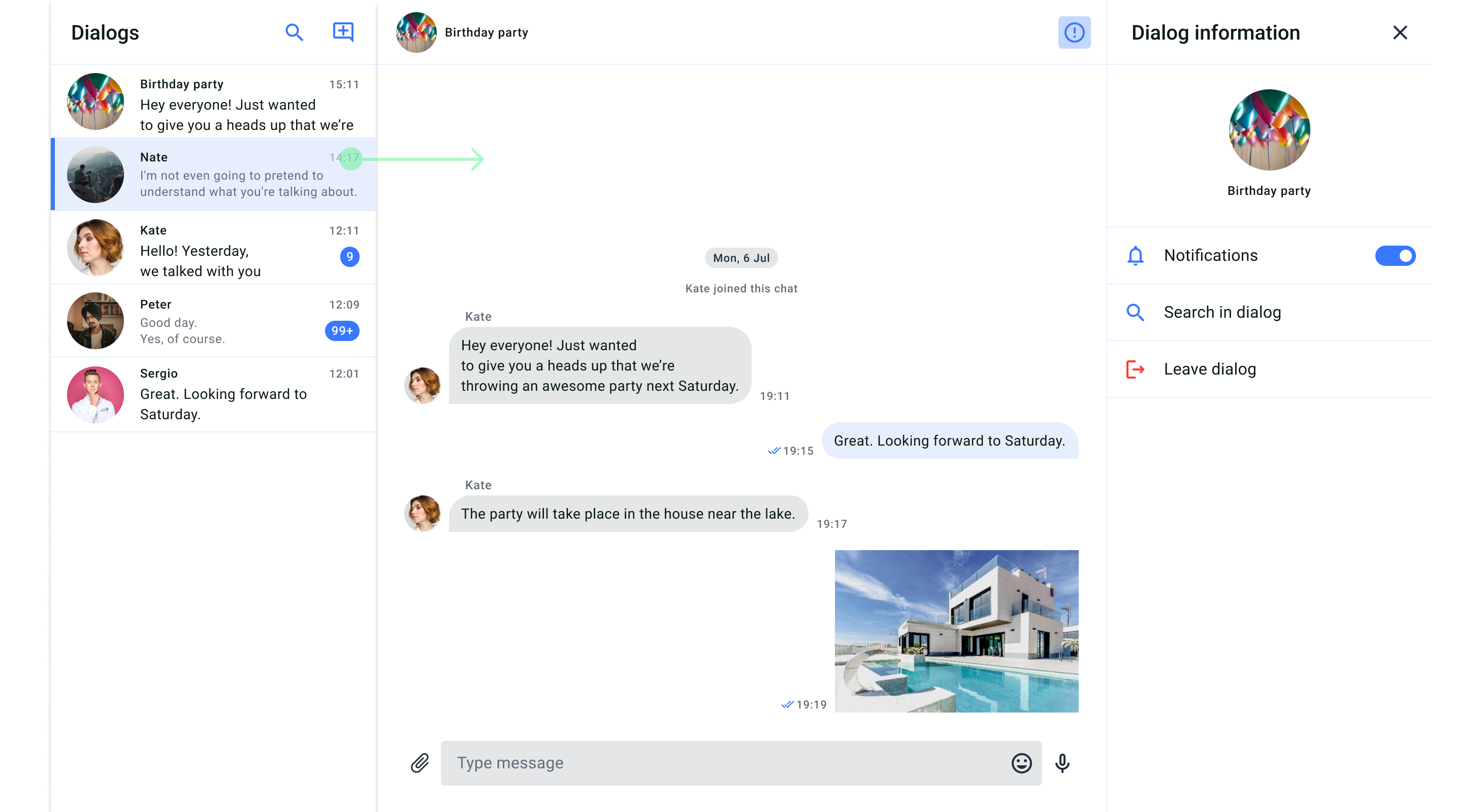 * Delete dialogs: The feature allows users to delete dialogs from the list, removing them from their conversation history.
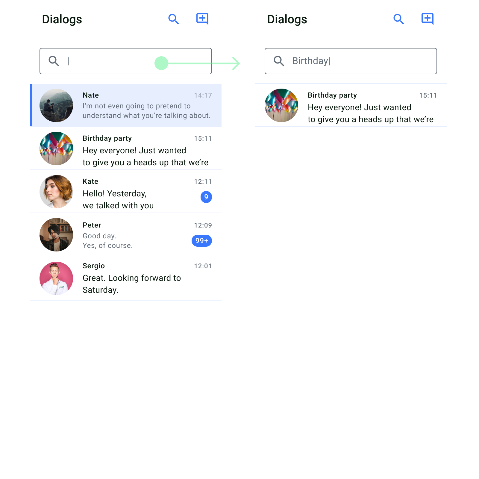
 * Search functionality: Users can search for specific dialogs using the provided search bar.
 * Sync state indication: The sync state is provided to indicate whether the dialog list is currently syncing data with the server.
 ### Usage
## Create New Dialog Screen
The dialog list screen shows the complete list of group and private dialogs of which the current user is a member. After following the steps described in the [Get started](/ui-kits/android-uikit-send-your-first-message#get-started) section, you can display and manage the list of dialogs.
### Usage
## Create New Dialog Screen
The dialog list screen shows the complete list of group and private dialogs of which the current user is a member. After following the steps described in the [Get started](/ui-kits/android-uikit-send-your-first-message#get-started) section, you can display and manage the list of dialogs.
 ### Customization
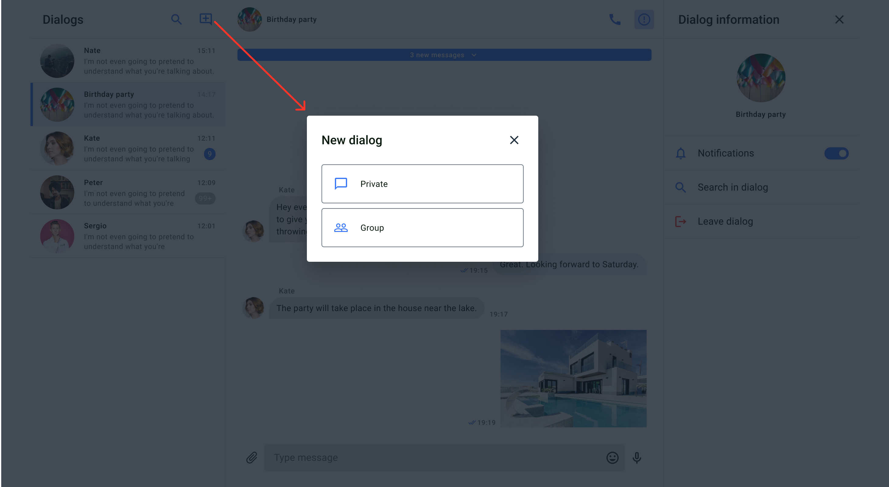
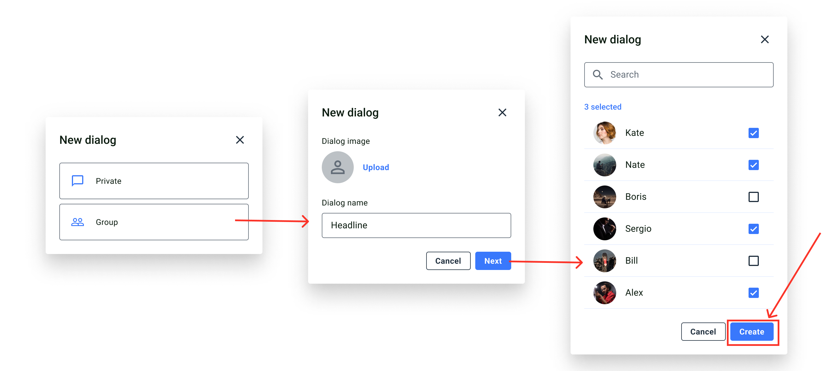
You can customize the "New dialog" pop-up window in the CreateDialog.scss file to modify various aspects of the screen. The UserList.scss file with classes allows you to customize the main list components.
## User list screen
The user list screen displays available users that can be selected to create a group or private dialog.
### Customization
You can customize the "New dialog" pop-up window in the CreateDialog.scss file to modify various aspects of the screen. The UserList.scss file with classes allows you to customize the main list components.
## User list screen
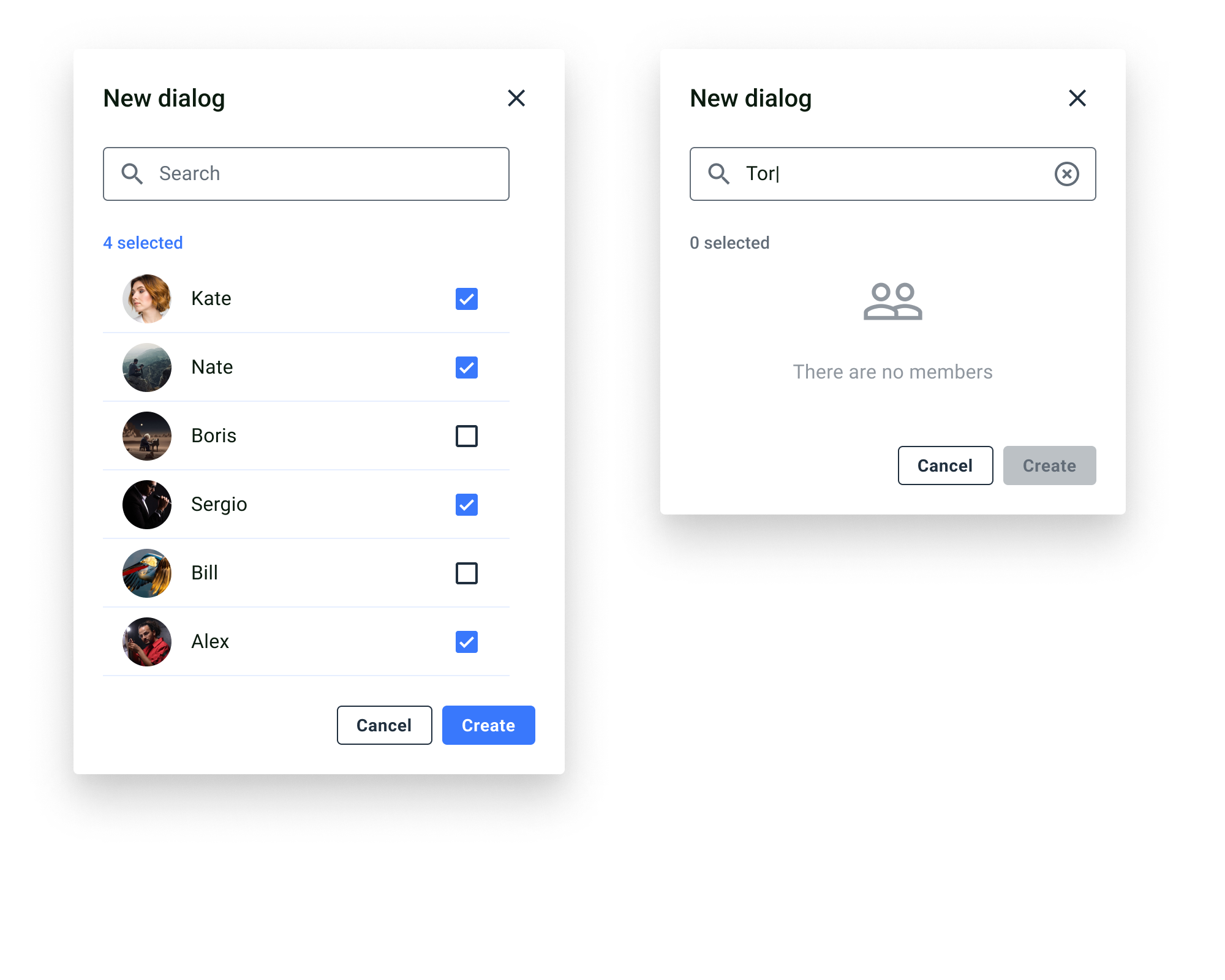
The user list screen displays available users that can be selected to create a group or private dialog.
 ## Group and private chats screen
A group chat screen allows close interactions between a limited number of users. To join the dialog, one of the members needs to add you to the dialog. A private chat screen allows close interaction between two users. To participate in this type of dialog, you can create a dialog with your opponent or your opponent can create a dialog with you.
## Group and private chats screen
A group chat screen allows close interactions between a limited number of users. To join the dialog, one of the members needs to add you to the dialog. A private chat screen allows close interaction between two users. To participate in this type of dialog, you can create a dialog with your opponent or your opponent can create a dialog with you.
 ### Screen structure
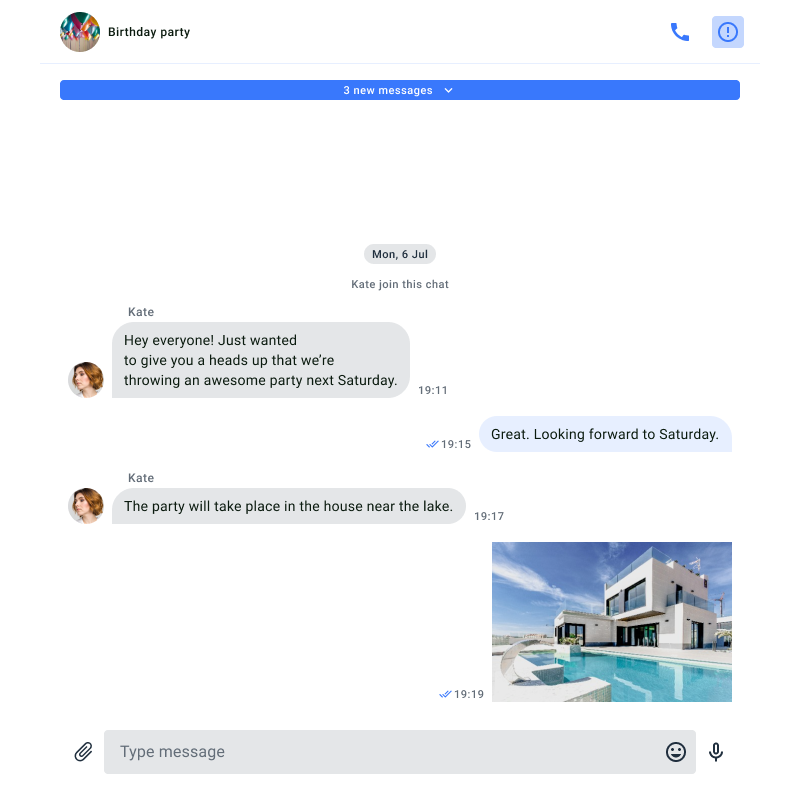
The chat screen consists of two components: the header and messages.
It utilizes two models: DialogsViewModel, which provides information about the current dialog, such as its name, list of participants, and message history, and MessagesViewModel, which describes the collection of messages for a specific dialog.
You can access the **DialogsViewModel** using the custom hook **useDialogsViewModel()**. Similarly, you can access the **MessagesViewModel** using the custom hook **useMessagesViewModel()**.
The code for these hooks is located in the following files: src/Presentation/Views/Dialogs/useDialogsViewModel.ts and src/Presentation/components/UI/Dialogs/MessagesView/useMessagesViewModel.ts.
**Header**
The header component contains the name and the photo of the dialog. Also, the header contains a default button in the upper right corner that allows you to open the group chat info screen.
**Messages**
The message list component shows a list of all messages exchanged in the chat, in chronological order. The list displays both text and file messages, and messages sent by the current user are different from messages sent by other participants in the dialog.
**Send Message**
The send message component is where the user can either enter a text message or send the message as a file by importing a file, image, or video.
### Usage
The MessageView component, designed to display the list of dialogs (chats), consists of three logical parts: the HeaderMessages component (header of the message list), components for displaying messages (VideoAttachmentComponent, AudioAttachmentComponent, ImageAttachmentComponent, HighLightLink), and the component for sending messages.
While you cannot create your own custom component for the header of the message list, you can place your own components above and below it. This allows you to add your logo or other custom elements to the UIKit interface.
All parts of the MessageView component can be customized using themes.
In future versions of the UIKit, you will also be able to set your own components for sending messages and displaying the messages themselves.
### Customization
All parts of the MessageView component are sensitive to the theme used.
The HeaderMessages component, which serves as the header of the dialog list, uses icons:
* To display the type of dialog: GroupChat, UserAvatar, PublicChannel;
* To display dialog properties: InformationFill;
* To start a video call: Phone;
The icons are located in the directory: **src/Presentation/components/UI/svgs/Icons**
The HeaderMessages component uses a set of theme elements defined by the following methods in the UiKitTheme interface: divider(), secondaryText(), secondaryBackground().
The specific styles for this component are defined in the HeaderMessages.scss file.
Other parts of the MessageView component responsible for displaying messages (VideoAttachmentComponent, AudioAttachmentComponent, ImageAttachmentComponent, HighLightLink) use the icons SentStatusIcon, ViewedDelivered, ImagePlay, AudioFile, ImageEmpty.
The icons are located in the directory: **src/Presentation/components/UI/svgs/Icons**.
The **MessageView** component uses a set of theme elements defined by the following methods in the **UiKitTheme** interface: mainElements(), mainBackground(), disabledElements(), secondaryText(), inputElements(), mainText(), divider(), chatInput(), fieldBorder().
The specific styles for this component are defined in the **MessageView\.scss** file.
Each of the nested components also has its own styles specified in separate files, which customize the parent component's styles. For example, the **VideoAttachmentComponent** component responsible for displaying the appearance of video files is styled in the **VideoAttachmentComponent.scss** file.
Similarly, the **AudioAttachmentComponent** component responsible for displaying and playing audio files is styled in the **AudioAttachmentComponent.scss** file.
The **ImageAttachmentComponent** component, responsible for displaying the appearance of images, is styled in the **ImageAttachmentComponent.scss** file.
The **HighLightLink** component, responsible for displaying the appearance of links in messages, is styled in the **HighLightLink.scss** file.
The MessageView component has the following list of properties:
| Property name | Type | Description |
| -------------------------- | ---------------- | ------------------------------------------------------------------------------------------------------------------------------------------------------------------------------------------------------------------------------------------------------------------------------------ |
| upHeaderContent | React.ReactNode | This field allows passing a React element as the content for the upper header of the chat dialog list. |
| subHeaderContent | React.ReactNode | This field allows passing a React element as the content for the additional subheader of the chat dialog list. |
| dialogsViewModel | DialogsViewModel | This field represents the dialogs view model (DialogsViewModel) that manages the data and state of the chat messages list. In the context of the MVVM pattern, the view model handles the logic related to data and interaction with the user interface components. |
| onDialogInformationHandler | Object function | This field represents the handler function (Handler) for the event of obtaining information about a dialog. It may not take any arguments and performs specific actions when requesting information about a dialog. |
| theme | UiKitTheme | This field represents the theme (UiKitTheme) for styling the chat messages list component. In an MVVM pattern-based application, themes are often used to manage the style and appearance of the user interface. |
| AIAnswerToMessage | AIWidget | ***In versions 0.2.0*** and later, you can integrate AI functionality based on OpenAI features. This field allows you to specify your own AI Widget for generating quick responses to messages. For more details, please refer to the following AI Feature section of documentation. |
### Screen structure
The chat screen consists of two components: the header and messages.
It utilizes two models: DialogsViewModel, which provides information about the current dialog, such as its name, list of participants, and message history, and MessagesViewModel, which describes the collection of messages for a specific dialog.
You can access the **DialogsViewModel** using the custom hook **useDialogsViewModel()**. Similarly, you can access the **MessagesViewModel** using the custom hook **useMessagesViewModel()**.
The code for these hooks is located in the following files: src/Presentation/Views/Dialogs/useDialogsViewModel.ts and src/Presentation/components/UI/Dialogs/MessagesView/useMessagesViewModel.ts.
**Header**
The header component contains the name and the photo of the dialog. Also, the header contains a default button in the upper right corner that allows you to open the group chat info screen.
**Messages**
The message list component shows a list of all messages exchanged in the chat, in chronological order. The list displays both text and file messages, and messages sent by the current user are different from messages sent by other participants in the dialog.
**Send Message**
The send message component is where the user can either enter a text message or send the message as a file by importing a file, image, or video.
### Usage
The MessageView component, designed to display the list of dialogs (chats), consists of three logical parts: the HeaderMessages component (header of the message list), components for displaying messages (VideoAttachmentComponent, AudioAttachmentComponent, ImageAttachmentComponent, HighLightLink), and the component for sending messages.
While you cannot create your own custom component for the header of the message list, you can place your own components above and below it. This allows you to add your logo or other custom elements to the UIKit interface.
All parts of the MessageView component can be customized using themes.
In future versions of the UIKit, you will also be able to set your own components for sending messages and displaying the messages themselves.
### Customization
All parts of the MessageView component are sensitive to the theme used.
The HeaderMessages component, which serves as the header of the dialog list, uses icons:
* To display the type of dialog: GroupChat, UserAvatar, PublicChannel;
* To display dialog properties: InformationFill;
* To start a video call: Phone;
The icons are located in the directory: **src/Presentation/components/UI/svgs/Icons**
The HeaderMessages component uses a set of theme elements defined by the following methods in the UiKitTheme interface: divider(), secondaryText(), secondaryBackground().
The specific styles for this component are defined in the HeaderMessages.scss file.
Other parts of the MessageView component responsible for displaying messages (VideoAttachmentComponent, AudioAttachmentComponent, ImageAttachmentComponent, HighLightLink) use the icons SentStatusIcon, ViewedDelivered, ImagePlay, AudioFile, ImageEmpty.
The icons are located in the directory: **src/Presentation/components/UI/svgs/Icons**.
The **MessageView** component uses a set of theme elements defined by the following methods in the **UiKitTheme** interface: mainElements(), mainBackground(), disabledElements(), secondaryText(), inputElements(), mainText(), divider(), chatInput(), fieldBorder().
The specific styles for this component are defined in the **MessageView\.scss** file.
Each of the nested components also has its own styles specified in separate files, which customize the parent component's styles. For example, the **VideoAttachmentComponent** component responsible for displaying the appearance of video files is styled in the **VideoAttachmentComponent.scss** file.
Similarly, the **AudioAttachmentComponent** component responsible for displaying and playing audio files is styled in the **AudioAttachmentComponent.scss** file.
The **ImageAttachmentComponent** component, responsible for displaying the appearance of images, is styled in the **ImageAttachmentComponent.scss** file.
The **HighLightLink** component, responsible for displaying the appearance of links in messages, is styled in the **HighLightLink.scss** file.
The MessageView component has the following list of properties:
| Property name | Type | Description |
| -------------------------- | ---------------- | ------------------------------------------------------------------------------------------------------------------------------------------------------------------------------------------------------------------------------------------------------------------------------------ |
| upHeaderContent | React.ReactNode | This field allows passing a React element as the content for the upper header of the chat dialog list. |
| subHeaderContent | React.ReactNode | This field allows passing a React element as the content for the additional subheader of the chat dialog list. |
| dialogsViewModel | DialogsViewModel | This field represents the dialogs view model (DialogsViewModel) that manages the data and state of the chat messages list. In the context of the MVVM pattern, the view model handles the logic related to data and interaction with the user interface components. |
| onDialogInformationHandler | Object function | This field represents the handler function (Handler) for the event of obtaining information about a dialog. It may not take any arguments and performs specific actions when requesting information about a dialog. |
| theme | UiKitTheme | This field represents the theme (UiKitTheme) for styling the chat messages list component. In an MVVM pattern-based application, themes are often used to manage the style and appearance of the user interface. |
| AIAnswerToMessage | AIWidget | ***In versions 0.2.0*** and later, you can integrate AI functionality based on OpenAI features. This field allows you to specify your own AI Widget for generating quick responses to messages. For more details, please refer to the following AI Feature section of documentation. |
 ### Screen structure
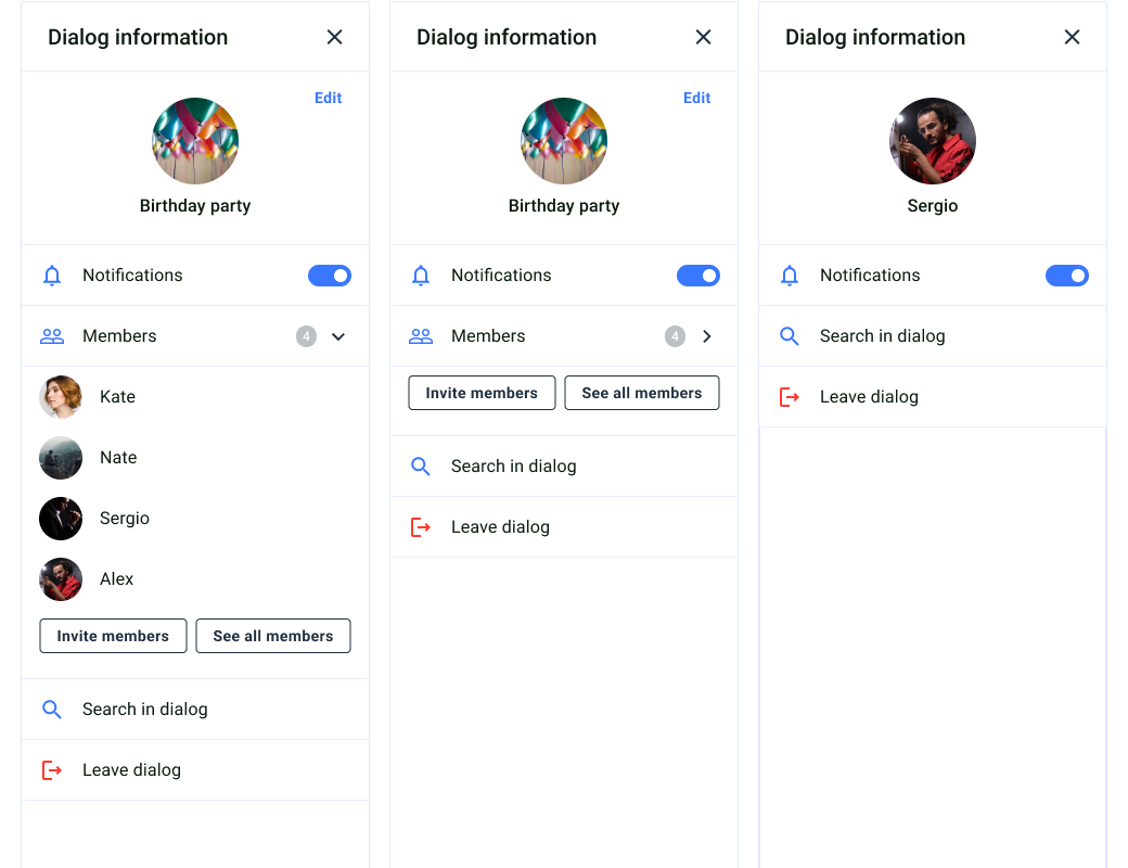
The group chat info screen consists of two components: header, dialog info and dialog members list. We want to draw your attention that the list of participants is only available for group dialogs and is not displayed for private dialogs.
### Screen structure
The group chat info screen consists of two components: header, dialog info and dialog members list. We want to draw your attention that the list of participants is only available for group dialogs and is not displayed for private dialogs.
 ### Add members screen
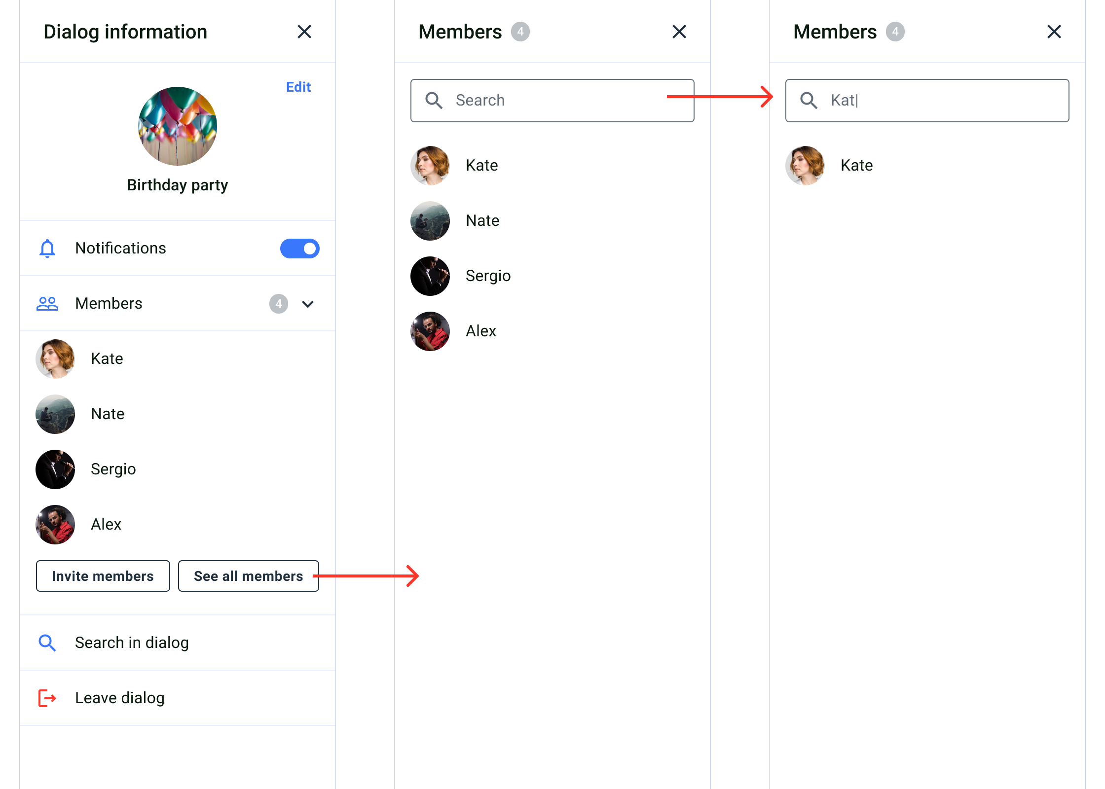
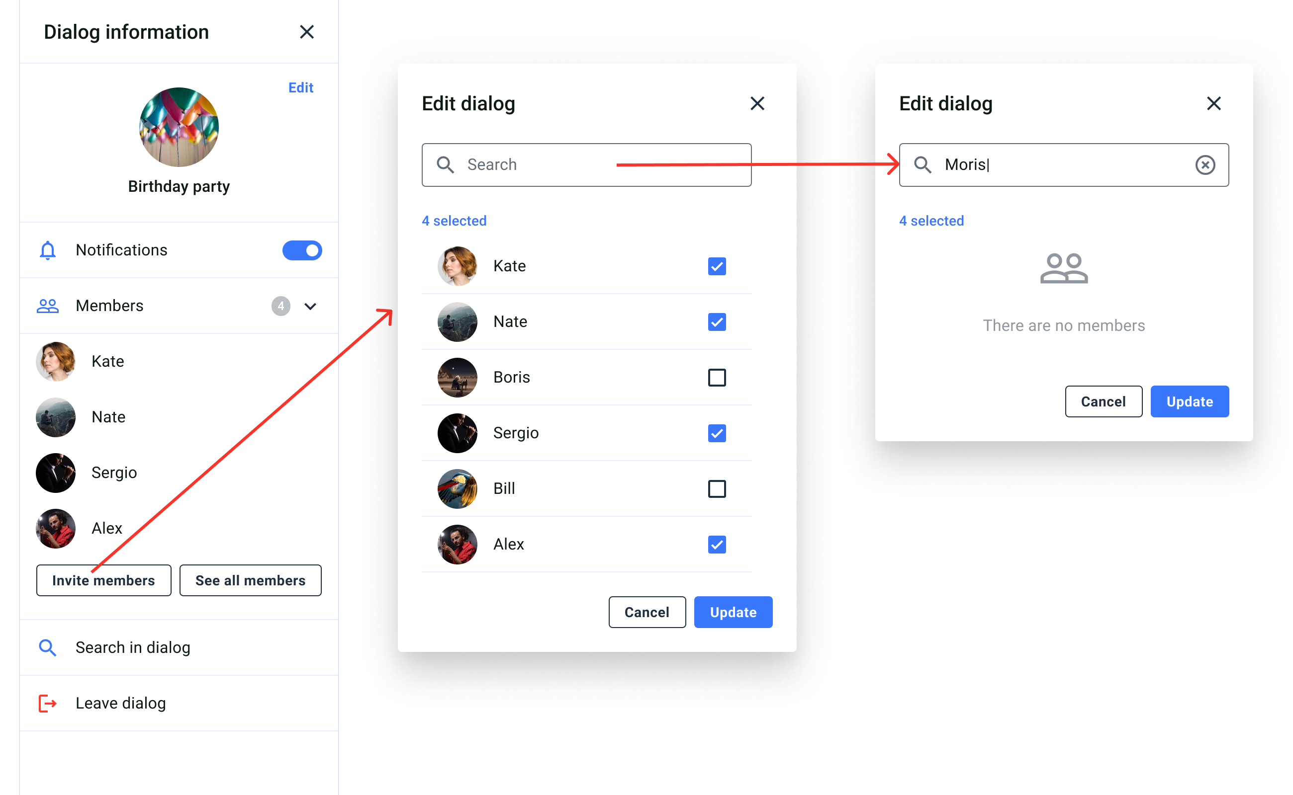
The add members screen allow invite new members to the group dialog. The dialog member list is created through MembersList or InviteMembers components. All users are listed through the pagination, and members who already belong to the dialog cannot be shown.
### Add members screen
The add members screen allow invite new members to the group dialog. The dialog member list is created through MembersList or InviteMembers components. All users are listed through the pagination, and members who already belong to the dialog cannot be shown.
 ### Customization
The MembersList and InviteMembers components use styles defined specifically for them in the files MembersList.scss and InviteMembers.scss, respectively.
### Customization
The MembersList and InviteMembers components use styles defined specifically for them in the files MembersList.scss and InviteMembers.scss, respectively.