Documentation Index
Fetch the complete documentation index at: https://docs.quickblox.com/llms.txt
Use this file to discover all available pages before exploring further.
Overview
With essential messaging functionalities such as typing indicators, unread messages, file sharing etc., users can engage in more interactive conversations.
Supported features by dialog types
| Group dialog | Private dialog |
|---|
File sharing | ✓ | ✓ |
Voice message | ✓ | ✓ |
Typing indicator | ✓ | ✓ |
Delivery receipt | ✓ | ✓ |
Read receipt | ✓ | ✓ |
Unread message count | ✓ | ✓ |
Highlight URLs | ✓ | ✓ |
Public dialogs are not currently supported but will be added in the upcoming releases.
Dialog types
QuickBlox UIKit provides support for three types of dialogs: public dialog, group dialog, and private dialog.
Public dialog
A public dialog is an open chat that is shown to everyone in the app and anyone can join it. Public dialogs can host more participants compared to group dialogs, but does not have a list of participants and their online statuses within dialog.
Group dialog
A group dialog is a chat between closed group of people. New participant can be added either by dialog owner or any other participant of the group dialog.
Private dialog
A private dialog is a direct chat between two people, it can’t be extended to host more people.
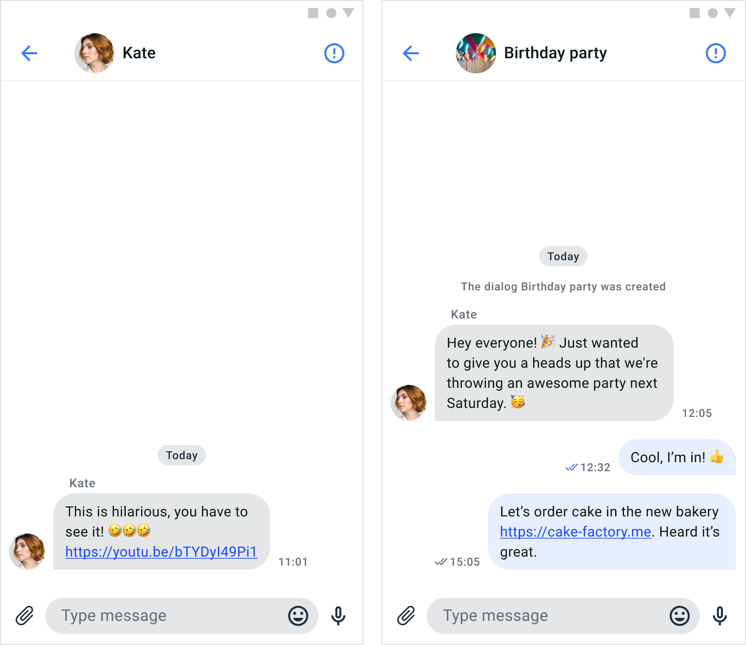
File sharing
QuickBlox provides file sharing functionality that enables users to effortlessly send various types of files while engaged in a chat session, such as images, audio files, or videos. File sharing appears on SendMessageComponent.
Customize the UI for file sharing
You can customize the UI for file sharing using string resource and icon resource.
String resource
The string resource is a set of strings used to compose the screen. It’s a res/strings.xml file containing UIKit-defined string values.
<resources>
  	<string name="send_attachment">Send attachment</string>
  	<string name="take_photo">Take photo from camera</string>
  	<string name="take_video">Take video from camera</string>
    <string name="photo_video">Photo and video</string>
    <string name="file">File</string>
</resources>
| Icon name | Image | Description |
|---|
| attachment |  | An icon used to select and add files. |
| ic_video_placeholder |  | An icon for video placeholder. |
| ic_gif_placeholder |  | An icon for gif placeholder. |
| ic_image_placeholder |  | An icon for image placeholder. |
| ic_file |  | An icon for file. |
Voice message
Voice messaging is another way for people to communicate without typing text. With voice messages, you can express yourself better by using tone and intention. It’s also quicker to record a voice message than to write a long text, which makes it more efficient for the sender. The receiver can listen to the message whenever it’s convenient for them, even while doing other tasks. To send a voice message in a dialog, you just need to press and hold the mic icon. Then, the message will appear in the chat, and the receiver can play it.
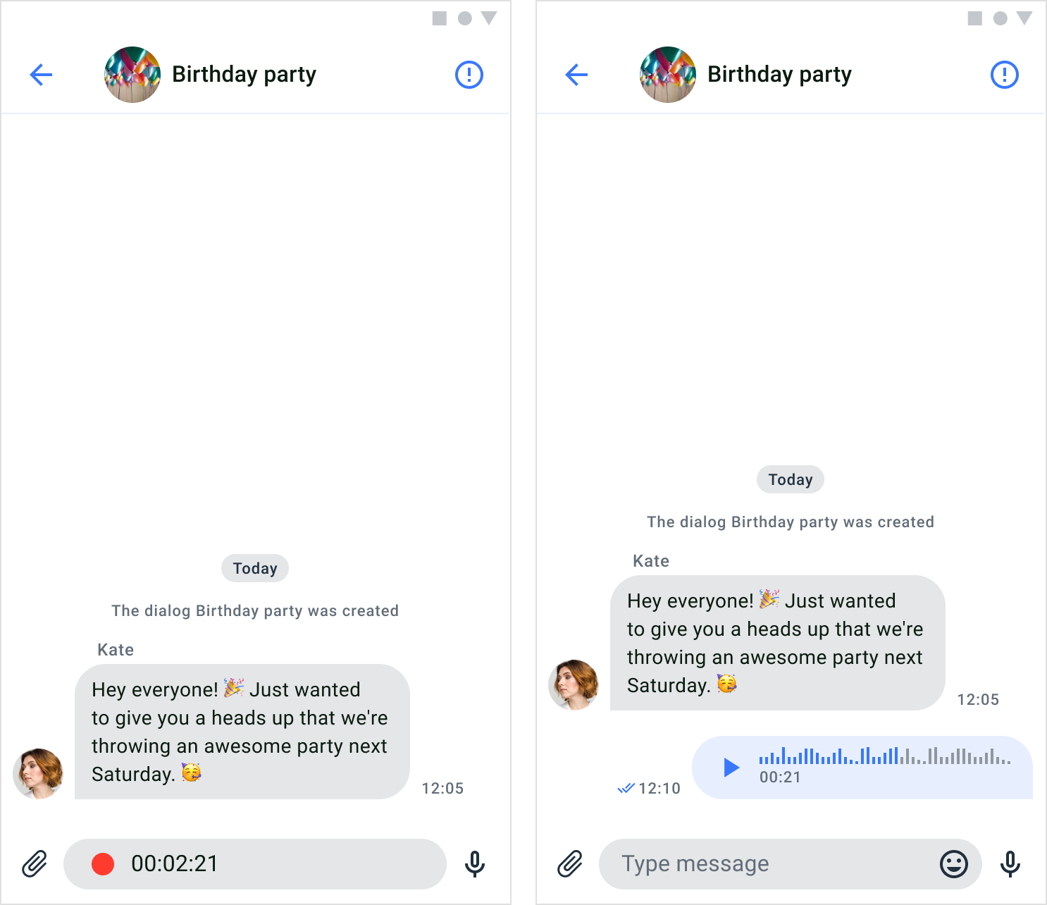
Send a voice message
In order to send a voice message, users have to record a message first. By default, a voice message icon is visible on the right side of the input field. While the icon is pressed, the voice recorder appears and recording the sound from microphone. The voice message icon appears only when input text form is empty. When the icon unpressed the voice message will send automatically.
Customize the UI for voice message recorder
You can customize the UI for voice message recorder using icon resource.
Icon resource
Icon resources are stored in drawable directory, all icons are vectors in XML file. The following table shows customizable file sharing icon.
| Icon name | Image | Description |
|---|
| send_voice |  | An icon for send voice. |
| ic_record |  | An icon for recorder. |
Customize the UI for voice messages
You can customize the UI for voice messages using icon resource.
| Icon name | Image | Description |
|---|
| ic_play |  | An icon for audio. |
| equalizer |  | An icon for audio message background. |
Typing indicator
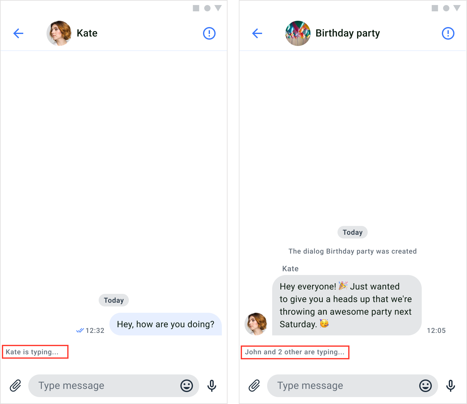
The typing indicator is a useful feature that provides users with a visual signal when someone else in the dialog is typing a message. This feature is implemented in the PrivateChatViewModel of the PrivateChatFragment and GroupChatViewModel of the GroupChatFragment. The indicator remains visible until the user sends the message or clears the text. If the user stops typing for more than 10 seconds, the indicator will also disappear.
Delivery receipt
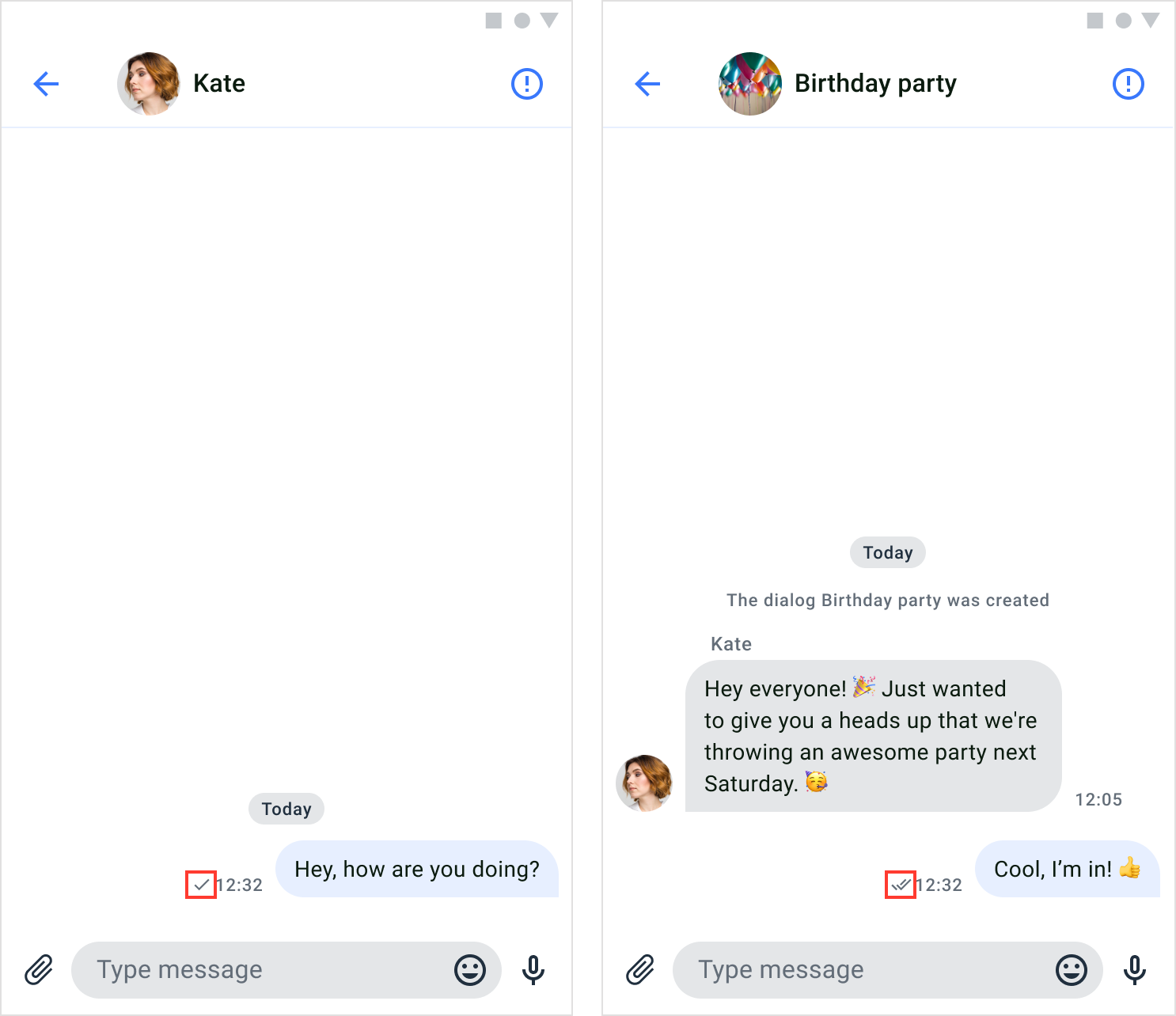
The delivery receipt is a feature that informs a user if their messages have been successfully delivered to other users in the dialog. When message reaches server, it is marked as sent, a single-tick icon appears next to the message’s timestamp. Once message reaches receiver device, it is marked as delivered. If the sender’s message has been delivered to any recipient in the dialog, a double-tick icon appears next to the message’s timestamp. The delivery receipt can only be seen by the sender of the message. It appears on the MessagesComponent.
Customize the UI for delivery receipt
You can customize the UI for delivery receipt using icon resource.
Icon resource
Icon resources are stored in drawable directory, all icons are vectors in XML file. The following table shows customizable file sharing icon.
| Icon name | Image | Description |
|---|
| sent |  | An icon for sent. |
| delivered |  | An icon for delivery. |
The default delivery receipt color uses the tertiary elements color, it can be changed in the theme with setTertiaryElementsColor() (see Theme colors) Read receipt
The read receipt feature allows users to determine whether their messages have been read by others in the dialog. When any recipient in the dialog have read the sender’s message, a colored double-tick icon is displayed next to the message’s timestamp. The read receipts are only visible to the sender of the message. It appears on the MessagesComponent.

Customize the UI for read receipt
You can customize the UI for read receipt using icon resource.
Icon resource
Icon resources are stored in drawable directory, all icons are vectors in XML file. The following table shows customizable file sharing icon.
| Icon name | Image | Description |
|---|
| read | | An icon for read. |
The default read receipt color uses the main elements color, it can be changed in the theme with setMainElementsColor() (see Theme colors) Unread message count
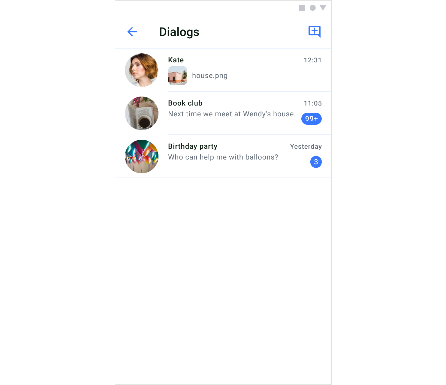
Unread message count is a feature that informs users of the number of messages they haven’t read in each dialog. The number of unread messages per dialog is displayed below the timestamp. If the number of messages is more than 100, it will be displayed as 99+. The unread message count appears on the DialogsComponent.
Customize the UI for unread message counts
You can customize the UI for unread message count using shape resource.
Shape resource
Shape resources are stored in drawable directory.
| Shape name | Description |
|---|
| bg_dialog_counter | Shape for unread message count |
The default shape color uses the main elements color, it can be changed in the theme with setMainElementsColor() (see Theme colors) Highlight URLs
The highlighting URLs is a feature that refers to displaying clickable links in a chat message, where the URL is visually distinguished and can be interacted with the user.
Forwarding and Replying Messages
Modern messengers and chat platforms offer various functional features, among the most useful of which are message forwarding and reply options. Let’s take a closer look at them.
 By default, these functions are enabled, but if necessary, they can be disabled and enabled using special methods:
QuickBloxUiKit.enableReply()
QuickBloxUiKit.disableReply()

QuickBloxUiKit.enableForward()
QuickBloxUiKit.disableForward()
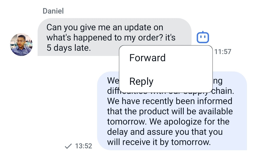
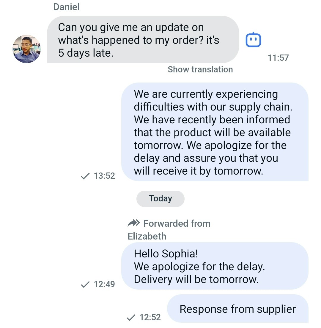
Forwarding Messages:
Forwarding is the capability to transfer messages from one chat participant to another, similar to email forwarding. It enables efficient exchange and discussion of information within the context of chats and messengers.
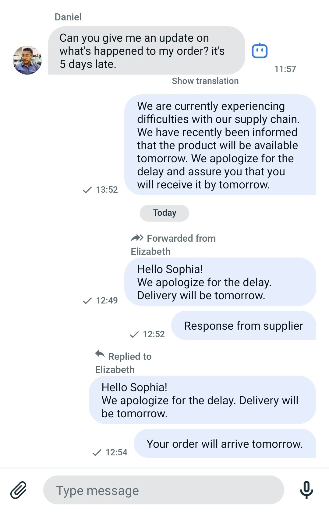
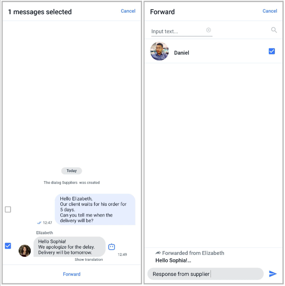 Once you’ve selected the dialogue to which you want to forward the message, the forwarded message will be displayed in the selected dialogue like this.
Replying to Messages:
Replying is the ability to respond to a specific message, establishing a connection between the reply and the original message. It enhances the structure of communication in a chat, making conversations more clear and organized.
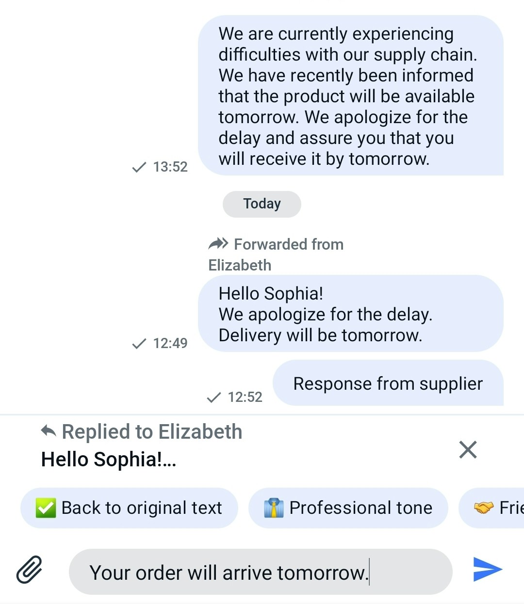 After choosing the message to which you’ve decided to reply, your response to the message will be displayed like this.
Customize the UI for forwarding and replying:
You can customize the UI for file sharing using string resources and icon resources.
String resource
The string resource is a set of strings used to compose the screen. It’s a res/strings.xml file containing UIKit-defined string values.
<resources>
    <string name="forward">Forward</string>
    <string name="forwarded_from_with_name">Forwarded from %s</string>
    <string name="replied_to_with_name">Replied to %s</string>
    <string name="replied_to">Replied to</string>
    <string name="forwarded_from">Forwarded from</string>
    <string name="message_forwarded_to">Message forwarded to %s</string>
    <string name="reply">Reply</string>
</resources>
| Icon name | Image | Description |
|---|
| ic_forward |  | An icon for forward. |
| ic_reply |  | An icon for reply. |
