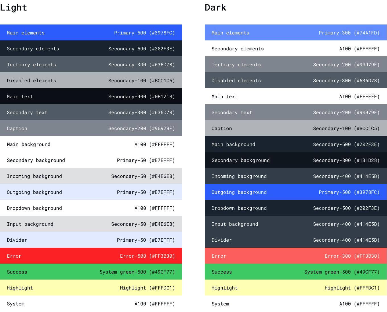
Default themes
The QuickBlox UIKit for React has 2 built in themes: Dark and Light.Color Theme
JavaScript
Use your own theme
There are two options how you can create your own theme:- Customize current theme using css
- Create your own theme to customize selected components
SCSS
SCSS
TypeScript
- desktop layout container
TypeScript
- header of dialogs
TypeScript
- item of dialogs
TypeScript