Default theme
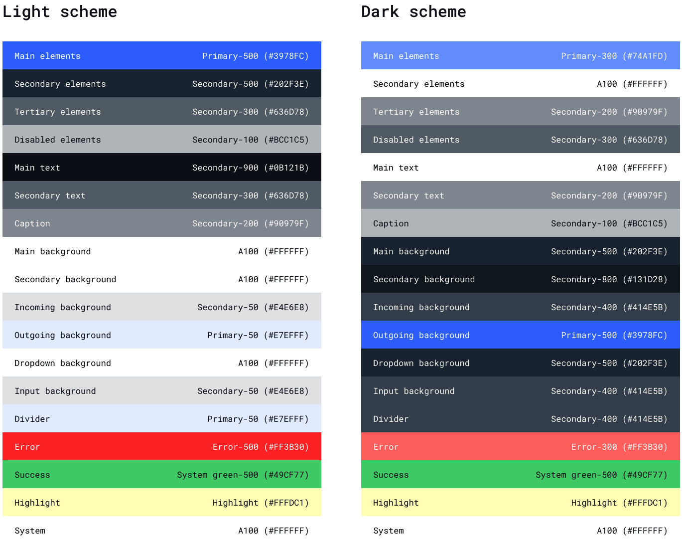
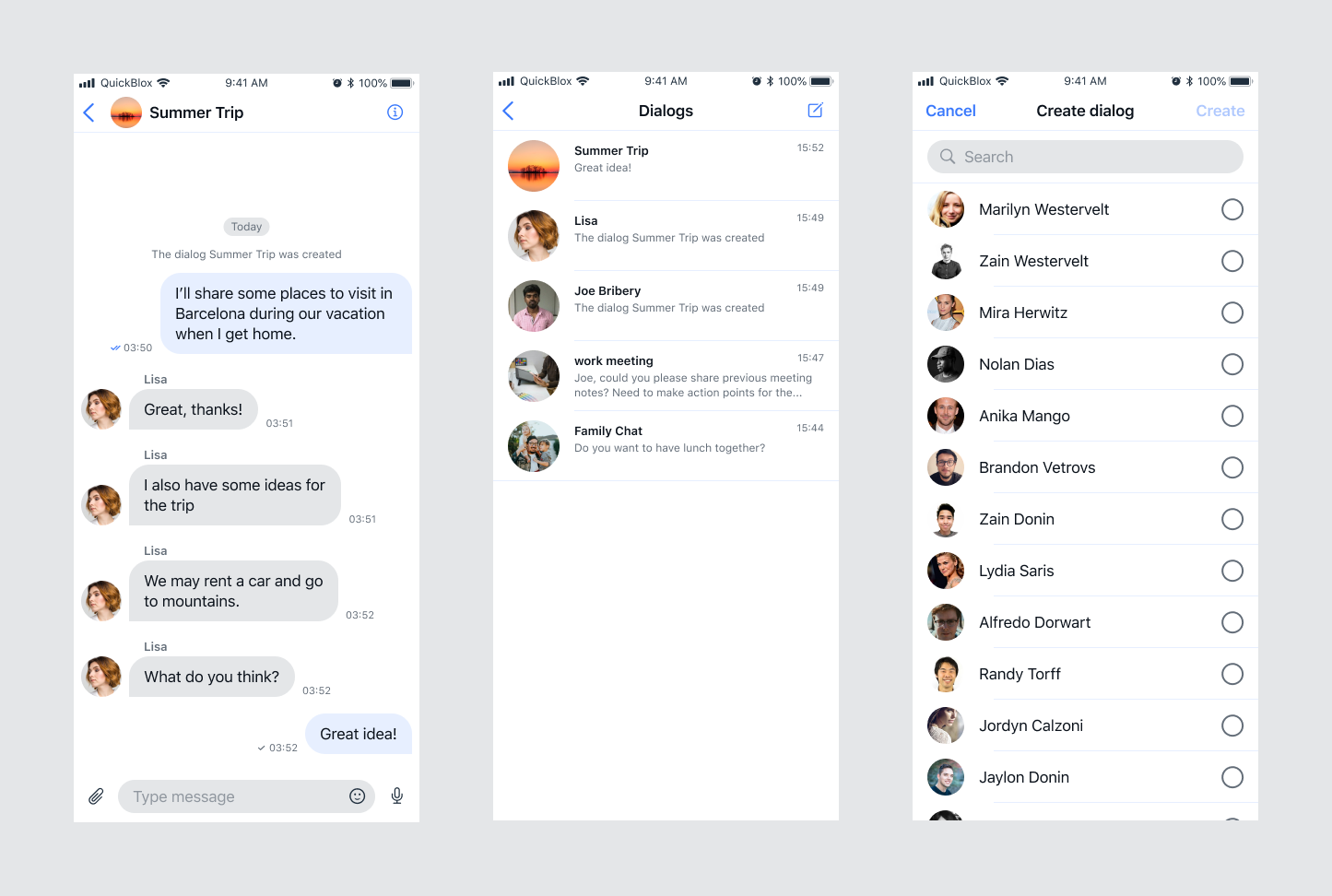
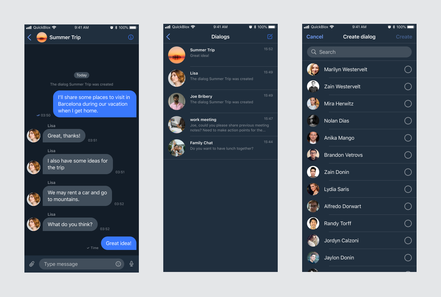
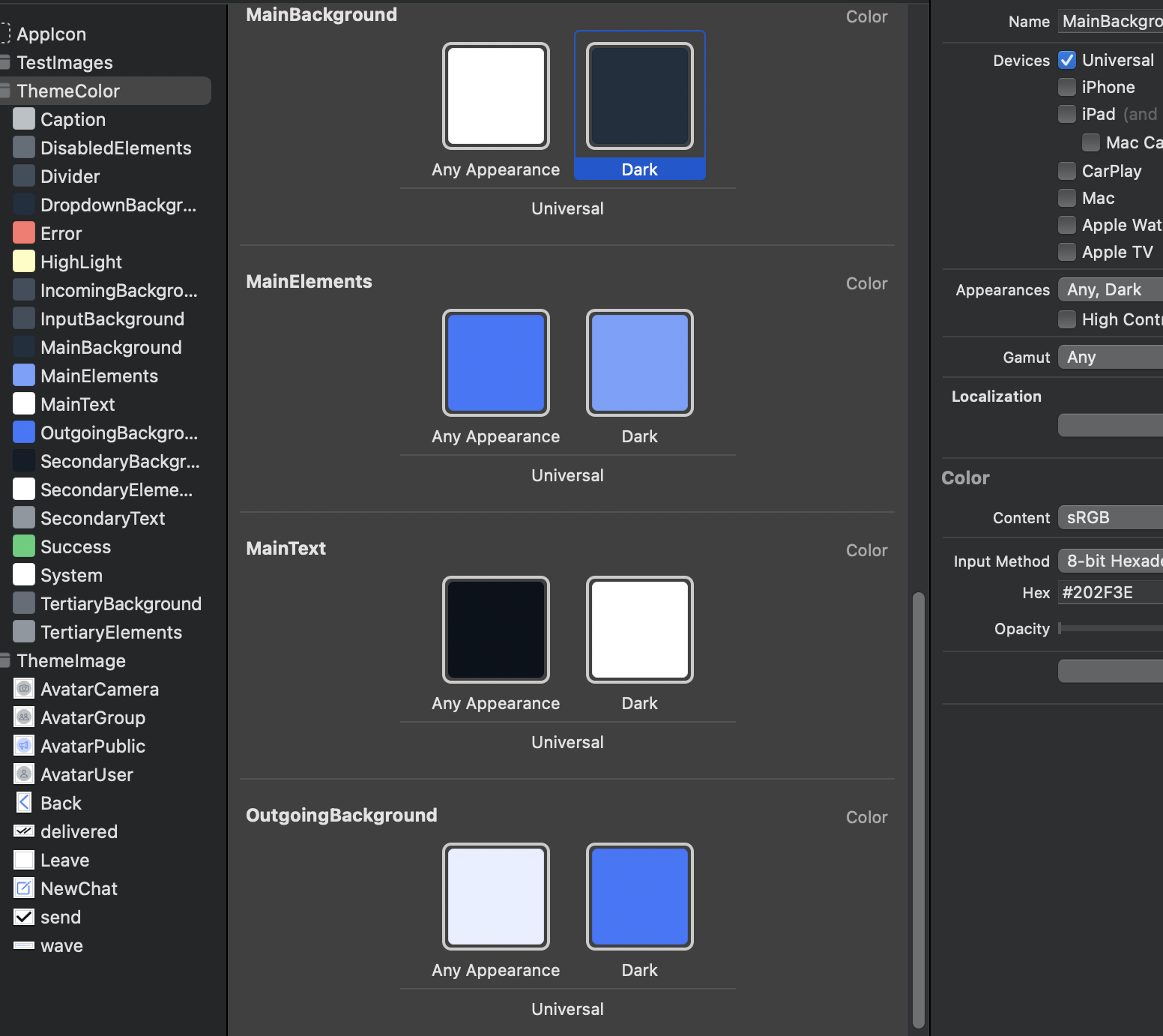
The QuickBlox iOS UIKit comes with the default Theme conforms toThemeProtocol out of the box. It consists of a ThemeColor, ThemeFont, ThemeImage and an ThemeString that describe the properties needed to properly display the appearance of the kit.Color Theme
Swift
public protocol ThemeColorProtocol {
    var mainElements: Color { get set }
    var secondaryElements: Color { get set }
    var tertiaryElements: Color { get set }
    var disabledElements: Color { get set }
    var mainText: Color { get set }
    var secondaryText: Color { get set }
    var caption: Color { get set }
    var mainBackground: Color { get set }
    var secondaryBackground: Color { get set }
    var tertiaryBackground: Color { get set }
    var incomingBackground: Color { get set }
    var outgoingBackground: Color { get set }
    var dropdownBackground: Color { get set }
    var inputBackground: Color { get set }
    var divider: Color { get set }
    var error: Color { get set }
    var success: Color { get set }
    var highLight: Color { get set }
    var system: Color { get set }
}
Swift
class ThemeColor: QuickBloxUIKit.ThemeColorProtocol {
    var mainElements: Color = Color("MainElements")
    var secondaryElements: Color = Color("SecondaryElements")
    var tertiaryElements: Color = Color("TertiaryElements")
    var disabledElements: Color = Color("DisabledElements")
    var mainText: Color = Color("MainText")
    var secondaryText: Color = Color("SecondaryText")
    var caption: Color = Color("Caption")
    var mainBackground: Color = Color("MainBackground")
    var secondaryBackground: Color = Color("SecondaryBackground")
    var tertiaryBackground: Color = Color("TertiaryBackground")
    var incomingBackground: Color = Color("IncomingBackground")
    var outgoingBackground: Color = Color("OutgoingBackground")
    var dropdownBackground: Color = Color("DropdownBackground")
    var inputBackground: Color = Color("InputBackground")
    var divider: Color = Color("Divider")
    var error: Color = Color("Error")
    var success: Color = Color("Success")
    var highLight: Color = Color("HighLight")
    var system: Color = Color("System")

    init() {}
}
Use your own Color Theme
You can create and use your own color theme. To do this you need to create a class that implementsQuickBloxUIKit\.ThemeColorProtocol and initialize it with your own color set. The example shows different options for color constructors. Use the most suitable for you:
Swift
class YourAmazingColorTheme: ThemeColorProtocol {
    // 1. Init with setup Light and Dark schemes.
    var mainElements: Color = Color(uiColor: UIColor { traitCollection in
        traitCollection.userInterfaceStyle == .dark ? UIColor.blue
        : UIColor.cyan
    })

    // 2. Some convenience methods to create colors.
    var secondaryElements: Color = .gray
    var tertiaryElements: Color = .black
    var disabledElements: Color = .black.opacity(0.5)

    // 3. Creates a color from a color set that you indicate by name with setup Light and Dark schemes.
    var mainText: Color = Color("Your_MainText")
    var secondaryText: Color = Color("Your_SecondaryText")
    var caption: Color = Color("Your_Caption")
    var mainBackground: Color = Color("Your_MainBackground")
    var secondaryBackground: Color = Color("Your_SecondaryBackground")
    var tertiaryBackground: Color = Color("Your_TertiaryBackground")
    var incomingBackground: Color = Color("Your_IncomingBackground")
    var outgoingBackground: Color = Color("Your_OutgoingBackground")
    var dropdownBackground: Color = Color("Your_DropdownBackground")
    var inputBackground: Color = Color("Your_InputBackground")
    var divider: Color = Color("Your_Divider")
    var error: Color = Color("Your_Error")
    var success: Color = Color("Your_Success")
    var highLight: Color = Color("Your_HighLight")
    var system: Color = Color("Your_System")

    init() {}
}
QuickBloxUIKit.ThemeProtocol, which obliges to do initialization with ThemeColorProtocol, ThemeFontProtocol, ThemeImageProtocol and ThemeStringProtocol:
Swift
class YourAmazingTheme: ThemeProtocol {
    var color: ThemeColorProtocol
    var font: ThemeFontProtocol
    var image: ThemeImageProtocol
    var string: ThemeStringProtocol

    init(color: ThemeColorProtocol,
         font: ThemeFontProtocol,
         image: ThemeImageProtocol) {
        self.color = color
        self.font = font
        self.image = image
        self.string = string
    }
}
Swift
var appTheme: YourAmazingTheme = YourAmazingTheme(color: YourAmazingColorTheme(),
                                      font: QuickBloxUIKit.ThemeFont(),
                                      image: QuickBloxUIKit.ThemeImage(),
                                      string: QuickBloxUIKit.ThemeString())
Swift
import SwiftUI
import QuickBloxUIKit

struct ShowQuickBlox: View {

    init() {
        var appTheme: YourAmazingTheme = YourAmazingTheme(color: MyAmazingColorTheme(),
                                          font: QuickBloxUIKit.ThemeFont(),
                                          image: QuickBloxUIKit.ThemeImage(),
                                          string: QuickBloxUIKit.ThemeString())
        QuickBloxUIKit.settings.theme = appTheme // Custom color theme setting.
    }

    var body: some View {
        QuickBloxUIKit.dialogsView(onExit: {
        // Handling an event when exiting the QuickBloxUIKit for example, disconnect and logout
        })
    }
}
Font Theme
The default FontTheme conforms to the ThemeFontProtocol:Swift
public protocol ThemeFontProtocol {
    var headline: Font { get set }
    var footnote: Font { get set }
    var caption: Font { get set }
    var caption2: Font { get set }
    var callout: Font { get set }
    var largeTitle: Font { get set }
    var title1: Font { get set }
    var title3: Font { get set }
}
Swift
public class ThemeFont: ThemeFontProtocol {
    public var headline: Font = .headline
    public var footnote: Font = .footnote.weight(.semibold)
    public var caption: Font = .caption
    public var caption2: Font = .caption2
    public var callout: Font = .callout
    public var largeTitle: Font = .largeTitle
    public var title1: Font = .title.weight(.semibold)
    public var title3: Font = .title3

    public init() {}
}
Use your own Font Theme
You can create and use your own font theme. To do this you need to create a class that implementsQuickBloxUIKit.ThemeFontProtocol with the fonts you need.
For example:
Swift
public class CustomThemeFont: ThemeFontProtocol {
    public var headline: Font = .custom("Menlo", size: 17)
    public var footnote: Font = .custom("Menlo", size: 13)
    public var caption: Font = .custom("Menlo", size: 12)
    public var caption2: Font = .custom("Menlo", size: 11)
    public var callout: Font = .custom("Menlo", size: 17)
    public var largeTitle: Font = .custom("Menlo", size: 34)
    public var title1: Font = .custom("Menlo", size: 28)
    public var title3: Font = .custom("Menlo", size: 20)

    public init() {}
}
Swift
var appTheme: AppTheme = AppTheme(color: QuickBloxUIKit.ThemeColor(),
                                  font: CustomThemeFont(),
                                  image: QuickBloxUIKit.ThemeImage(),
                                  string: QuickBloxUIKit.ThemeString())

QuickBloxUIKit.settings.theme = appTheme // Custom font theme setting.
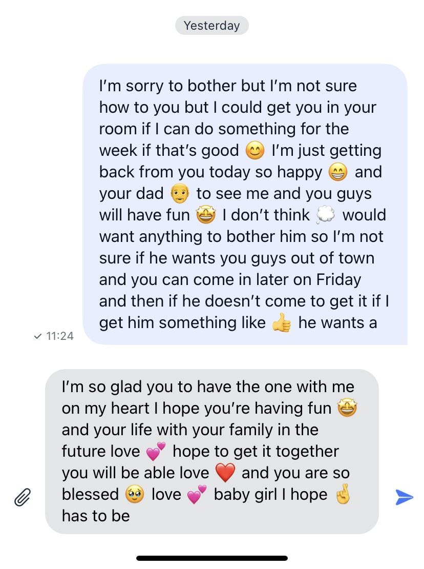
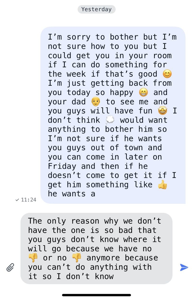
Image Theme
The default ImageTheme conforms to the ThemeImageProtocol:Swift
public protocol ThemeImageProtocol {
    var avatarUser: Image { get set }
    var avatarGroup: Image { get set }
    var avatarPublic: Image { get set }
    var user: Image { get set }
    var groupChat: Image { get set }
    var publicChannel: Image { get set }
    var leave: Image { get set }
    var leavePNG: Image { get set }
    var newChat: Image { get set }
    var back: Image { get set }
    var close: Image { get set }
    var conference: Image { get set }
    var chat: Image { get set }
    var camera: Image { get set }
    var avatarCamera: Image { get set }
    var checkmark: Image { get set }
    var attachmentPlaceholder: Image { get set }
    var info: Image { get set }
    var bell: Image { get set }
    var magnifyingglass: Image { get set }
    var chevronForward: Image { get set }
    var trash: Image { get set }
    var plus: Image { get set }
    var mic: Image { get set }
    var smiley: Image { get set }
    var paperclip: Image { get set }
    var paperplane: Image { get set }
    var keyboard: Image { get set }
    var record: Image { get set }
    var wave: Image { get set }
    var play: Image { get set }
    var pause: Image { get set }
    var photo: Image { get set }
    var delivered: Image { get set }
    var read: Image { get set }
    var send: Image { get set }
    var doctext: Image { get set }
    var speakerwave: Image { get set }
    var robot: Image { get set }
}
Swift
public class ThemeImage: ThemeImageProtocol {
    public var avatarUser: Image = Image("AvatarUser", bundle: .module)
    public var avatarGroup: Image = Image("AvatarGroup", bundle: .module)
    public var avatarPublic: Image = Image("AvatarPublic", bundle: .module)
    public var user: Image = Image(systemName: "person")
    public var groupChat: Image = Image(systemName: "person.2")
    public var publicChannel: Image = Image(systemName: "megaphone")
    public var leave: Image = Image(systemName: "rectangle.portrait.and.arrow.forward")
    public var leavePNG: Image = Image("Leave", bundle: .module)
    public var newChat: Image = Image(systemName: "square.and.pencil")
    public var back: Image = Image(systemName: "chevron.backward")
    public var close: Image = Image(systemName: "xmark")
    public var conference: Image = Image(systemName: "person.3")
    public var chat: Image = Image(systemName: "message")
    public var camera: Image = Image(systemName: "camera")
    public var avatarCamera: Image = Image("AvatarCamera", bundle: .module)
    public var checkmark: Image = Image(systemName: "checkmark")
    public var attachmentPlaceholder: Image = Image("attachmentPlaceholder", bundle: .module)
    public var info: Image = Image(systemName: "info.circle")
    public var bell: Image = Image(systemName: "bell")
    public var magnifyingglass: Image = Image(systemName: "magnifyingglass")
    public var chevronForward: Image = Image(systemName: "chevron.forward")
    public var trash: Image = Image(systemName: "trash")
    public var plus: Image = Image(systemName: "plus.app")
    public var mic: Image = Image(systemName: "mic")
    public var smiley: Image = Image(systemName: "smiley")
    public var paperclip: Image = Image(systemName: "paperclip")
    public var paperplane: Image = Image(systemName: "paperplane.fill")
    public var keyboard: Image = Image(systemName: "keyboard")
    public var record: Image = Image(systemName: "record.circle")
    public var wave: Image = Image("wave", bundle: .module)
    public var play: Image = Image(systemName: "play.fill")
    public var pause: Image = Image(systemName: "pause.fill")
    public var photo: Image = Image(systemName: "photo")
    public var delivered: Image = Image("delivered", bundle: .module)
    public var read: Image = Image("delivered", bundle: .module)
    public var send: Image = Image("send", bundle: .module)
    public var doctext: Image = Image(systemName: "doc.text.fill")
    public var speakerwave: Image = Image(systemName: "speaker.wave.1.fill")
    public var robot: Image = Image("Robot", bundle: .module)

    public init() {}
}
Use your own Image Theme
You can create and use your own images theme. To do this you need to create a class that implementsQuickBloxUIKit.ThemeImageProtocol with the images you need.
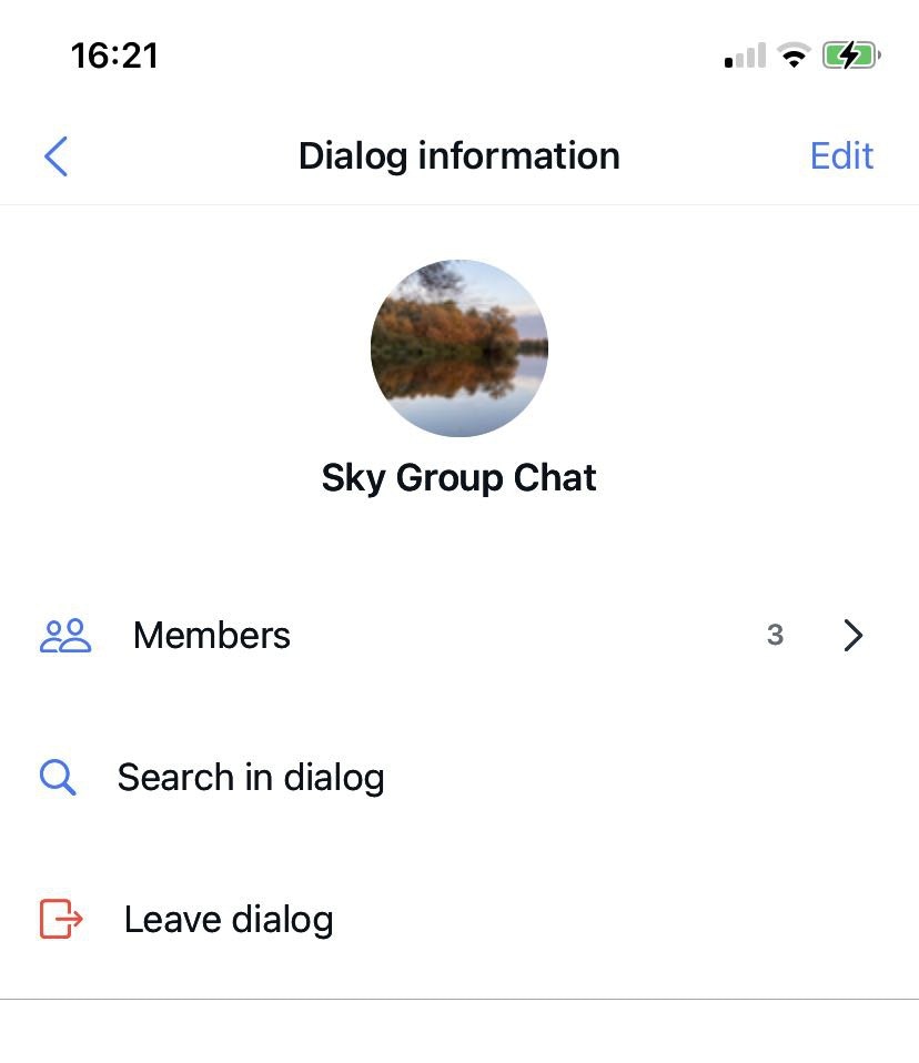
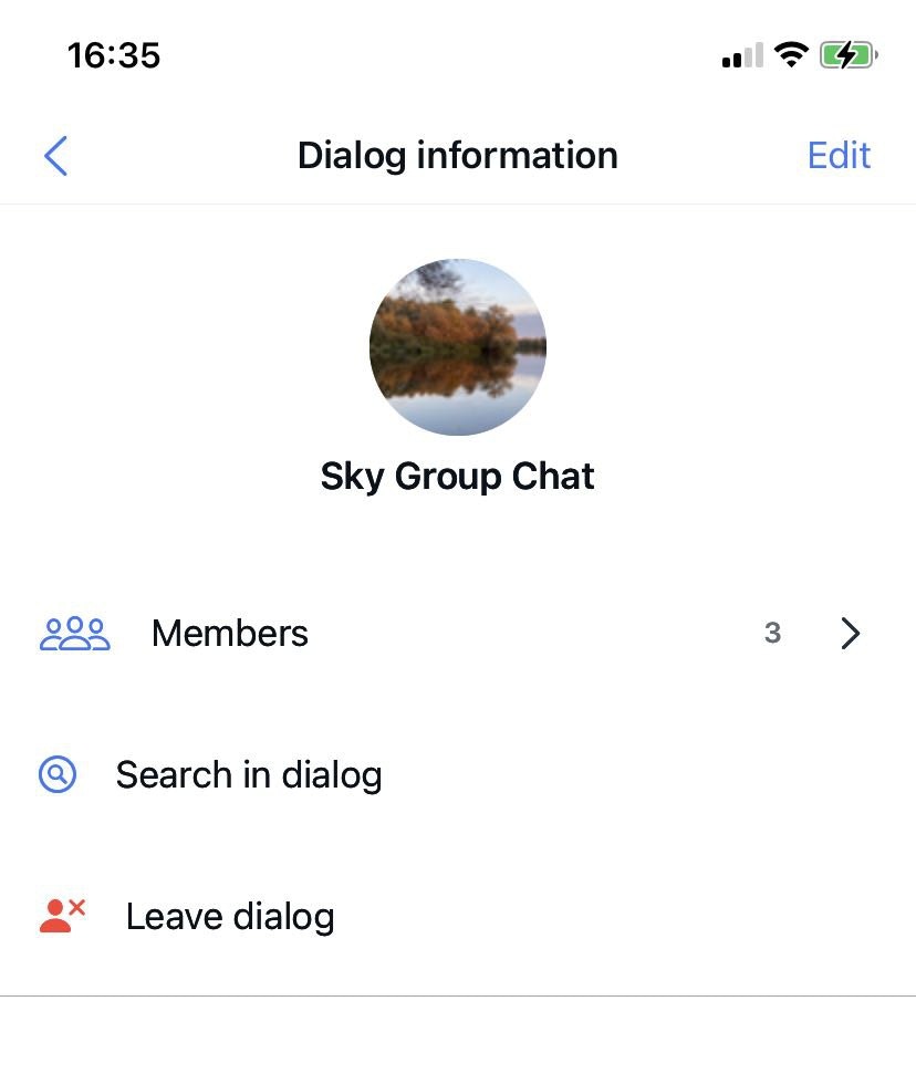
For example set up images for the Info Dialog screen:
Swift
public class CustomImageTheme: ThemeImageProtocol {
    public var avatarUser: Image = Image("AvatarUser")
    public var avatarGroup: Image = Image("AvatarGroup")
    public var avatarPublic: Image = Image("AvatarPublic")
    public var user: Image = Image(systemName: "person")
    public var groupChat: Image = Image(systemName: "person.3") // default: person.2
    public var publicChannel: Image = Image(systemName: "megaphone")
    public var leave: Image = Image(systemName: "person.fill.xmark") // default: rectangle.portrait.and.arrow.forward
    public var leavePNG: Image = Image("Leave")
    public var newChat: Image = Image(systemName: "square.and.pencil")
    public var back: Image = Image(systemName: "chevron.backward")
    public var close: Image = Image(systemName: "xmark")
    public var conference: Image = Image(systemName: "person.3")
    public var chat: Image = Image(systemName: "message")
    public var camera: Image = Image(systemName: "camera")
    public var avatarCamera: Image = Image("AvatarCamera")
    public var checkmark: Image = Image(systemName: "checkmark")
    public var attachmentPlaceholder: Image = Image("attachmentPlaceholder")
    public var info: Image = Image(systemName: "info.circle")
    public var bell: Image = Image(systemName: "bell")
    public var magnifyingglass: Image = Image(systemName: "magnifyingglass.circle") // default: magnifyingglass
    public var chevronForward: Image = Image(systemName: "chevron.forward")
    public var trash: Image = Image(systemName: "trash")
    public var plus: Image = Image(systemName: "plus.app")
    public var mic: Image = Image(systemName: "mic")
    public var smiley: Image = Image(systemName: "smiley")
    public var paperclip: Image = Image(systemName: "paperclip")
    public var paperplane: Image = Image(systemName: "paperplane.fill")
    public var keyboard: Image = Image(systemName: "keyboard")
    public var record: Image = Image(systemName: "record.circle")
    public var wave: Image = Image("wave")
    public var play: Image = Image(systemName: "play.fill")
    public var pause: Image = Image(systemName: "pause.fill")
    public var photo: Image = Image(systemName: "photo")
    public var delivered: Image = Image("delivered")
    public var read: Image = Image("delivered")
    public var send: Image = Image("send")
    public var doctext: Image = Image(systemName: "doc.text.fill")
    public var speakerwave: Image = Image(systemName: "speaker.wave.1.fill")
    public var message: Image = Image(systemName: "message")
    public var robot: Image = Image("Robot")

    public init() {}
}
Swift
var appTheme: AppTheme = AppTheme(color: QuickBloxUIKit.ThemeColor(),
                                  font: CustomThemeFont(),
                                  image: CustomThemeImage(),
                                  string: QuickBloxUIKit.ThemeString())

QuickBloxUIKit.settings.theme = appTheme // Custom images and fonst themes setting.
String Theme
The default StringTheme conforms to the ThemeStringProtocol:Swift
public class ThemeString: ThemeStringProtocol {
    public var dialogsEmpty: String = String(localized: "dialog.items.empty", bundle: .module)
    public var usersEmpty: String = String(localized: "dialog.members.empty", bundle: .module)
    public var messegesEmpty: String = String(localized: "dialog.messages.empty", bundle: .module)

    public var privateDialog: String = String(localized: "dialog.type.private", bundle: .module)
    public var groupDialog: String = String(localized: "dialog.type.group", bundle: .module)
    public var publicDialog: String = String(localized: "dialog.type.group", bundle: .module)

    public var typingOne: String = String(localized: "dialog.typing.one", bundle: .module)
    public var typingTwo: String = String(localized: "dialog.typing.two", bundle: .module)
    public var typingFour: String = String(localized: "dialog.typing.four", bundle: .module)

    public var enterName: String = String(localized: "alert.actions.enterName", bundle: .module)
    public var nameHint: String = String(localized: "dialog.name.hint", bundle: .module)
    public var create: String = String(localized: "dialog.name.create", bundle: .module)
    public var next: String = String(localized: "dialog.name.next", bundle: .module)
    public var search: String = String(localized: "dialog.name.search", bundle: .module)
    public var edit: String = String(localized: "dialog.info.edit", bundle: .module)
    public var members: String = String(localized: "dialog.info.members", bundle: .module)
    public var notification: String = String(localized: "dialog.info.notification", bundle: .module)
    public var searchInDialog: String = String(localized: "dialog.info.searchInDialog", bundle: .module)
    public var leaveDialog: String = String(localized: "dialog.info.leaveDialog", bundle: .module)

    public var you: String = String(localized: "dialog.info.you", bundle: .module)
    public var admin: String = String(localized: "dialog.info.admin", bundle: .module)
    public var typeMessage: String = String(localized: "dialog.action.typeMessage", bundle: .module)

    public var dialogs: String = String(localized: "screen.title.dialogs", bundle: .module)
    public var dialog: String = String(localized: "screen.title.dialog", bundle: .module)
    public var dialogType: String = String(localized: "screen.title.dialogType", bundle: .module)
    public var newDialog: String = String(localized: "screen.title.newDialog", bundle: .module)
    public var createDialog: String = String(localized: "screen.title.createDialog", bundle: .module)
    public var addMembers: String = String(localized: "screen.title.addMembers", bundle: .module)
    public var dialogInformation: String = String(localized: "screen.title.dialogInformation", bundle: .module)

    public var add: String = String(localized: "alert.actions.add", bundle: .module)
    public var dialogName: String = String(localized: "alert.actions.dialogName", bundle: .module)
    public var changeImage: String = String(localized: "alert.actions.changeImage", bundle: .module)
    public var changeDialogName: String = String(localized: "alert.actions.changeDialogName", bundle: .module)

    public var photo: String = String(localized: "alert.actions.photo", bundle: .module)
    public var removePhoto: String = String(localized: "alert.actions.removePhoto", bundle: .module)
    public var camera: String = String(localized: "alert.actions.camera", bundle: .module)
    public var gallery: String = String(localized: "alert.actions.gallery", bundle: .module)
    public var file: String = String(localized: "alert.actions.file", bundle: .module)

    public var remove: String = String(localized: "alert.actions.remove", bundle: .module)
    public var cancel: String = String(localized: "alert.actions.cancel", bundle: .module)
    public var ok: String = String(localized: "alert.actions.ok", bundle: .module)
    public var removeUser: String = String(localized: "alert.message.removeUser", bundle: .module)
    public var questionMark: String = String(localized: "alert.message.questionMark", bundle: .module)
    public var errorValidation: String = String(localized: "alert.message.errorValidation", bundle: .module)
    public var addUser: String = String(localized: "alert.message.addUser", bundle: .module)
    public var toDialog: String = String(localized: "alert.message.toDialog", bundle: .module)

    public var maxSize: String = String(localized: "attachment.maxSize.title", bundle: .module)
    public var maxSizeHint: String = String(localized: "attachment.maxSize.hint", bundle: .module)
    public var fileTitle: String  = String(localized: "attachment.title.file", bundle: .module)
    public var gif: String = String(localized: "attachment.title.gif", bundle: .module)

    public init() {}
}
Swift
// swift-tools-version: 5.7
// The swift-tools-version declares the minimum version of Swift required to build this package.

import PackageDescription

let package = Package(
    name: "QuickBloxUIKit",
    defaultLocalization: "en",
    platforms: [
        .iOS(.v15)
    ],
Swift
`"dialog.items.empty" = "You don’t have any dialogs.";
"dialog.members.empty" = "You don’t have any users.";
"dialog.messages.empty" = "You don’t have any messages.";
"dialog.type.private" = "Private";
"dialog.type.group" = "Group";
"dialog.type.public" = "Public";
"dialog.typing.one" = " is typing...";
"dialog.typing.two" = " are typing...";
"dialog.typing.four" = " and 2 others are typing...";
"dialog.name.hint" = "Use alphanumeric characters and spaces in a range from 3 to 60. Cannot contain more than one space in a row.";
"dialog.name.create" = "Create";
"dialog.name.next" = "Next";
"dialog.name.search" = "Search";
"dialog.name.cancel" = "Cancel";
"dialog.info.edit" = "Edit";
"dialog.info.members" = "Members";
"dialog.info.notification" = "Notification";
"dialog.info.searchInDialog" = "Search in dialog";
"dialog.info.leaveDialog" = "Leave dialog";
"dialog.info.you" = " (You)";
"dialog.info.admin" = "Admin";
"dialog.action.typeMessage" = "Type message";

"screen.title.dialogs" = "Dialogs";
"screen.title.dialog" = "Dialog";
"screen.title.dialogType" = "Dialog type";
"screen.title.newDialog" = "New Dialog";
"screen.title.createDialog" = "Create Dialog";
"screen.title.addMembers" = "Add Members";
"screen.title.dialogInformation" = "Dialog information";

"alert.actions.add" = "Add";
"alert.actions.dialogName" = "Dialog name";
"alert.actions.enterName" = "Enter name";
"alert.actions.changeImage" = "Change image";
"alert.actions.changeDialogName" = "Change dialog name";
"alert.actions.photo" = "Photo";
"alert.actions.removePhoto" = "Remove photo";
"alert.actions.camera" = "Camera";
"alert.actions.gallery" = "Gallery";
"alert.actions.file" = "File";
"alert.actions.remove" = "Remove";
"alert.actions.cancel" = "Cancel";
"alert.actions.ok" = "Ok";
"alert.message.removeUser" = "Are you sure you want to remove ";
"alert.message.questionMark" = "?";
"alert.message.errorValidation" = "Error Validation";
"alert.message.addUser" = "Are you sure you want to add ";
"alert.message.toDialog" = " to this dialog?";

"attachment.maxSize.title" = "The uploaded file exceeds maximum file size (10MB)";
"attachment.maxSize.hint" = "Please select a smaller attachment.";
"attachment.title.file" = "file";
"attachment.title.gif" = "GIF";
Use your own String Theme
You can use your string values to uniquely design your application:Swift
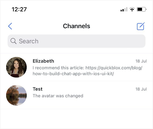
`"dialog.items.empty" = "You don’t have any channels.";
"dialog.members.empty" = "You don’t have any users.";
"dialog.messages.empty" = "You don’t have any messages.";
"dialog.type.private" = "Private";
"dialog.type.group" = "Group";
"dialog.type.public" = "Public";
"dialog.typing.one" = " is typing...";
"dialog.typing.two" = " are typing...";
"dialog.typing.four" = " and 2 others are typing...";
"dialog.name.hint" = "Use alphanumeric characters and spaces in a range from 3 to 60. Cannot contain more than one space in a row.";
"dialog.name.create" = "Create";
"dialog.name.next" = "Next";
"dialog.name.search" = "Search";
"dialog.name.cancel" = "Cancel";
"dialog.info.edit" = "Edit";
"dialog.info.members" = "Members";
"dialog.info.notification" = "Notification";
"dialog.info.searchInDialog" = "Search in channel";
"dialog.info.leaveDialog" = "Leave channel";
"dialog.info.you" = " (You)";
"dialog.info.admin" = "Admin";
"dialog.action.typeMessage" = "Type message";

"screen.title.dialogs" = "Channels";
"screen.title.dialog" = "Channel";
"screen.title.dialogType" = "Channel type";
"screen.title.newDialog" = "New Channel";
"screen.title.createDialog" = "Create Channel";
"screen.title.addMembers" = "Add Members";
"screen.title.dialogInformation" = "Channel information";

"alert.actions.add" = "Add";
"alert.actions.dialogName" = "Channel name";
"alert.actions.enterName" = "Enter name";
"alert.actions.changeImage" = "Change image";
"alert.actions.changeDialogName" = "Change channel name";
"alert.actions.photo" = "Photo";
"alert.actions.removePhoto" = "Remove photo";
"alert.actions.camera" = "Camera";
"alert.actions.gallery" = "Gallery";
"alert.actions.file" = "File";
"alert.actions.remove" = "Remove";
"alert.actions.cancel" = "Cancel";
"alert.actions.ok" = "Ok";
"alert.message.removeUser" = "Are you sure you want to remove ";
"alert.message.questionMark" = "?";
"alert.message.errorValidation" = "Error Validation";
"alert.message.addUser" = "Are you sure you want to add ";
"alert.message.toDialog" = " to this channel?";

"attachment.maxSize.title" = "The uploaded file exceeds maximum file size (10MB)";
"attachment.maxSize.hint" = "Please select a smaller attachment.";
"attachment.title.file" = "file";
"attachment.title.gif" = "GIF";
QuickBloxUIKit.ThemeStringProtocol:
Swift
public class CustomThemeString: ThemeStringProtocol {
    public var dialogsEmpty: String = String(localized: "dialog.items.empty")
    public var usersEmpty: String = String(localized: "dialog.members.empty")
    public var messegesEmpty: String = String(localized: "dialog.messages.empty")

    public var privateDialog: String = String(localized: "dialog.type.private")
    public var groupDialog: String = String(localized: "dialog.type.group")
    public var publicDialog: String = String(localized: "dialog.type.group")

    public var typingOne: String = String(localized: "dialog.typing.one")
    public var typingTwo: String = String(localized: "dialog.typing.two")
    public var typingFour: String = String(localized: "dialog.typing.four")

    public var enterName: String = String(localized: "alert.actions.enterName")
    public var nameHint: String = String(localized: "dialog.name.hint")
    public var create: String = String(localized: "dialog.name.create")
    public var next: String = String(localized: "dialog.name.next")
    public var search: String = String(localized: "dialog.name.search")
    public var edit: String = String(localized: "dialog.info.edit")
    public var members: String = String(localized: "dialog.info.members")
    public var notification: String = String(localized: "dialog.info.notification")
    public var searchInDialog: String = String(localized: "dialog.info.searchInDialog")
    public var leaveDialog: String = String(localized: "dialog.info.leaveDialog")

    public var you: String = String(localized: "dialog.info.you")
    public var admin: String = String(localized: "dialog.info.admin")
    public var typeMessage: String = String(localized: "dialog.action.typeMessage")

    public var dialogs: String = String(localized: "screen.title.dialogs")
    public var dialog: String = String(localized: "screen.title.dialog")
    public var dialogType: String = String(localized: "screen.title.dialogType")
    public var newDialog: String = String(localized: "screen.title.newDialog")
    public var createDialog: String = String(localized: "screen.title.createDialog")
    public var addMembers: String = String(localized: "screen.title.addMembers")
    public var dialogInformation: String = String(localized: "screen.title.dialogInformation")

    public var add: String = String(localized: "alert.actions.add")
    public var dialogName: String = String(localized: "alert.actions.dialogName")
    public var changeImage: String = String(localized: "alert.actions.changeImage")
    public var changeDialogName: String = String(localized: "alert.actions.changeDialogName")

    public var photo: String = String(localized: "alert.actions.photo")
    public var removePhoto: String = String(localized: "alert.actions.removePhoto")
    public var camera: String = String(localized: "alert.actions.camera")
    public var gallery: String = String(localized: "alert.actions.gallery")
    public var file: String = String(localized: "alert.actions.file")

    public var remove: String = String(localized: "alert.actions.remove")
    public var cancel: String = String(localized: "alert.actions.cancel")
    public var ok: String = String(localized: "alert.actions.ok")
    public var removeUser: String = String(localized: "alert.message.removeUser")
    public var questionMark: String = String(localized: "alert.message.questionMark")
    public var errorValidation: String = String(localized: "alert.message.errorValidation")
    public var addUser: String = String(localized: "alert.message.addUser")
    public var toDialog: String = String(localized: "alert.message.toDialog")

    public var maxSize: String = String(localized: "attachment.maxSize.title")
    public var maxSizeHint: String = String(localized: "attachment.maxSize.hint")
    public var fileTitle: String  = String(localized: "attachment.title.file")
    public var gif: String = String(localized: "attachment.title.gif")

    public init() {}
}
Swift
var appTheme: AppTheme = AppTheme(color: CustomThemeColor(),
                                  font: QuickBloxUIKit.ThemeFont(),
                                  image: QuickBloxUIKit.ThemeImage(),
                                  string: CustomThemeString())

QuickBloxUIKit.settings.theme = appTheme // Custom color and string themes setting.
- Copy and add to the localization file in your project the necessary string constants from QuickBlox iOS UIKit. If you do not have a localization file yet, then create it following the guide from Apple Documentation.
- Customize these constants as you need for your purposes.
- Create and add the necessary localization files to your project.
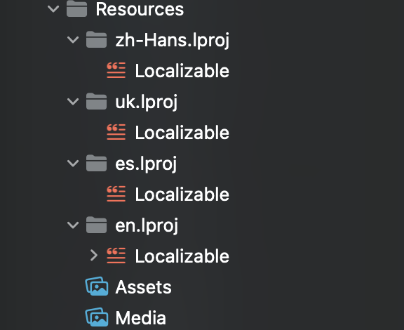
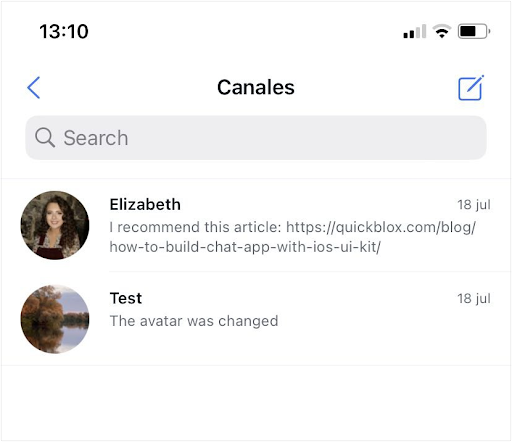
- Customize localization files according to the language they represent. For example, add a localization file for Spanish:
Swift
"dialog.items.empty" = "No tiene ningún cuadro de canal.";
"dialog.members.empty" = "No tiene ningún usuario.";
"dialog.messages.empty" = "No tiene ningún mensaje.";
"dialog.type.private" = "Privado";
"dialog.type.group" = "Grupo";
"dialog.type.public" = "Público";
"dialog.typing.one" = " está escribiendo...";
"dialog.typing.two" = " están escribiendo...";
"dialog.typing.four" = " y otros 2 están escribiendo...";
"dialog.name.hint" = "Use caracteres alfanuméricos y espacios en un rango de 3 a 60. No puede contener más de un espacio en una fila.";
"dialog.name.create" = "Crear";
"dialog.name.next" = "Siguiente";
"dialog.name.search" = "Buscar";
"dialog.name.cancel" = "Cancelar";
"dialog.info.edit" = "Editar";
"dialog.info.members" = "Miembros";
"dialog.info.notification" = "Notificación";
"dialog.info.searchInDialog" = "Buscar en canal";
"dialog.info.leaveDialog" = "Salir del cuadro de canal";
"dialog.info.you" = " (usted)";
"dialog.info.admin" = "Admin";
"dialog.action.typeMessage" = "Escribir mensaje";

"screen.title.dialogs" = "Canales";
"screen.title.dialog" = "Canal";
"screen.title.dialogType" = "Tipo de canal";
"screen.title.newDialog" = "Canal nuevo";
"screen.title.createDialog" = "Crear canal";
"screen.title.addMembers" = "Agregar miembros";
"screen.title.dialogInformation" = "Información de canal";

"alert.actions.add" = "Agregar";
"alert.actions.dialogName" = "Nombre del canal";
"alert.actions.enterName" = "Ingrese el nombre";
"alert.actions.changeImage" = "Cambiar imagen";
"alert.actions.changeDialogName" = "Cambiar nombre de canal";
"alert.actions.photo" = "Foto";
"alert.actions.removePhoto" = "Eliminar foto";
"alert.actions.camera" = "Cámara";
"alert.actions.gallery" = "Galería";
"alert.actions.file" = "Archivo";
"alert.actions.remove" = "Eliminar";
"alert.actions.cancel" = "Cancelar";
"alert.actions.ok" = "Ok";
"alert.message.removeUser" = "¿Está seguro de que desea eliminar ";
"alert.message.questionMark" = "?";
"alert.message.errorValidation" = "Error de validación";
"alert.message.addUser" = "¿Está seguro de que desea agregar ";
"alert.message.toDialog" = "¿a este cuadro de canal?";

"attachment.maxSize.title" = "El archivo cargado supera el tamaño máximo de archivo (10 MB)";
"attachment.maxSize.hint" = "Seleccione un archivo adjunto más pequeño.";
"attachment.title.file" = "archivo";
"attachment.title.gif" = "GIF";