Overview
By incorporating essential messaging functionalities such as typing indicators, delivered/read receipts, and other functionality, users can engage in more interactive and meaningful conversations. The table below presents a comprehensive list of features supported by QuickBlox UIKit, categorized by dialogs type, along with indications of the specific dialogs types that support each feature.| Feature | Group dialog | Private dialog |
|---|---|---|
File sharing | ✓ | ✓ |
Voice message | ✓ | ✓ |
Typing indicator | ✓ | ✓ |
Delivery receipt | ✓ | ✓ |
Read receipt | ✓ | ✓ |
Unread message count | ✓ | ✓ |
Highlight URLs | ✓ | ✓ |
Forward message | ||
Reply message |
Dialog types
QuickBlox UIKit provides support for the following types:Group dialog
A group dialog is a chat between closed group of people. New participant can be added either by dialog owner or any other participant of the group dialog.Private dialog
A private dialog is a direct chat between two people, it can’t be extended to host more people.File sharing
File sharing is a fundamental chat feature that allows users to share different types of files such as images, audio files, videos, and other file types during a conversation. The ability to share files is conveniently available through the messageInput component. When using the file sharing feature, users can send four different types of file messages: image files, video files, audio files, and document files. These files can be easily shared with other participants in the conversation. Users can take a photo with the mobile device’s camera directly, or upload an existing image, video, audio, or document file from their mobile device to share it with others in a chat.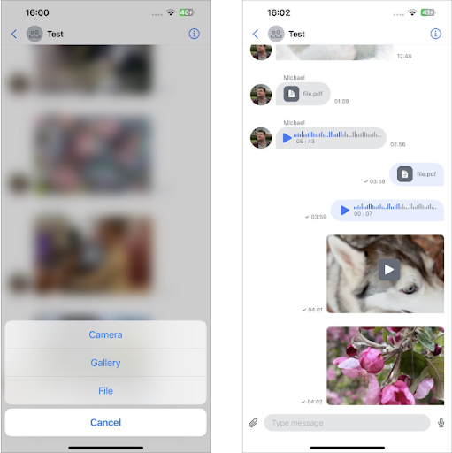
Customizing the UI for File Sharing
To provide a personalized user experience for file sharing, you can customize the UI elements using various components available in the QuickBlox UIKit. The following sections outline the customization options and properties that can be adjusted: You can customize the UI for file sharing using string resource and icon resource.String resource
The string resource is a set of strings used to compose the screens described inThemeString containing QuickBlox UIKit-defined string values.
swift
Swift
A set of icons for file sharing
The file sharing icon set is part of the QuickBlox UIKit icons described inThemeImage. It allows you to customize the icons used throughout the user interface, including those related to file sharing.
| Icon name | Image | Description |
|---|---|---|
| paperclip |  | Add a file. The system symbol image. |
| play |  | Play a video/audio file. The system symbol image. |
| pause |  | Pause/stop a video/audio file. The system symbol image. |
| gif |  | GIF, Graphics Interchange Format, file. Text used. |
| photo |  | Image file. The system symbol image. |
| doctext |  | Document file message. The system symbol image. |
Swift
Voice message
Voice messaging is a valuable feature that provides users with an alternative means of communication, enabling them to exchange messages without relying on text or file-based content. With voice messages, users can convey their thoughts, emotions, and intentions more effectively by utilizing the power of their own voice. By utilizing voice messages, users can benefit from increased efficiency and convenience. It takes significantly less time to record a voice message compared to composing a lengthy text message, allowing the sender to save time and effort. Furthermore, the receiver can listen to the voice message at their convenience, even while multitasking or engaged in other activities. To send a voice message, users can utilize the input component provided by QuickBlox UIKit. By recording and sending the voice message using this component, it will be displayed in the message list component of the dialog. The receiver can then easily access the voice message and play it to listen to its contents.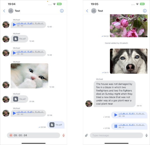
Sending a voice message:
To send a voice message, users need to record their message using the inputView available in theDialogView. By default, a voice message icon is displayed on the right side of the input field, indicating that the voice recording feature is available.
Clicking this icon will initiate the burning process and the icon will turn red. The user can stop recording by clicking on the same button. To cancel sending a voice message and return to the text input field, the user can click on the cancel button on the left. To send a recorded voice message, users can click the send button on the right.
When the recording process completes, the recorder will deactivate the audio session configured by QuickBlox UIKit and attempt to reactivate the client application’s audio session. For instructions on setting up an audio session in QuickBlox UIKit and playing audio and video files, see the corresponding guide in the documentation.
Receiving voice messages:
Voice messages can be received in all types of dialogues, just like any other messages exchanged between participants in a dialogue. Received and sent voice messages are displayed as two components:InboundAudioMessageRow and OutboundAudioMessageRow.
When a voice message is sent and received it will allow users to access and view received voice messages.
It is important to note that in dialog, users can listen to only one voice message at a time. If an attempt is made to play another voice message while listening to the previous one, the previous message being played will be paused to accommodate the new playback.
To end voice message playback:
Upon completion of listening to a voice message, the player responsible for processing playback deactivates the audio session configured using QuickBlox UIKit. Subsequently, it will attempt to reactivate the audio session associated with the client application. For detailed information about setting up and activating an audio session, see the Apple Developer Guide, which provides a comprehensive guide to working with audio sessions.Customizing the UI for Voice message
To provide a personalized user experience for voice messages, you can customize the UI elements using various components available in the QuickBlox UIKit. The following sections outline the customization options and properties that can be adjusted:A set of icons for Voice message
The voice message icon set is part of the QuickBlox UIKit icons described inThemeImage. It allows you to customize the icons used throughout the user interface, including those related to voice messages.
| Icon name | Image | Description |
|---|---|---|
| mic |  | Start/stop voice message recording. The system symbol image. |
| record |  | Record a voice message. The system symbol image. |
| close |  | Cancel sending a voice message. The system symbol image. |
| play | | Play a voice message. The system symbol image. |
| pause | | Pause/stop a voice message. The system symbol image. |
Swift
Typing indicator
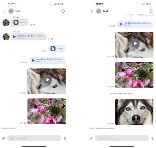
The typing indicator is a valuable feature that provides users with visual cues that indicate when another user is actively composing a message in a chat. This feature enhances real-time communication by providing visibility into ongoing typing activities. The input indicator UI is displayed in theDialogView component between MessagesScrollView and InputView. This ensures that users can easily observe and determine when other participants are typing.
The input indicator remains visible until the user submits a message or deletes all text. Also, if the user pauses while typing for more than 5 seconds, the typing indicator will automatically disappear, providing an accurate view of the current typing state of the dialog.
Customizing the UI for Typing indicator:
To provide a personalized user experience for typing indicators, you can customize the UI elements using various components available in the QuickBlox UIKit. The following sections outline the customization options and properties that can be adjusted: You can use your values to uniquely design your application:Swift
Delivery receipt
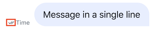
The delivery receipt is a feature that informs a user if their messages have been successfully delivered to other users in the dialog. When message reaches server, it is marked as sent, a single-tick icon appears next to the message’s timestamp.
Customizing the UI for Delivered receipt
To provide a personalized user experience for delivered receipt, you can customize the UI elements using various components available in the QuickBlox UIKit. The following sections outline the customization options and properties that can be adjusted:A set of icons for Delivered receipt
The delivered receipt icon set is part of the QuickBlox UIKit icons described inThemeImage. It allows you to customize the icons used throughout the user interface, including those related to delivered receipt.
| Icon name | Image | Description |
|---|---|---|
| send |  | Used to indicate that the message was successfully sent. |
| delivered |  | Used to indicate that a message was successfully delivered. |
Swift
Swift
Read receipt
The read receipt feature allows users to determine whether their messages have been read by others in the dialog. When any recipient in the dialog have read the sender’s message, a colored double-tick icon is displayed next to the message’s timestamp. The read receipts are only visible to the sender of the message.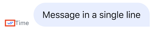
Customizing the UI for Read receipt
To provide a personalized user experience for read receipt, you can customize the UI elements using various components available in the QuickBlox UIKit. The following sections outline the customization options and properties that can be adjusted:A set of icons for Read receipt
The read receipt icon set is part of the QuickBlox UIKit icons described inThemeImage. It allows you to customize the icons used throughout the user interface, including those related to read receipt.
| Icon name | Image | Description |
|---|---|---|
| read | | Used to indicate that the message was successfully read. Color modified |
Swift
Swift
Unread message count
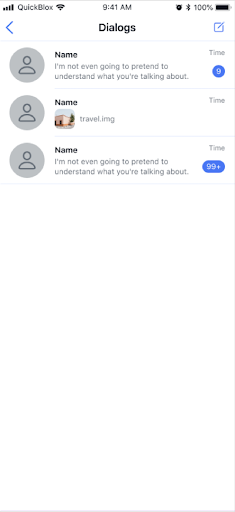
The unread message count feature is designed to provide users with important information about the number of unread messages in each conversation they are in. This feature allows users to be informed about the volume of messages they have yet to read, ensuring they never miss important conversations. The unread message count is displayed in theDialogRowView which is the DialogsListView list component of the DialogsView structure, making it easily accessible and visible to users. A counter is specifically shown below the timestamp of the last message received for each conversation in the list.
To ensure a concise and convenient display, if the number of unread messages exceeds 100, it will be presented as 99+, indicating a large number of unread messages.
Customizing the UI for Unread message count
To provide a personalized user experience for counting unread messages, you can customize the user interface elements using the various components available in QuickBlox UIKit. The following example describes the configuration options and properties that you can configure:Swift
Highlight URLs
When communicating via instant messengers, it is often useful to Highlight URLs to make them more visible and distinguish them from plain text. QuickBlox UIKit recognizes URLs and automatically converts them into clickable links. This allows recipients to easily access the associated web page. For example, if you simply include Highlight URLs like www.example.com in your message, the messenger will automatically convert it into a clickable link.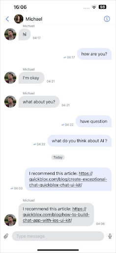
Customizing the UI for Highlight URLs
QuickBlox UIKit supports text formatting options such as bold, italic, or underline. You can apply these formatting styles to Highlight URLs to make them stand out. For example:Swift
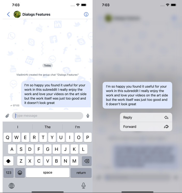
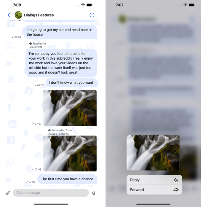
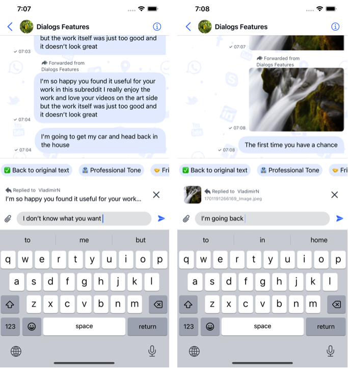
Forward message
The Forward message feature in QuickBlox iOS UIKit enhances communication flexibility by allowing users to easily share messages with others in a chat. This feature is invaluable for circulating information, fostering collaboration, and maintaining a coherent conversation flow. Below is an overview of the forward message feature along with associated functionalities. Forwarding Messages:- Initiating Forward:
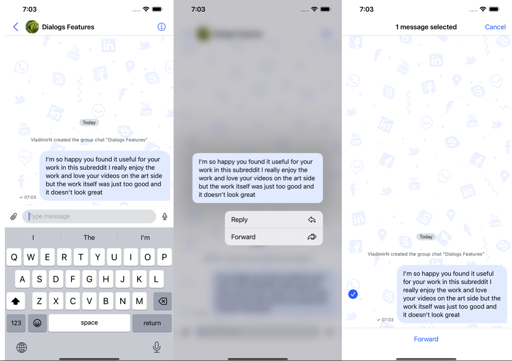
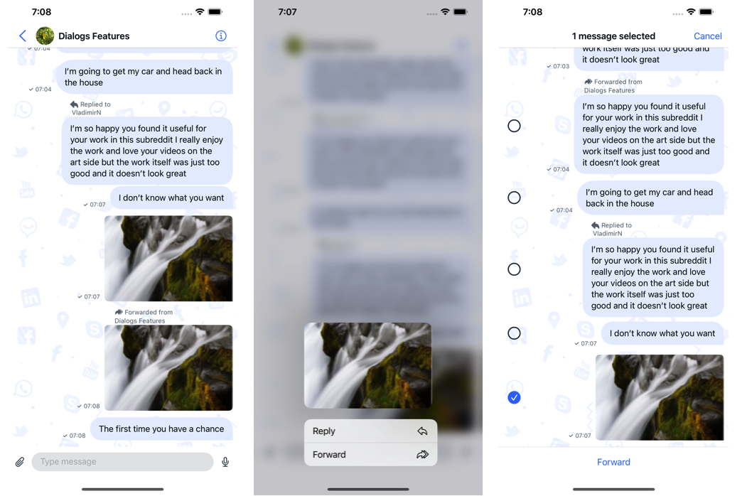
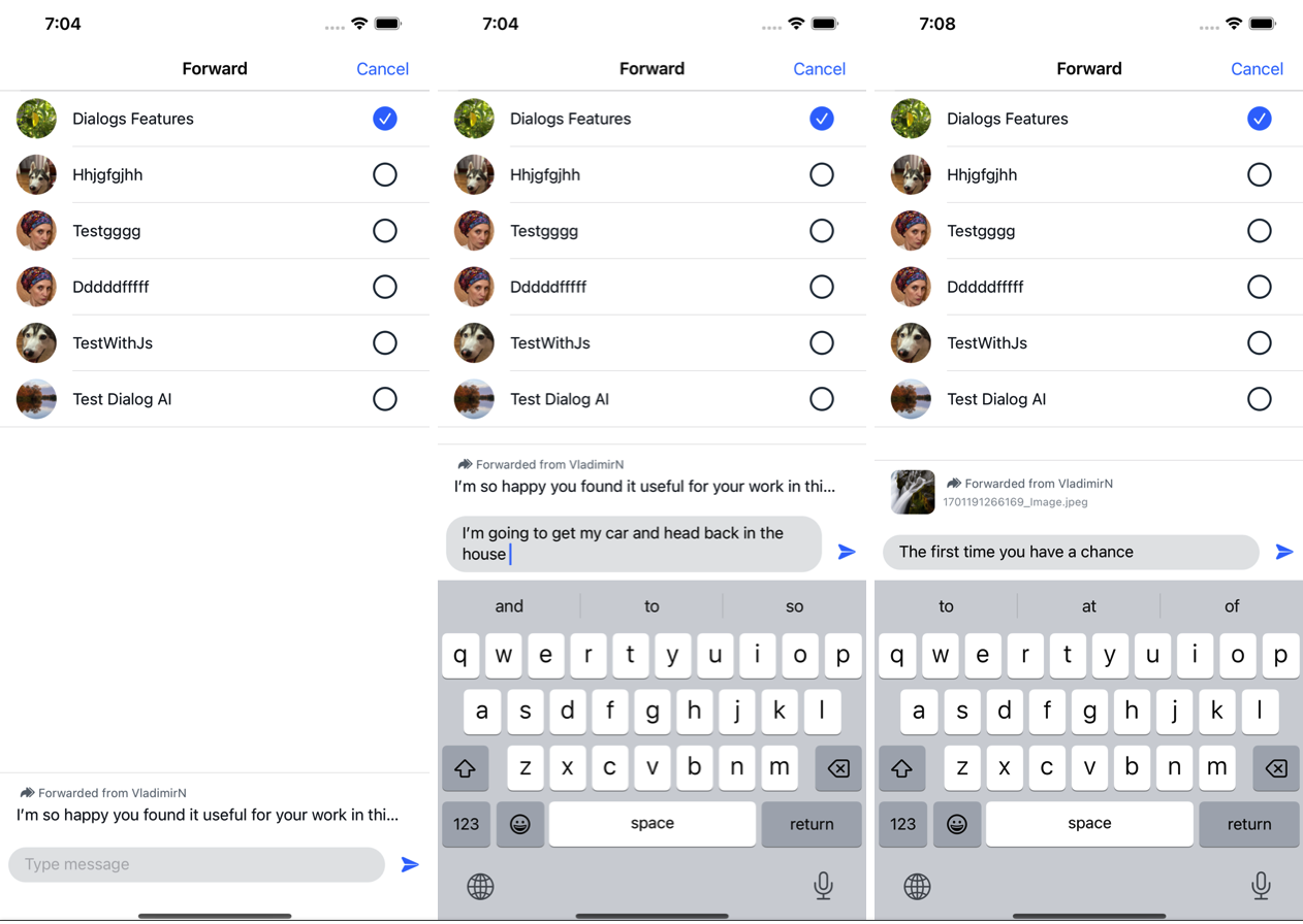
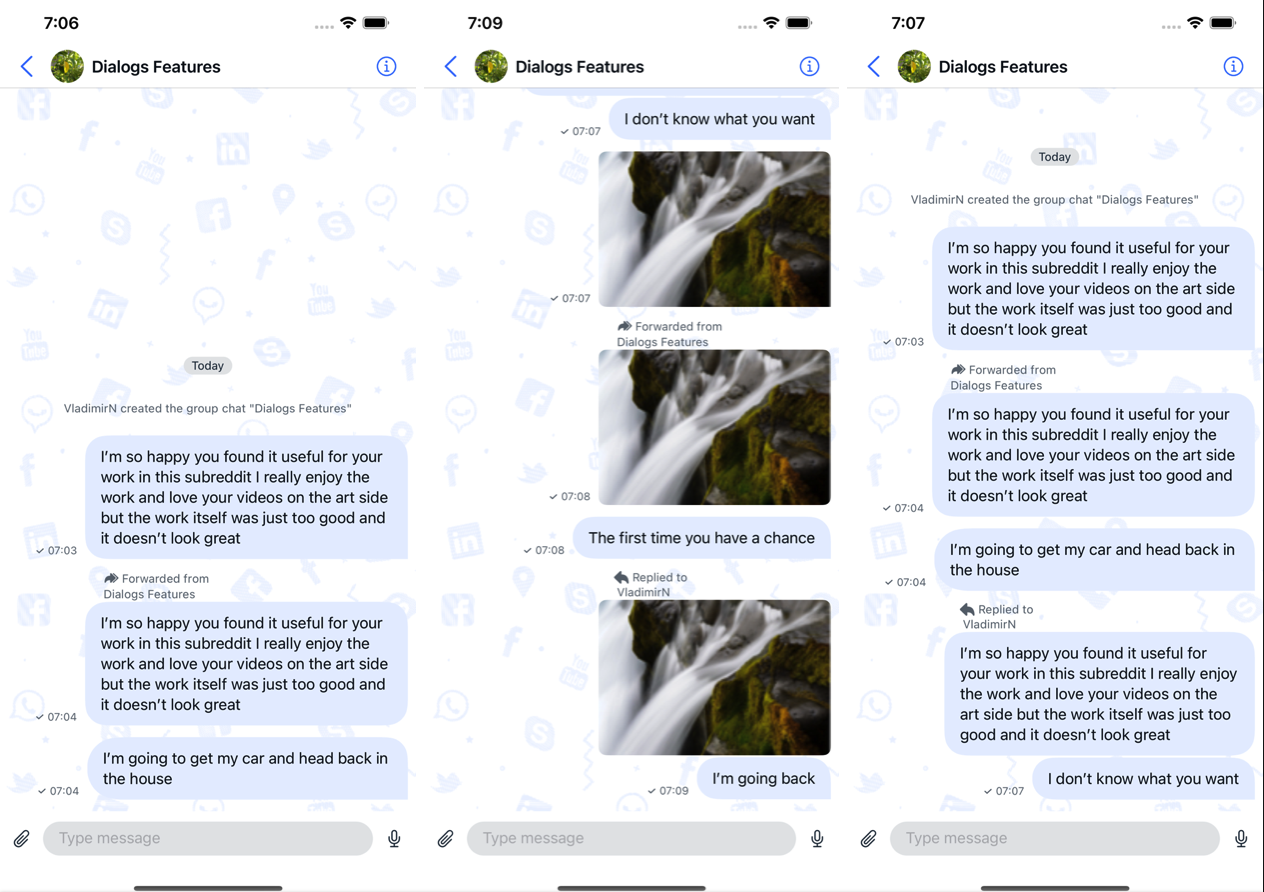
- AI Features:
Customizing the UI for Forward message
To provide a personalized user experience for Forward messages, you can customize the UI elements using various components available in the QuickBlox UIKit. The following sections outline the customization options and properties that can be adjusted:A set of icons for Forward message
The Forward message icon set is part of the QuickBlox UIKit icons described inThemeImage. It allows you to customize the icons used throughout the user interface, including those related to Forward messages.
| Icon name | Image | Description |
|---|---|---|
| forward |  | Forward icon. |
| forward filled |  | Forward Filled icon. |
Swift
Enable Forward message Feature
Message forwarding is enabled by default. You can also turn it on and off:Swift
Reply message
The Reply message feature in QuickBlox iOS UIKit enhances communication flexibility by allowing users to easily Interaction with messages in a chat. This feature is invaluable for circulating information, fostering collaboration, and maintaining a coherent conversation flow. Below is an overview of the reply message feature along with associated functionalities. Reply Messages:- Initiating Reply:
- AI Features:
Customizing the UI for Reply message
To provide a personalized user experience for Reply messages, you can customize the UI elements using various components available in the QuickBlox UIKit. The following sections outline the customization options and properties that can be adjusted:A set of icons for Reply message
The Reply message icon set is part of the QuickBlox UIKit icons described inThemeImage. It allows you to customize the icons used throughout the user interface, including those related to Reply messages.
| Icon name | Image | Description |
|---|---|---|
| reply |  | Reply icon. |
| reply filled |  | Reply Filled icon. |
Swift
Enable Reply message Feature
Message Reply is enabled by default. You can also turn it on and off:Swift