Overview
It provides developers with a convenient way to integrate chat functionality into their projects, enabling them to quickly create interactive and responsive chat interfaces.
Some key features and capabilities of QuickBlox React Chat UIKit include:
Ready-made components for Chat: UIKit offers pre-built components for displaying and managing various aspects of a chat, such as contact lists, headers, messages, user profile information, and more. These components can be easily customized and adapted to meet the project’s requirements.
Customization: Developers can customize the appearance and styling of the chat using various parameters and styles. This allows for creating unique and visually consistent chat interfaces that align with the application’s design.
Sending and receiving messages: UIKit provides an easy way to send and receive messages between users. Developers can use ready-made methods and events to handle real-time message sending and receiving.
Contact management: The library allows for managing the contact list, adding and removing users from the contact list, as well as viewing user profile information.
Various functional capabilities: UIKit offers additional functional capabilities such as file sharing, group chats, message history viewing, and more, making the chat interface more comprehensive and feature-rich.
QuickBlox React Chat UIKit provides a convenient and efficient way to integrate chat into React applications, reducing development time and simplifying tasks related to chat functionality implementation. It can be a useful tool for developers who want to quickly add chat to their projects without the need to build everything from scratch.
Supported features by dialog types
| Group dialog | Private dialog | |
|---|
File sharing | ✓ | ✓ |
Voice message | ✓ | ✓ |
Typing indicator | ✓ | ✓ |
Delivery receipt | ✓ | ✓ |
Read receipt | ✓ | ✓ |
Unread message count | ✓ | ✓ |
Highlight URLs | ✓ | ✓ |
Adding a Public dialog is planned in the next releases.
Dialog types
QuickBlox UIKit provides support for three types of dialogs: public dialog, group dialog, and private dialog.
Public dialog
A public dialog is an open chat that is shown to everyone in the app and anyone can join it. Public dialogs can host more participants compared to group dialogs, but does not have a list of participants and their online statuses within dialog.
Group dialog
A group dialog is a chat between closed group of people. New participant can be added either by dialog owner or any other participant of the group dialog.
Private dialog
A private dialog is a direct chat between two people, it can’t be extended to host more people.
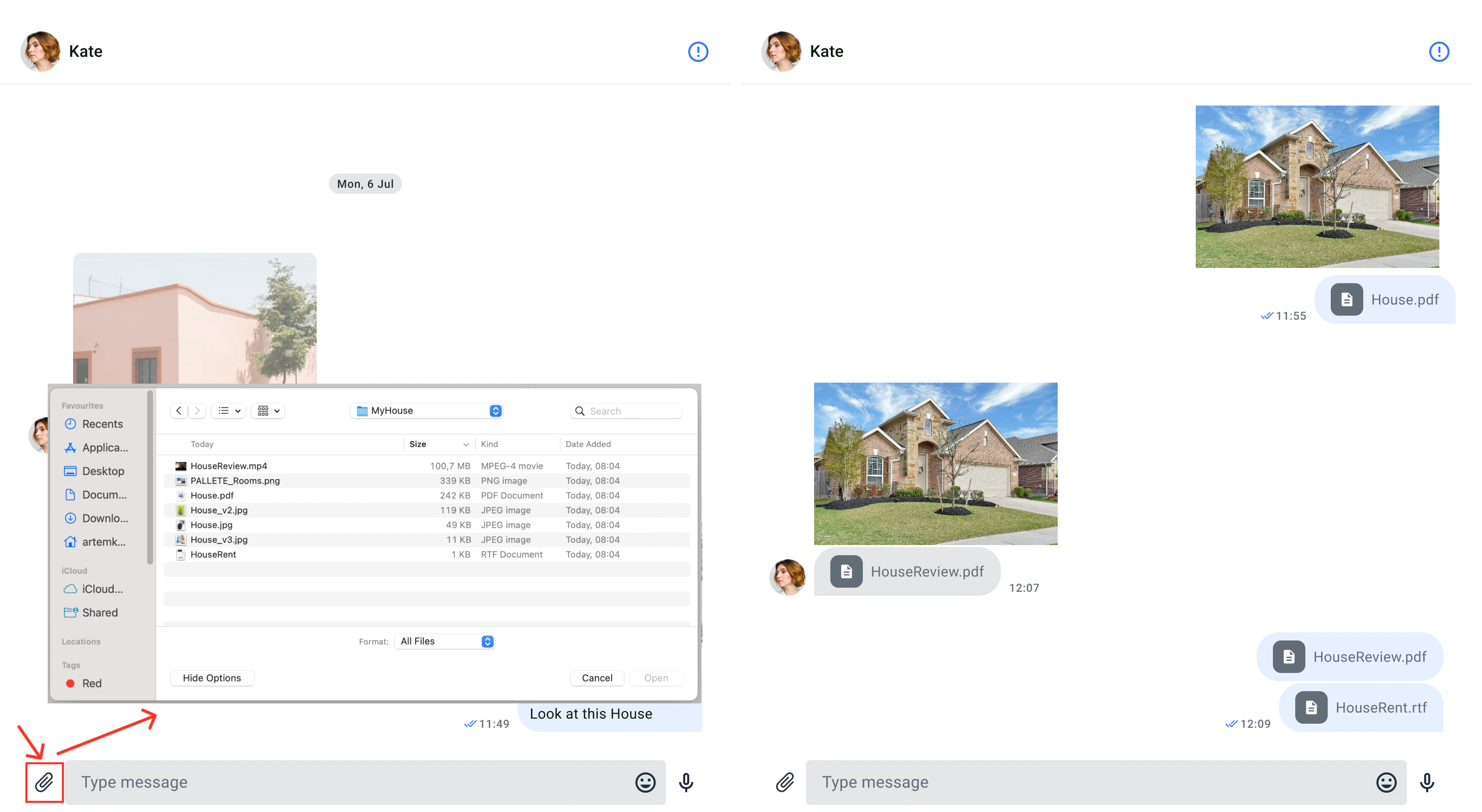
File sharing
QuickBlox allows users to easily send different types of files, like images, audio files, or videos, during a chat session with the help of the file sharing feature. The file sharing icon appears on the UI element for typing messages.
Customize the UI for file sharing
You can customize the UI for file sharing using icon resource.
Icon resource
Icon resources are stored in src/Presentation/components/UI/svgs directory, all icons are vectors (svg). The following table shows customizable file sharing icon.
The default icon color uses sharing icons (like others). It can be changed in the IconTheme property. To set the icon color, you should use the methods ‘inputElements()’ or ‘mainElements()’ from the UiKitTheme interface or configure it in the Theme colors (see Theme colors). | Id | Component name | Image | Description |
|---|
| Attachment | Media/Attachment |  | An icon used to select and add files. |
| Play | Toogle/ImagePlay |  | An icon for video placeholder. |
| GifFile | Media/GifFile |  | An icon for gif placeholder. |
| Image | Media/ImageEmpty |  | An icon for image placeholder. |
| File | Media/ImageFile |  | An icon for file. |
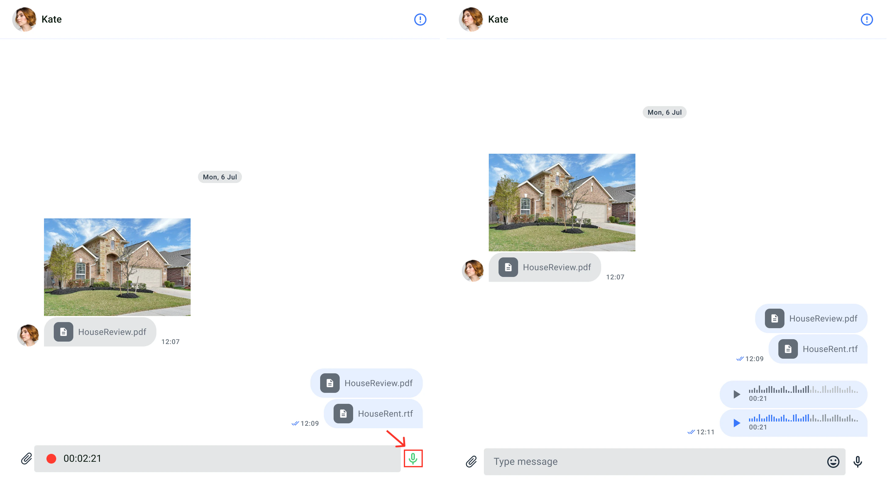
Voice message
Voice messages are another way for people to communicate without typing text. Through voice messages, you can express yourself better, using tone and intention. Additionally, recording a voice message is quicker than writing a long text, making it more efficient for the sender. The recipient can listen to the message at their convenience, even while doing other tasks. To send a voice message in a chat, you simply need to press and hold the microphone icon. Then, the message will appear in the chat, and the recipient can play it back.
Send a voice message
To send a voice message, users need to record the message first. By default, the voice message icon is visible to the right of the input field. While the icon is pressed, the microphone appears and records the sound from the microphone. The voice message icon only appears when the text input field is empty. When the icon is not pressed, the voice message is sent automatically.
Customize the UI for voice message recorder
You can customize the user interface for the voice message recording device using the icon resource.
Icon resource
The icon resources are stored in the src/Presentation/components/UI/svgs folder, and all icons are in vector format (svg). The following table shows the customizable icon for file access.
| Id | Component Name | Image | Description |
|---|
| MicOn | Toogle/MicOn |  | An icon for send voice. |
| Record | Toogle/Record |  | An icon for recorder. |
Customize the UI for voice messages
Using the icon resource, it is possible to tailor the user interface for voice messages.
| Icon name | Component Name | Image | Description |
|---|
| Play | Toogle/ImagePlay |  | An icon for audio. |
| AudioAttachment | AudioAttachmentComponent |  | An icon for audio message background. |
Forwarding Messages and Replying
Modern messengers and chat platforms offer various functional features, among the most useful of which are message forwarding and reply options. Let’s take a closer look at them.
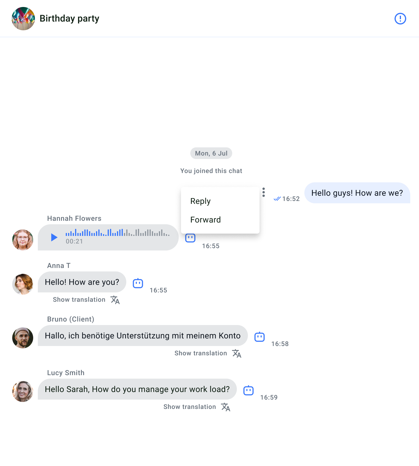
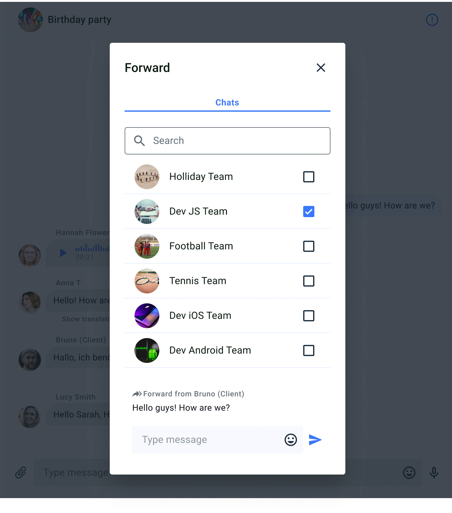
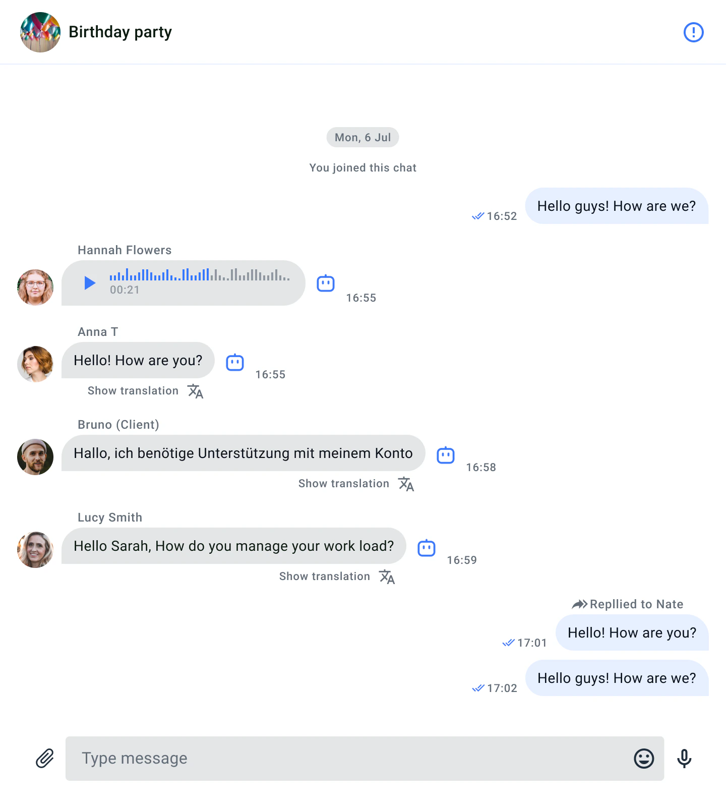
Forwarding Messages:
Forwarding is the capability to transfer messages from one chat participant to another, similar to email forwarding. It enables efficient exchange and discussion of information within the context of chats and messengers.
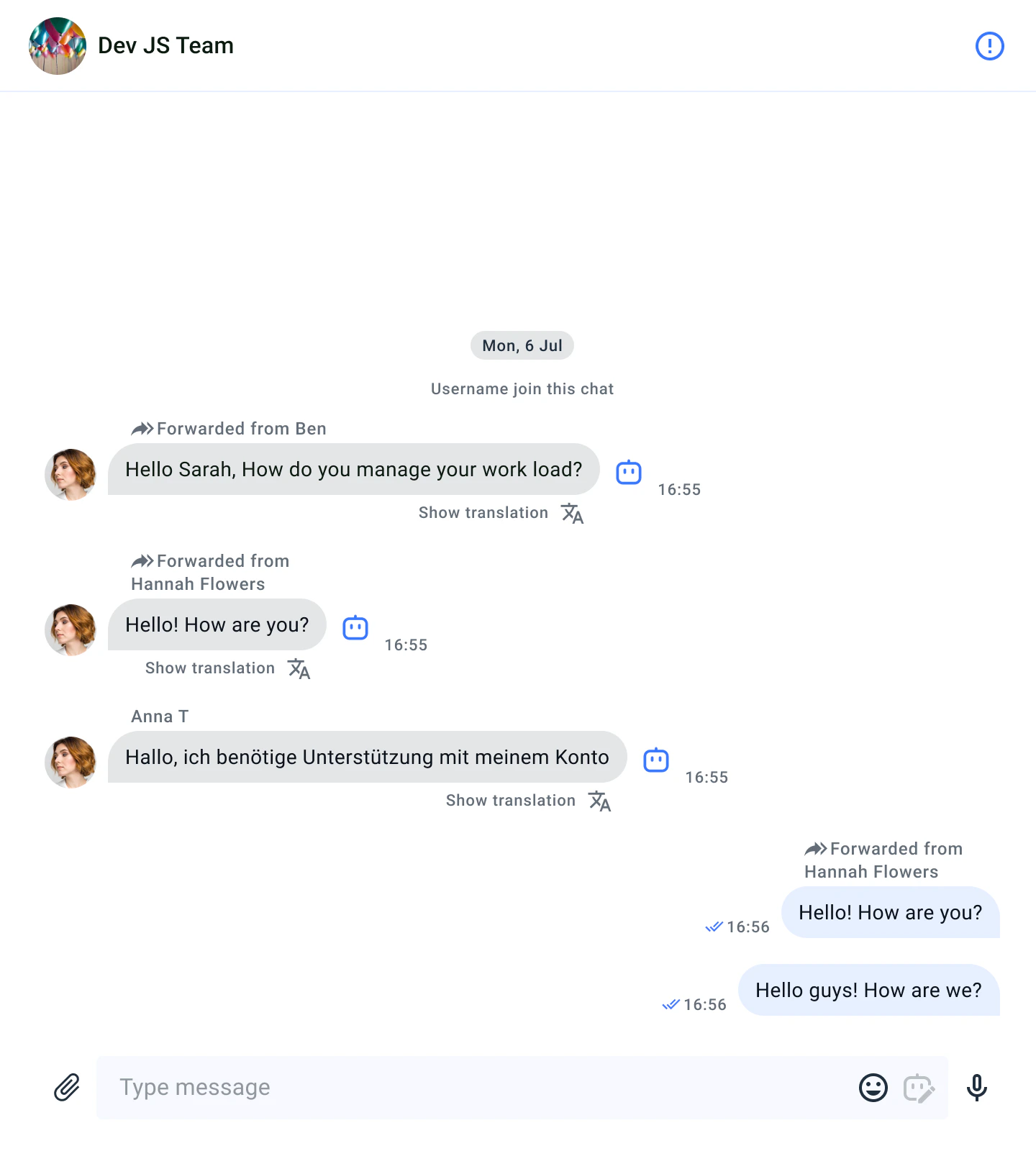
Once you’ve selected the dialogue to which you want to forward the message, the forwarded message will be displayed in the selected dialogue like this.
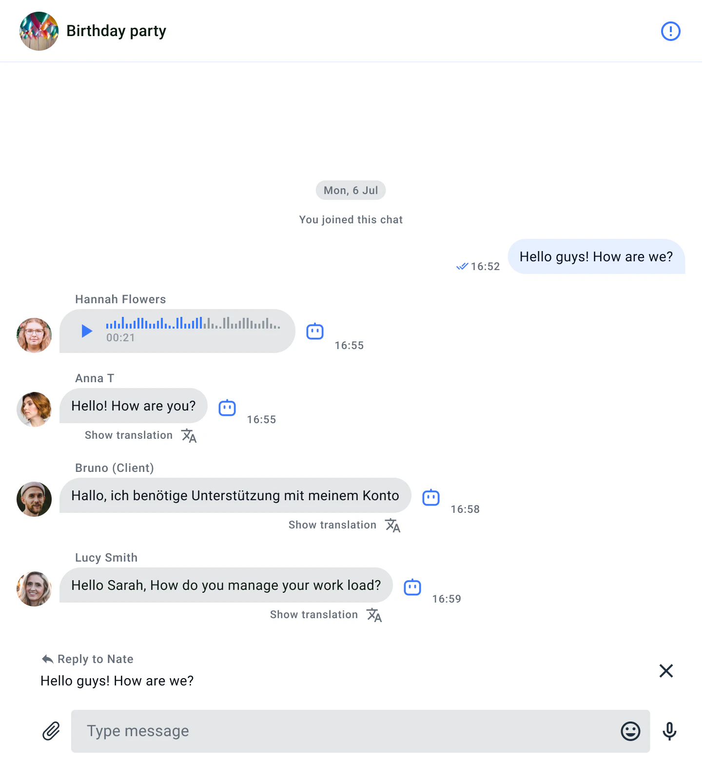
Replying to Messages:
Replying is the ability to respond to a specific message, establishing a connection between the reply and the original message. It enhances the structure of communication in a chat, making conversations more clear and organized.
After choosing the message to which you’ve decided to reply, your response to the message will be displayed like this.
Customize the UI for forwarding and replying
You can customize the interface elements related to forwarding and sending, just like individual components are customized, such as message sending elements and dialogue selection elements. You can customize the “Forward message dialog” pop-up window in the ForwardMessageFlow.scss file to modify various aspects of the screen. The ForwardMessagePreview.scss file with classes allows you to customize the forward/reply preview components.
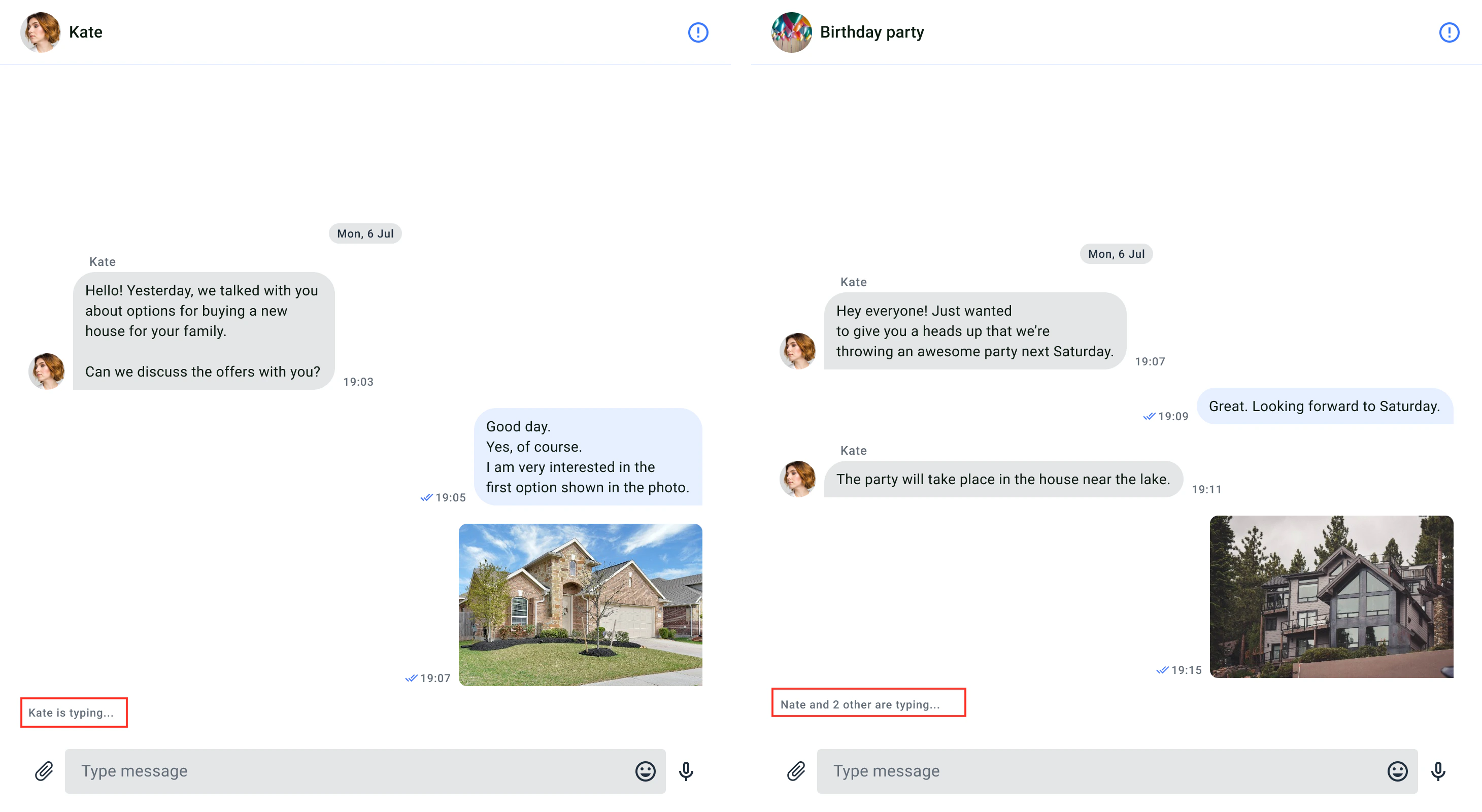
Typing indicator
The typing indicator is a useful feature that provides users with a visual signal when someone else is typing a message in the chat window. The indicator remains visible until the user sends a message or clears the text. If the user stops typing for more than 10 seconds, the indicator also disappears.
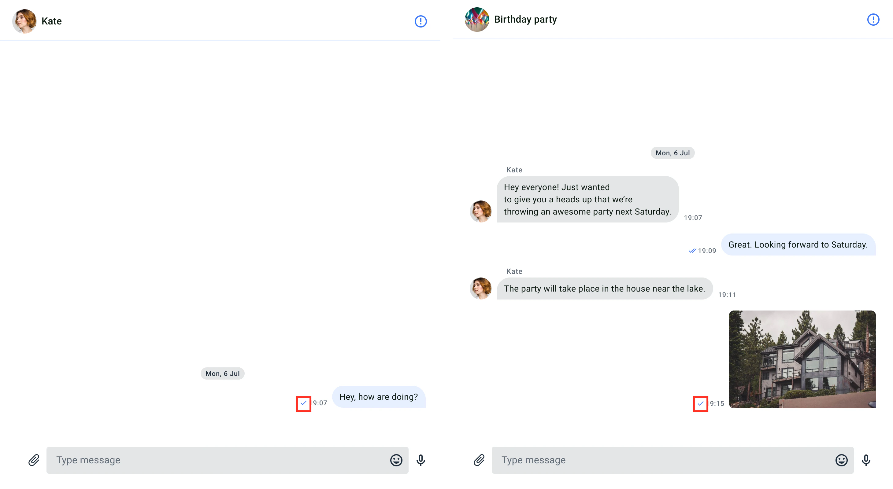
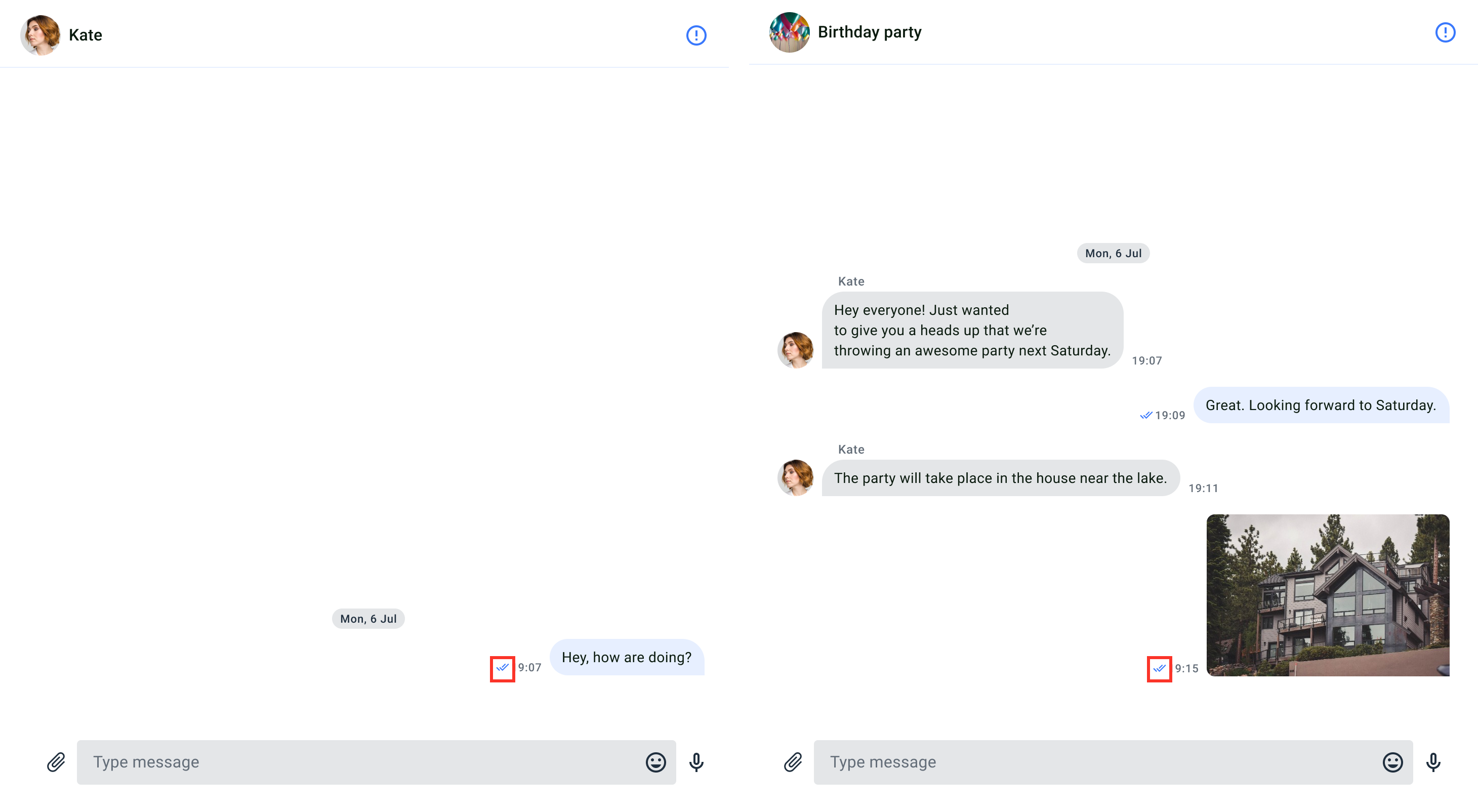
Delivery receipt
The delivery notification is a feature that informs the user about the successful delivery of their messages to other users in the chat window. When a message reaches the server, it is marked as sent, and a single checkmark icon appears next to the message’s timestamp. Once the message reaches the recipient’s device, it is marked as delivered. If the sender’s message has been delivered to any recipient in the chat, a double checkmark icon appears next to the message’s timestamp. The delivery notification is only visible to the message sender.
Customize the UI for delivery receipt
You can customize the user interface for delivery notifications using the icon resource.
Icon resource
The icon resources are stored in the src/Presentation/components/UI/svgs folder, and all icons are in vector format (svg). The following table shows the customizable icon for file access.
| Id | Component Name | Image | Description |
|---|
| Sent | Status/Sent |  | An icon for sent status. |
| ViewedDelivered | Status/ViewedDelivered |  | An icon for delivered status. |
The default delivery receipt color uses the tertiary elements color, it can be changed in the theme with setTertiaryElementsColor() (see Theme colors) Read receipt
The read receipt feature allows users to determine whether their messages have been read by others in the dialog. When any recipient in the dialog have read the sender’s message, a colored double-tick icon is displayed next to the message’s timestamp. The read receipts are only visible to the sender of the message. It appears on the MessagesComponent.
Customize the UI for read receipt
You can customize the UI for read receipt using icon resource.
Icon resource
Icon resources are stored in drawable directory, all icons are vectors (xml). The following table shows customizable file sharing icon.
| Id | Component Name | Image | Description |
|---|
| ViewedDelivered | Status/ViewedDelivered | | An icon for read status. |
The default read receipt color uses the main elements color, it can be changed in the theme with setMainElementsColor() (see Theme colors) Unread message count
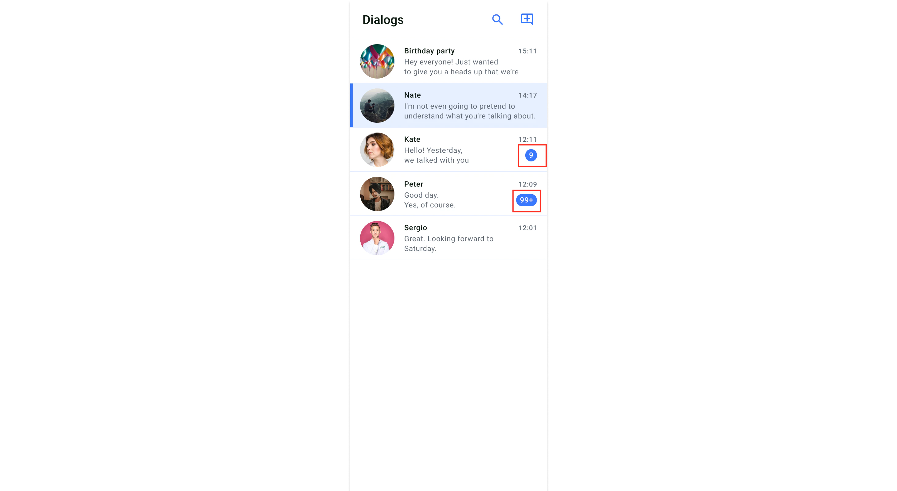
Unread message count is a feature that informs users of the number of messages they haven’t read in each dialog. The number of unread messages per dialog is displayed below the timestamp. If the number of messages is more than 100, it will be displayed as 99+. The unread message count appears on the DialogsComponent.
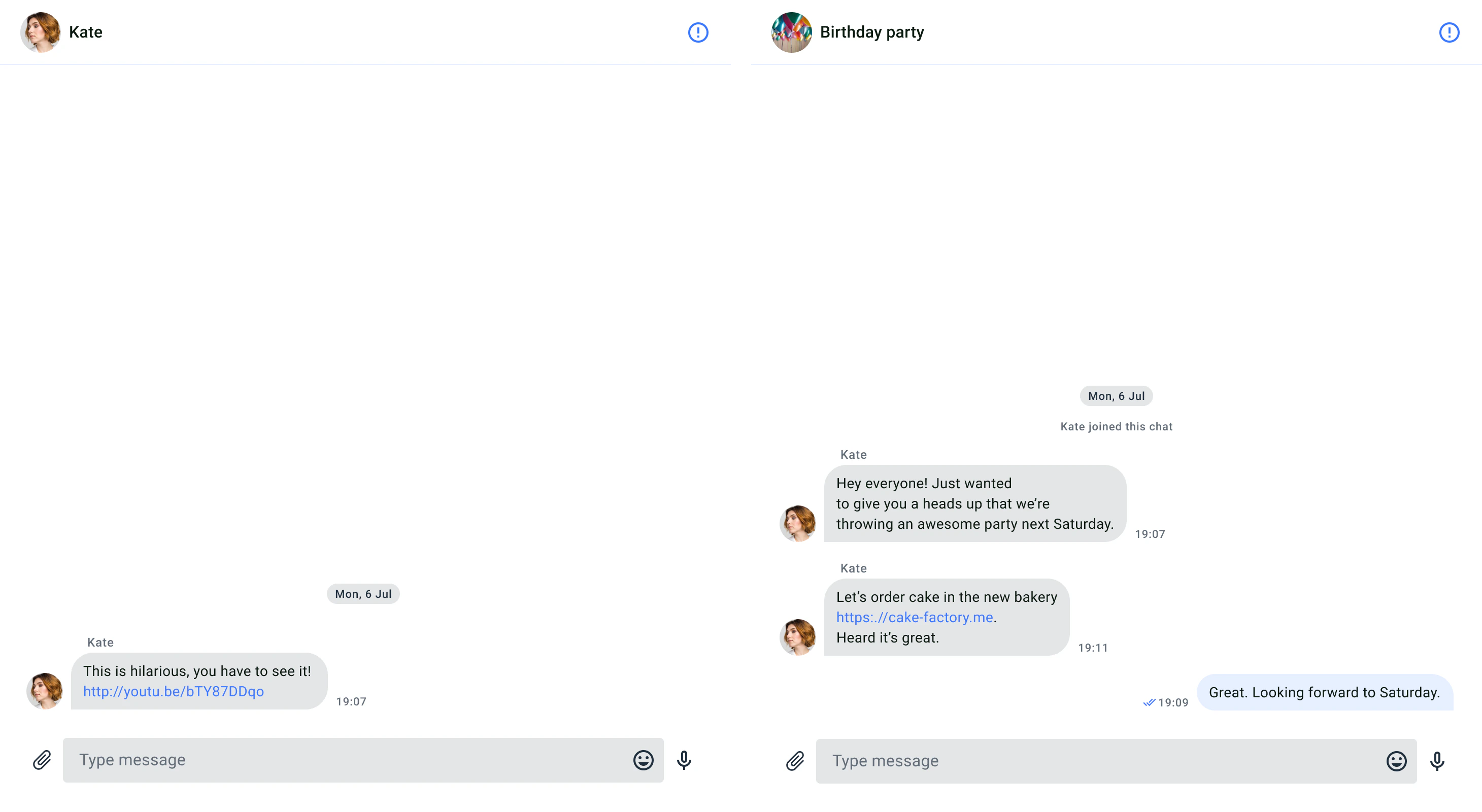
Highlight URLs
The highlighting URLs is a feature that refers to displaying clickable links in a chat message, where the URL is visually distinguished and can be interacted with the user.